Air pressure
Open Climate4you homepage
Recent Northern Hemisphere surface air pressure and 200 mb air flow
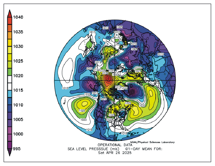
Northern Hemisphere sea level pressure (Mb) on 26 April 2025. Source: NOAA Earth System Research Laboratory.
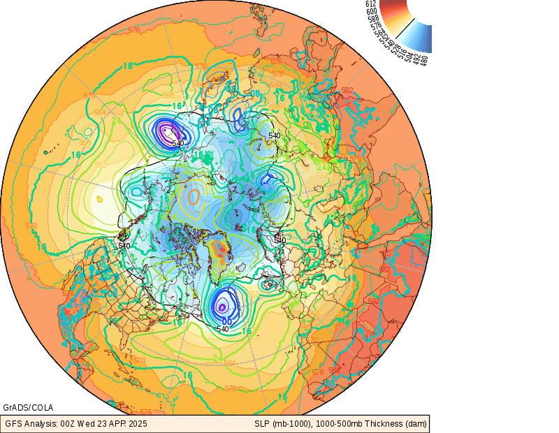
Northern Hemisphere sea level pressure and 1000-1500 millibar thickness.
-
The colored contours indicate sea level pressure in millibars. High pressure is red, low pressure in green or blue. Only the last 2 digits are shown. Sea level pressure is usually around 1000 millibars, so add 1000 to values in the range of 00-50, and add 900 to values in the range of 50-98.
-
Low sea level pressure indicates cyclones or storms near the surface of the earth. High sea level pressure indicates calm weather.
-
The shaded contours indicate the vertical distance, or thickness, between the 1000 millibar surface and the 500 millibar surface, measured in tens of meters.
-
Since air behaves nearly as an ideal gas, and vertical distance is proportional to volume over a specified surface area, the thickness between two pressure levels is proportional to the mean temperature of the air between those levels. Thus, low values of thickness mean relatively cold air.
-
The 540 line is highlighted in black, since this line is often used as a rule of thumb to indicate the division between rain and snow for low terrain. When there is precipitation where the thickness is below 540dam, it is generally snow. If the thickness is above 540dam, it is usually rain (or sleet if the air next to the surface is below freezing).
Source: National Centers for Environmental Prediction. An more detailed explanation of the diagram can be read by clicking here.
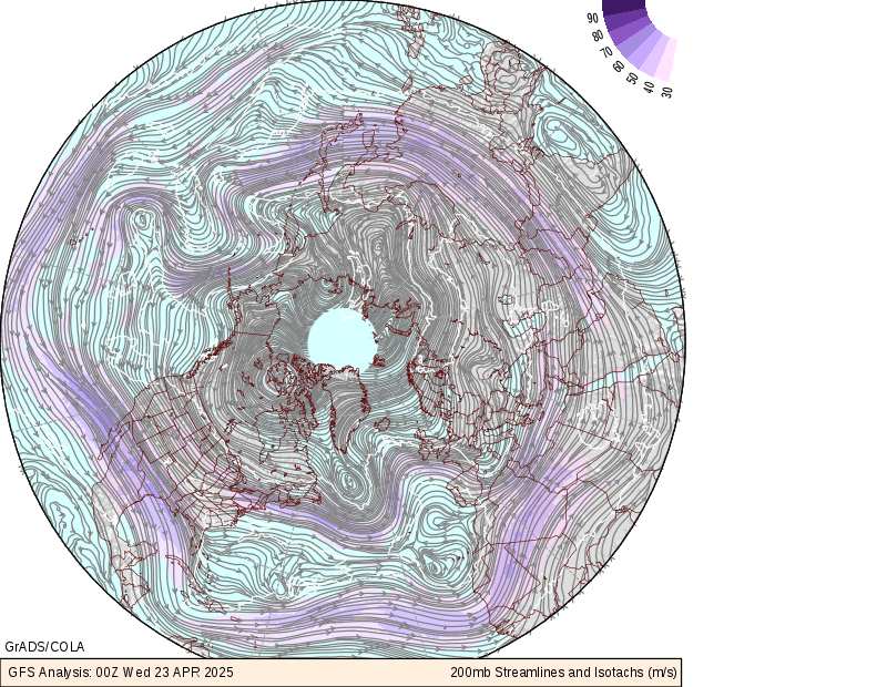
Northern Hemisphere air flow speed and -direction at the 200 milibar level (ca. 12 km altitude).
-
Purple shading indicates the speed of the winds at the 200 millibar level, in meters per second. This altitude is near the level of the core of the jet stream. So the tracks of the jet streams can be seen very clearly.
-
The streamlines indicate the direction of flow of the wind, which is generally from west to east throughout most of the subtropics, mid- and high-latitudes.
-
The color of the streamlines indicates a relative measure of divergence of the flow in the upper troposphere. Orange and red indicates strong divergence at upper levels, usually associated with strong vertical velocities in the middle troposphere, and severe weather/heavy rainfall.
Source: National Centers for Environmental Prediction. An more detailed explanation of the diagram can be read by clicking here.
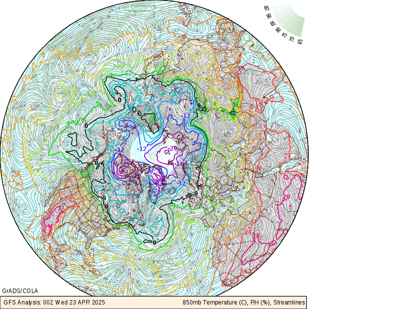
Northern Hemisphere 850mb (about 1000 m altitude) Temperature, Humidity and Winds.
-
Colored contours indicate the air temperature at the 850 millibar level, in degrees Celsius. The 0oC contour is highlighted, as this is also often used as a divider between rain and snow.
-
The green shading indicates the relative humidity percentage at the 850 millibar level. High values indicate the availability of moisture. When large rates of ascent (in panel 3) are located with high moisture availability, heavy rainfall will likely occur.
-
The streamlines indicate the wind direction.
-
Advection of moisture by the wind can be inferred by noticing the direction and rate at which moist areas appear to be blown. Similarly, temperature advection can be inferred by noticing whether the wind is blowing cold air toward a warm region, or warm air toward a cold region.
Source: National Centers for Environmental Prediction. An more detailed explanation of the diagram can be read by clicking here.
Click here to jump back to the list of contents.
Accumulated cyclone energy (ACE)
Accumulated cyclone energy (ACE) is a measure used by the National Oceanic and Atmospheric Administration (NOAA) to express the activity of individual tropical cyclones and entire tropical cyclone seasons.
ACE is calculated as the square of the wind speed every 6 hours, and is then scaled by a factor of 10,000 for usability, using a unit of 104 knots2. The ACE of a season is the sum of the ACE for each storm and takes into account the number, strength, and duration of all the tropical storms in the season.
The damage potential of a hurricane is proportional to the square or cube of the maximum wind speed, and thus ACE is not only a measure of tropical cyclone activity, but also a measure of the damage potential of an individual cyclone or a season.
Below is shown ACE for the Atlantic basin.
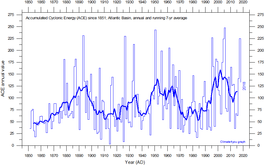
Accumulated cyclonic energy (ACE; Atlantic basin) per year since 1850 AD, according to data from the Atlantic Oceanographic and Meteorological Laboratory, Hurricane research Division. Thin lines show annual ACE values, and the thick line shows the running 7-yr average. Last year shown: 2018. Last diagram update: 29 August 2019.
-
Click here to download the ACE annual series from the Atlantic Oceanographic and Meteorological Laboratory, Hurricane research Division.
The ACE of a season is calculated by summing the squares of the estimated maximum sustained velocity of every active tropical storm (wind speed 35 knots (65 km/h) or higher), at six-hour intervals. If any storms of a season happen to cross years, the storm's ACE counts for the previous year. Kinetic energy is proportional to the square of velocity, and by adding together the energy per some interval of time, the accumulated energy is found. As the duration of a storm increases, more values are summed and the ACE also increases such that longer-duration storms may accumulate a larger ACE than more-powerful storms of lesser duration. Please note that although ACE is a value proportional to the energy of the system, it is not a direct calculation of energy.
It is interesting to inspect the ACE series for the presence of recurrent, natural variations. This may be done with a frequency analysis, as shown in the diagram below.
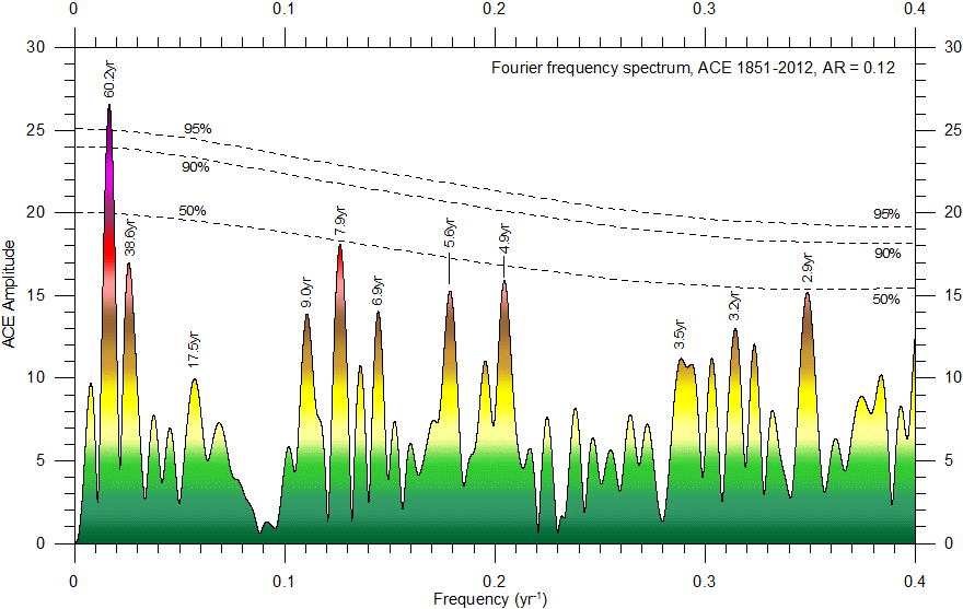
Fourier analysis (using Best Exact N composite algorithm) of the detrended ACE series, calculated for the Atlantic basin. The horizontal stippled lines indicate peak-based critical limit significance levels, while the colour scale indicates increasing amplitude. The ACE record is dominated by periods of about 60.2, 9.7, 5.6, 4.9 and 2.9 yr length, all with amplitude greater than 15. However, in a statistical sense, due to the still limited length of the ACE record, only the 60.2 yr peak is significant. Only frequencies lower than 0.4 yr-1 (periods longer than 2.5 yr) are shown. Last year incorporated in the analysis: 2012. Last diagram update: 3 December 2013.
Visual inspection of climate data series like the ACE series often suggests the existence of recurrent variations (see, e.g. Humlum et al. 2011 and Humlum et al. 2012), and Fourier analysis represents a valuable tool for the identification of such natural variations, as shown by the diagram above. However, describing the character (persistence, period and amplitude) of cyclic patterns might be difficult as they often come and go, lasting only for a limited period at each appearance. Especially the dynamics over time of the individual cycles can be complicated to analyse. For this reason, oscillations may prove difficult to characterise fully from a normal Fourier power spectrum.
To overcome the problem encountered when cyclic variations change their period and amplitude, a wavelet analysis (Morlet 1983) may be employed to identify and describe oscillating variations in the record as a supplement to the Fourier analysis. A more thorough description of the wavelet analysis is given by Torrence and Compo (1997) and by Humlum et al. (2011).
The result of a Morlet wavelet analysis of the ACE data is shown in the diagram below.
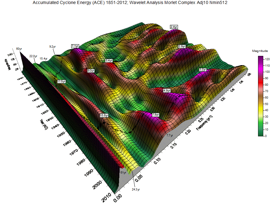
Diagram
showing the continuous wavelet time-frequency spectrum for the
ACE
series, calculated for the Atlantic basin.
Time (AD) and frequency (yr-1) of cyclic variations embedded in the
data are shown along the two horizontal
axes. Frequencies higher than 0.5 yr-1 are not shown, corresponding
to showing only periods longer than 2 yr. The vertical axis (and colour scale)
shows the component (magnitude) of the Continuous Wavelet Spectrum at a given
time and frequency. The magnitude is calculated as sqrt(Re*Re+Im*Im), where Re
is the real component of a given segment's FFT at a given frequency and Im is
the imaginary component. Usually the magnitude is 3-4 times the corresponding
amplitude. The dotted line indicates the extent of the cone of influence, where
the magnitude of oscillations may be diminished artificially due to zero
padding, especially towards the ends of the time scale, see, e.g. the 7.9 and
4.9 yr periods. Last year incorporated in the analysis: 2012. Last diagram
update: 3 December 2013.
The wavelet analysis reveals several cyclic variations in the ACE record (see diagram above). A dominant period of about 60 yr length characterises the entire record. Other variations are more dynamic over time, and may come and go, although two periods of 8-9 and about 5 yr length appear to be rather persistent. At the moment, especially the period with about 8 yr length appears to be important, and therefore not likely to disappear immediately.
Thus,
there is reason to expect that the development of ACE within the Atlantic basin in the near future will mainly be
controlled by the above mentioned 60 and 8 yr periods. As the 60 yr period just
now is entering its declining phase, it is likely that also the ACE value will
show an overall decline during the coming about 25-30 years.
Click here to jump back to the list of contents.
North Atlantic Oscillation (NAO)
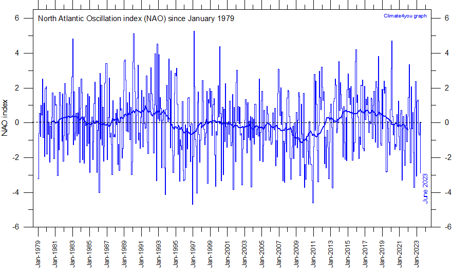
NAO monthly values since January 1979. The thin line represents the monthly values, and the thick line is the simple running 37 month average, nearly corresponding to a running 3 yr average. Reference period: 1961-1990. Last month shown: June 2023. Last diagram update: 6 December 2023.
-
The NAO record extends back to 1821, but in the diagram above January 1979 has been selected as starting date to make comparison with other meteorological diagrams easy. NAO December-March values since 1824 shown in the diagram below.
-
Click here for downloading all monthly NAO data since 1821 (reference period 1961-1990).
-
Click here to read about data smoothing.
-
Please read also the short explanation of the NAO index below.
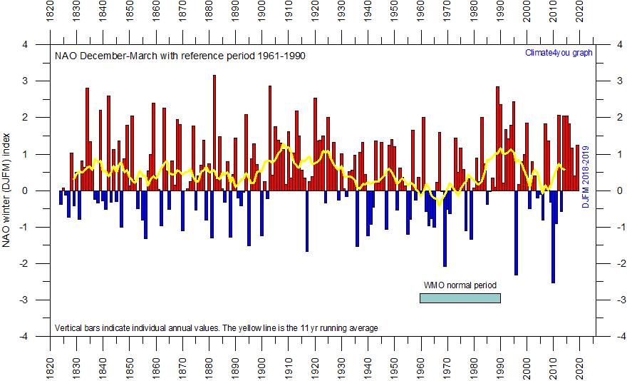
NAO
December-March values since 1824, using
the WMO normal period 1961-1990 as base period (or normal
period). This produces an artificial
dominance of years with positive NAO values. The high NAO values characterizing
the period 1990-2000 is however seen not to be unique when the whole data series
is considered.
-
The December to March NAO average is usually considered a useful winter season (Osborn 2004, 2006), and that this is what is shown in the diagrams above and below.
-
The 1961-1990 period is dominated by low NAO winter values. Using this period as reference period therefore results in unrealistic high average NAO average values for the entire period since 1824. Using the entire 1824-2010 observational period as reference results in a more balanced picture (see diagram below).
-
Click here for downloading NAO data (using 1961-1990 as reference period).
The
North Atlantic Oscillation (NAO) is the dominant pattern of atmospheric
circulation variability in the
In
general terms, NAO is calculated as the difference of normalised surface
pressure between a station close to the subtropical high area, usually
When
the NAO is in its positive phase, the subtropical high-pressure centre is
stronger than usual and the Icelandic low-pressure centre is deeper. The
positive phase is associated with stronger-than-average westerlies across
mid-latitudes, warm and wet winters in
In
certain years both
Much interest has been attached to variations in NAO since 1990, and global climate models have forecasted high, positive NAO values to characterise the 21st century. The NAO index has, however, since 2000 shown an overall falling trend, but with variations. NAO data may be downloaded by clicking here.
The
NAO index is well
suited to illustrate the visual effect of the base period chosen. Typically, the
WMO normal period 1961-1990 is used as base period, and zero is defined at the average of NAO
index values for this period (see figure
above).
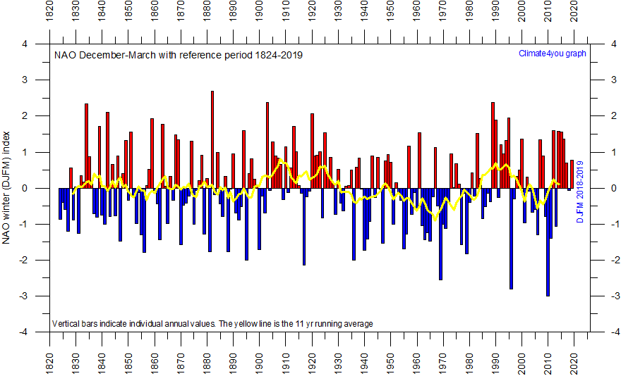
NAO December-March values since 1824, using the longer period 1824-2013 as reference period. This corrected diagram shows a more realistic balance between years with positive and negative NAO values, compared to the diagram above, using only 1961-1990 as reference period. Since 2000 there has been several years with NAO value below the long-term average (1824-2019). Last update: 29 August 2019.
-
The December to March NAO average is usually considered a useful winter season (Osborn 2004, 2006), and that this is what is shown in the two diagrams above and higher up this page.
-
The diagram suggests the existence of a 75-80 yr quasi-periodical variation with peak winter NAO values in the early part of the 20th century and again around 1990-1995.
-
Click here for downloading the original NAO data (using 1961-1990 as reference period).
Click here to jump back to the list of contents.
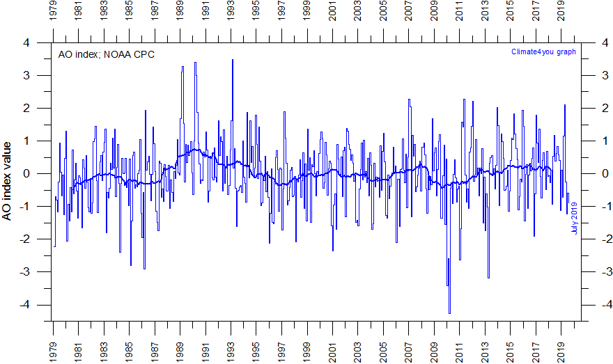
Monthly AO index since January 1979, according data from the National Weather Service Climate Prediction Center. The thin line indicates the monthly values, and the thick line represents the simple running 37 month average, nearly corresponding to a running 3 yr average. Reference period 1979-2000. Last month shown: July 2019. Last diagram update: 30 August 2019.
-
Click here to download the AO data series since 1950 from the National Weather Service Climate Prediction Center.
-
Click here to read about data smoothing.
The Arctic
Oscillation (AO) refers to opposing atmospheric pressure patterns in
northern middle and high latitudes.
The oscillation exhibits a "negative phase" with relatively high pressure over the polar region and low pressure at midlatitudes (about 45 degrees North), and a "positive phase" in which the pattern is reversed. In the positive phase, higher pressure at midlatitudes drives ocean storms farther north, and changes in the circulation pattern bring wetter weather to Alaska, Scotland and Scandinavia, as well as drier conditions to the western United States and the Mediterranean. In the positive phase, frigid winter air does not extend as far into the middle of North America as it would during the negative phase of the oscillation. This keeps much of the United States east of the Rocky Mountains warmer than normal, but leaves Greenland and Newfoundland colder than usual. Weather patterns in the negative phase are in general "opposite" to those of the positive phase.
In general, high AO index values correspond to a strong polar vortex, and low AO values to a weak polar vortex. In the Northern Hemisphere the distribution of land masses at high latitudes gives rise to Rossby waves (see also jet stream map above) which contribute to the weakening or breakdown of the vortex (low AO values). In rare events the Northern Hemisphere polar vortex can shift far south, leading to outbreaks of Arctic air masses. The Antarctic polar vortex in the Southern Hemisphere is more pronounced and persistent than the Arctic polar vortex. See also further explanation below below.
Since 2009, the AO index has decreased for all seasons, but most pronounced during the Northern Hemisphere winter.
The
diagram below shows monthly AO values for the entire length of the Arctic
Oscillation record.
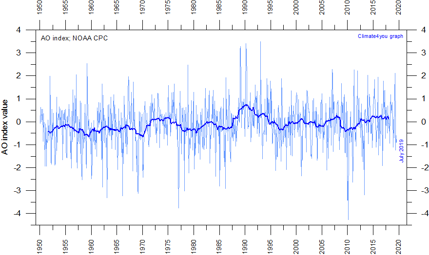
Monthly AO index since January 1950, according data from the National Weather Service Climate Prediction Center. The thin line indicates the monthly values, and the thick line represents the simple running 37 month average, nearly corresponding to a running 3 yr average. Reference period 1979-2000. Last month shown: July 2019. Last diagram update: 30 August 2019.
-
Click here to download the AO data series since 1950 from the National Weather Service Climate Prediction Center.
-
Click here to read about data smoothing.
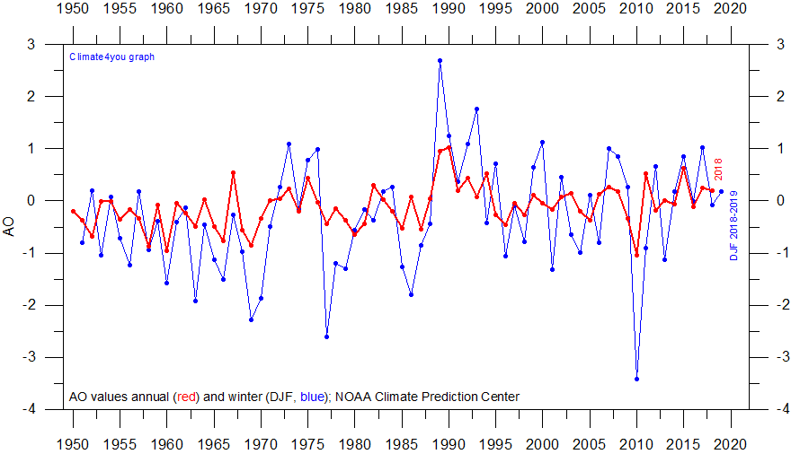
Annual Arctic Oscillation (AO) index values since 1950. Pressure variability for the winter is larger than the annual variability. Following peak values 1988-1093, the AO index have since decreased to values near zero or below. AO data can be downloaded from the NOAA Climate Prediction Center by clicking here. Last update: 30 August 2019.
The Arctic Oscillation (AO) has been recognised by various names for several years, but has become a topic of keen research interest only since 1995. The AO index refers to opposing atmospheric pressure patterns in northern middle and high latitudes (Serreze et al. 1993; Serreze et al. 1995; Serreze and Barry 1998). A band of upper-level winds circulate around the North Pole, forming a vortex. When the vortex increase and the AO index becomes positive, the winds tighten like a noose around the North Pole, locking cold air masses in place near the pole. A weak vortex and a negative AO allow intrusions of cold air masses to plunge southward into North America, Europe and Asia.
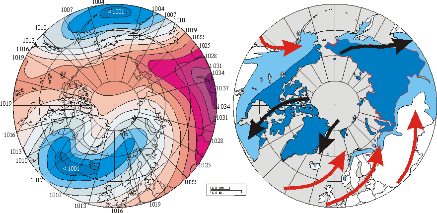
Left diagram shows winter (DJF) sea-level pressure (SLP) averaged over the period 1900-2001. Isobars are spaced every 3 hPa with red colours used for SLP values greater or equal than 1013 hPa and blue colors used for lower values. Numbers at circumference indicate SLP values in hPa. Right diagram shows the modern distribution of permafrost in the Northern Hemisphere. Continuous permafrost is shown by dark blue colour. Discontinuous and sporadic permafrost is shown by light blue color. Red and black arrows show main surface air flow (warm and cold, respectively) as generated by the 20th century pattern of SLP. The overall windsystems set up by the average winter sea-level pressure appears to represent one of several controls on the present distribution of permafrost in the northern hemisphere.
The
Arctic Oscillation thus exhibits a "negative phase" with
relatively high pressure over the polar region and low pressure at midlatitudes
(about 45oN), especially the oceanic mid-latitudes, and a
"positive phase" in which the pattern is reversed. In the positive
phase, higher pressure at midlatitudes drives cyclones farther north toward the
Series of surface atmospheric pressure from the Arctic Ocean is only available from 1950, wherefore the AO index values only is available for a hort period, compared to the NAO index. Updated AO values are shown in the diagram at the top of this section. The red graph in this diagram shows annual values, while the blue graph shows index values calculated for the winter (DJF). The pressure pattern in the northern middle and high latitudes is clearly seen to be much more variable during winter than on an annual basis.
AO data may be downloaded from the Goddard Space Flight Center by clicking here.
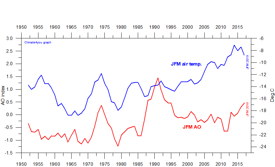
5yr running average AO index values calculated for January-March (reference period 1961-1990), compared to 5yr running January-March surface air temperature in Svalbard (Longyearbyen), since 1950. A certain degree of covariance is visible between the AO index value and Svalbard air temperature. In general, high AO values (JFM) tend to correspond to high JFM air temperature in Svalbard, and vice versa, especially between 1960 and 1995. After 1995 the relation seems to have changed. Last update: 30 August 2019.
In the above diagram there is clearly not a perfect match between the different graphs. This demonstrates that also other factors are important for winter temperatures in Svalbard, especially in the beginning and at the end of the period shown above. One candidate for explaining the divergence of the Svalbard JFM air temperature graph since 2005 (and perhaps around 1955-58) may be a reduced amount of sea ice near the official Svalbard meteorological station. Click here to read more about this.
Click here to jump back to the list of contents.
Southern Oscillation Index (SOI)
Southern Oscillation Index (SOI) since 1950 according to Climatic Research Unit (CRU), UK. The Southern Oscillation Index (SOI) is defined as the normalized pressure difference between Tahiti and Darwin. The thin line represents the monthly values, while the thick line is the simple running 37 month average, nearly corresponding to a running 3 yr average. Last month shown: July 2023. Last diagram update: 5 February 2024.
-
Click here to download the entire series of CRU monthly SOI-values since January 1866.
-
Click here to read about data smoothing
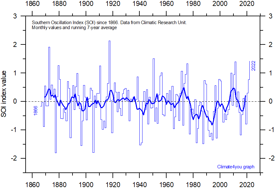
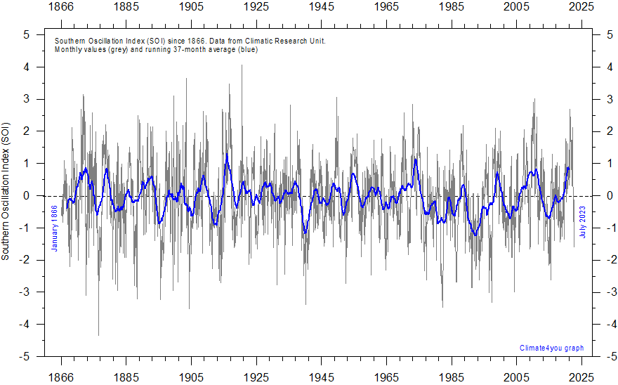
Southern Oscillation Index (SOI) since 1866 according to Climatic Research Unit (CRU), UK. The Southern Oscillation Index (SOI) is defined as the normalized pressure difference between Tahiti and Darwin. The thin line represents the annual values, while the thick line is the simple running 5-year average. Last year shown: 2022. Last diagram update: 5 February 2024.
-
Click here to download the entire series of CRU monthly SOI-values since January 1866.
-
Click here to read about data smoothing
Sustained negative values of the SOI often indicate El Niño episodes. These negative values are usually accompanied by sustained warming of the central and eastern tropical Pacific Ocean, a decrease in the strength of the Pacific Trade Winds, and a reduction in rainfall over eastern and northern Australia.
Positive values of the SOI are associated with stronger Pacific trade winds and higher sea surface temperatures to the north of Australia, popularly known as a La Niña episode. Waters in the central and eastern tropical Pacific Ocean become cooler during this time. Eastern and northern Australia usually receive increased precipitation during such periods.
Click here to jump back to the list of contents.
Wind at Lista Lighthouse, South Norway
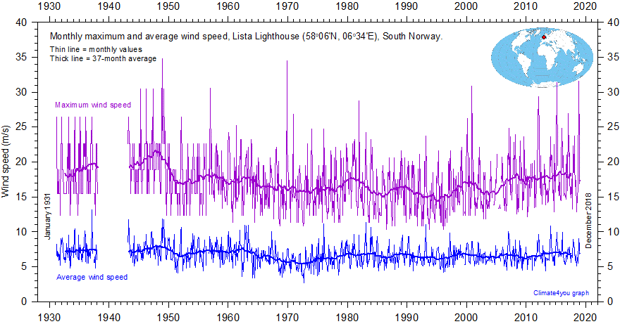
Monthly maximum and average wind speed since January 1931 measured at Lista Lighthouse, South Norway. Lista Lighthouse is on an exposed cape located at the extreme southwestern edge of mainland Norway, in a position to register wind conditions in the adjoining North See and the European sector of the North Atlantic.
-
Click here to download the Lista Lighthouse observations since January 1931. You will have to register, but the service is free.
Click here to jump back to the list of contents.