Precipitation in Polar regions: Arctic and adjoining regions
-
Arctic warm season (May-October) precipitation average 1901-2000
-
Arctic cold season (November-April) precipitation average 1901-2000
-
Arctic precipitation and temperature change during the 20th century
Open Climate4you homepage
The
two
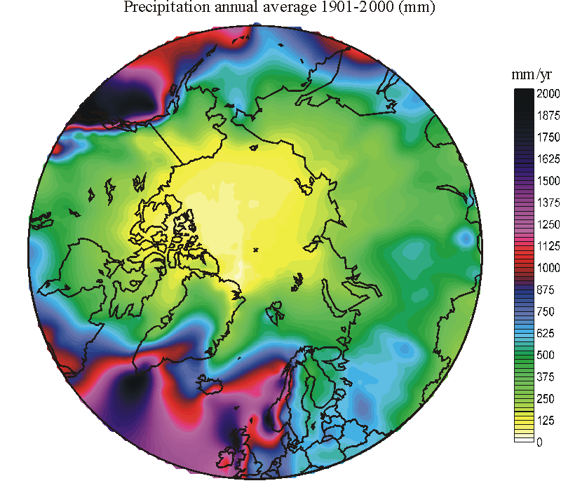
Distribution of the average annual 20th century precipitation north of 50oN, in mm w.e. (water equivalent). The observation network is thin especially within the Arctic Ocean, and details of individual contour lines may well represent artifacts of interpolation, only. The general aridity (low precipitation) of this area, however, is correct. In general, the annual precipitation is high over oceans and over the windward part of adjoining continents. The importance of high ground (e.g. Rocky Mountains, southern Greenland, Scotland and Norway) for generating orographic precipitation is also clear from this map.
The distribution of precipitation in the Arctic represents a complex problem, subject of long-standing debate and compounded by the paucity of meteorological stations. While air temperatures today are registered at Arctic meteorological stations with relative small technical difficulties, except for sites with icing conditions, precipitation is considerably more complicated to measure correctly, especially when in solid form. Many Arctic meteorological stations have simply avoided measuring precipitation due to severe problems by doing so. In addition, little is known about the local and regional effect of altitude and topography on precipitation. Also the local and regional importance of redistribution of snow by wind is usually virtually unknown (Humlum 1987; Humlum 2002; Humlum et al. 2003; Nordli and Kohler 2003). Finally, much of the information that does exist on precipitation within the Arctic tends to be widely scattered in the scientific literature and is often viewed only in the context of a particular local problem, with little emphasis on the regional amount of precipitation (Humlum 2002). In addition, high-latitude trends in measured precipitation are influenced by gauge under catch. At a meteorological station exposed to warming, the fraction of annual precipitation falling as snow diminishes, and vice versa. As the gauge under catch is substantially larger for solid than for liquid precipitation, this implies that a fraction of any observed positive precipitation trend is fictitious, caused by reduced under catch in the precipitation gauges (Førland and Hanssen-Bauer 2000).
Notwithstanding
all these limitations, the existing
meteorological records of precipitation still provide the mean to test the association
between air temperature and precipitation back in time. At the bottom of this
page a series of diagrams show how precipitation and air temperatures have
varied during the 20th century in regions north of 50oN. First,
however, it is useful to see how the average 20th century precipitation has been
distributed according to the existing meteorological records. This is illustrated by the three diagrams below.
Click here to jump back to the list of contents.
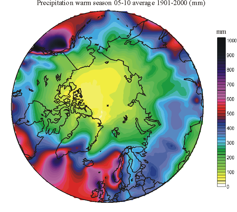
Distribution of the average
May-October 20th century precipitation north of 50oN, in mm w.e.
(water equivalent). The observation network is thin especially within the
Click here to jump back to the list of contents.
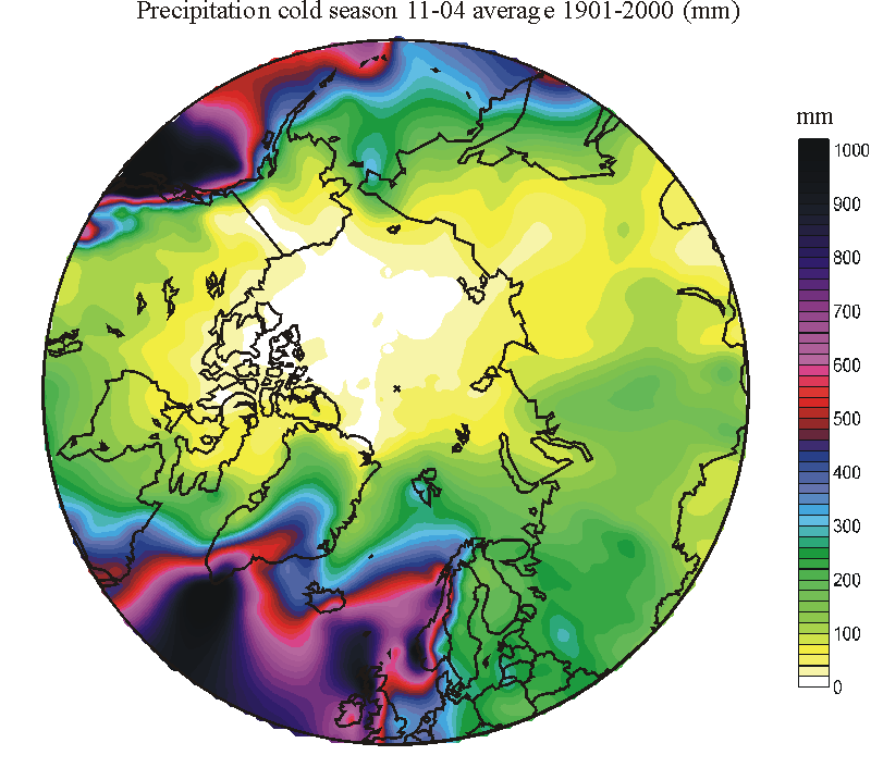
Distribution of the average
November-April 20th century precipitation north of 50oN, in mm w.e.
(water equivalent). The observation network is thin especially within the
Click here to jump back to the list of contents.
The
general problem of reliable records on Arctic precipitation has implications for
our knowledge on the duration and thickness of the seasonal snow cover,
significant for the ground thermal regime (Ballantyne
1978; Humlum et al. 2003). Snow plays a
key role in protecting plants and animals from cold dry winter conditions. It is
also important for the seasonal water cycle. Variations in the snow cover may
therefore have profound impact on biological activity and landforming geomorphic
activity in the
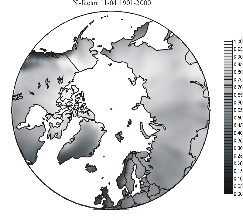
Average 20th century insulation factor (N-factor) November-April. The N-factor expresses how well the snow cover is able to protect the ground from the penetration of low air temperatures. The maximum value of 1 indicate that there is no protection at all, while the minimum value of zero indicate maximum insulation. As an example, all other things being equal, the map shows that permafrost will more easily form in the dry parts of Siberia and Alaska, compared to the mountains in Iceland and Norway, where cold season precipitation is high.
Click here to jump back to the list of contents.
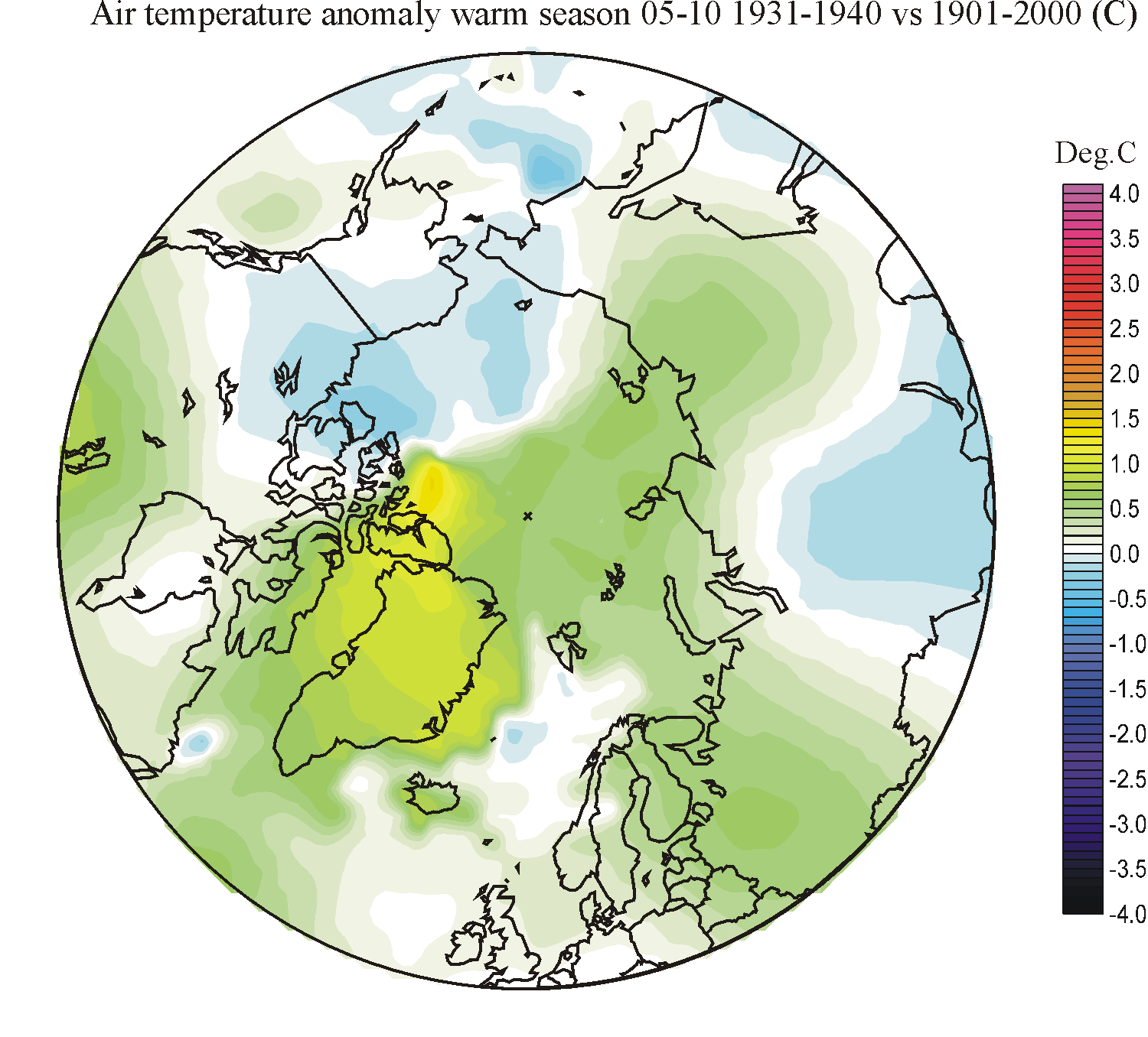
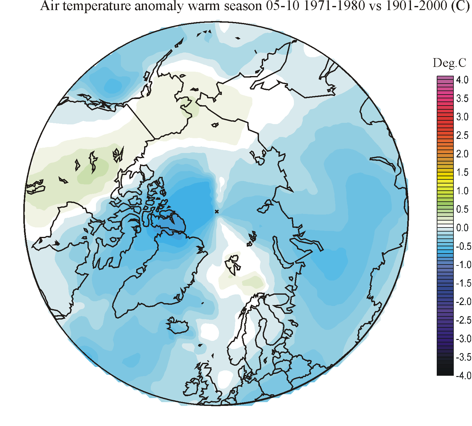
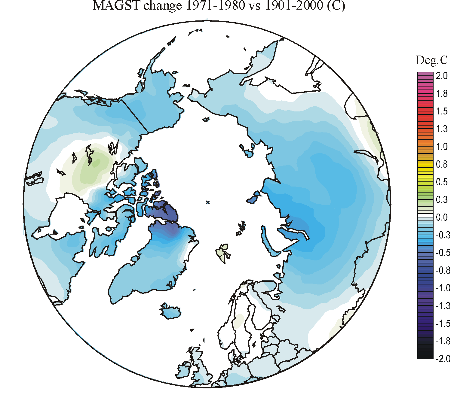
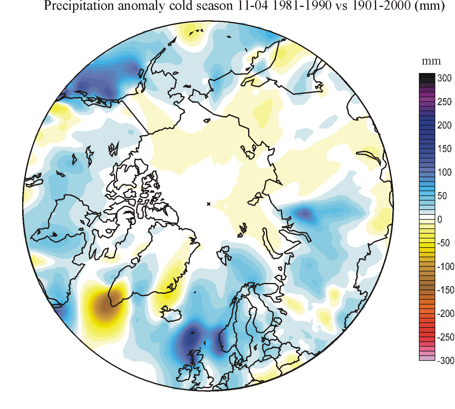
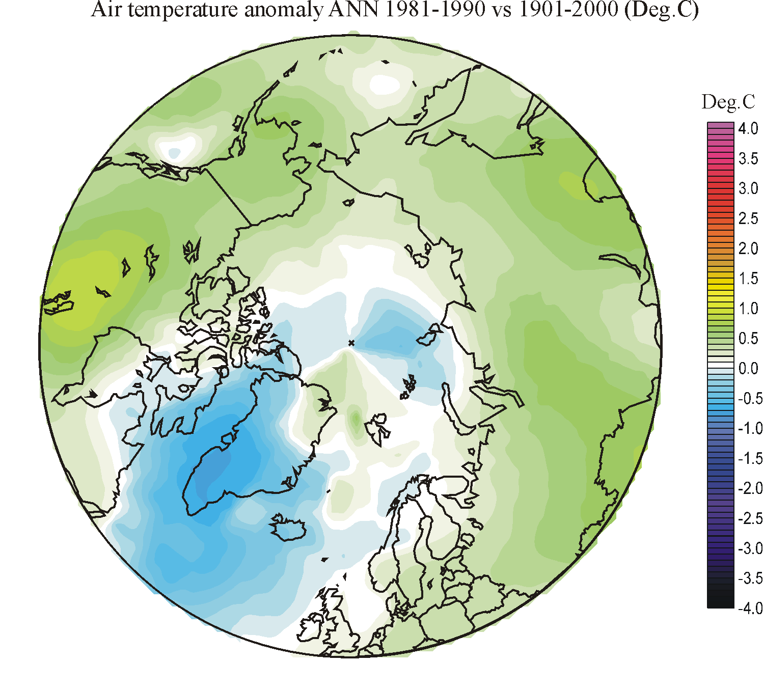
Arctic precipitation and temperature change during the 20th century
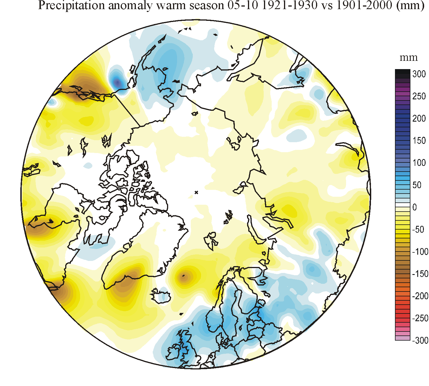
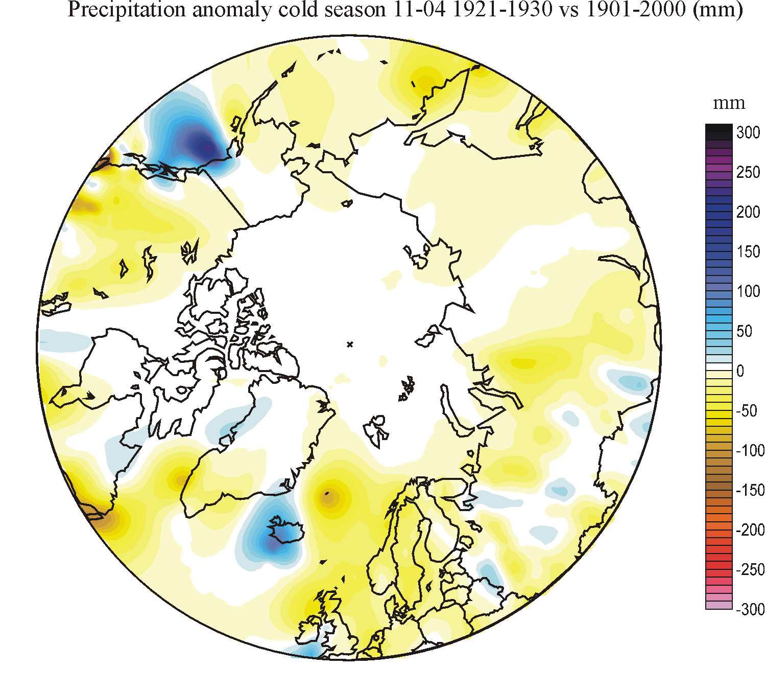
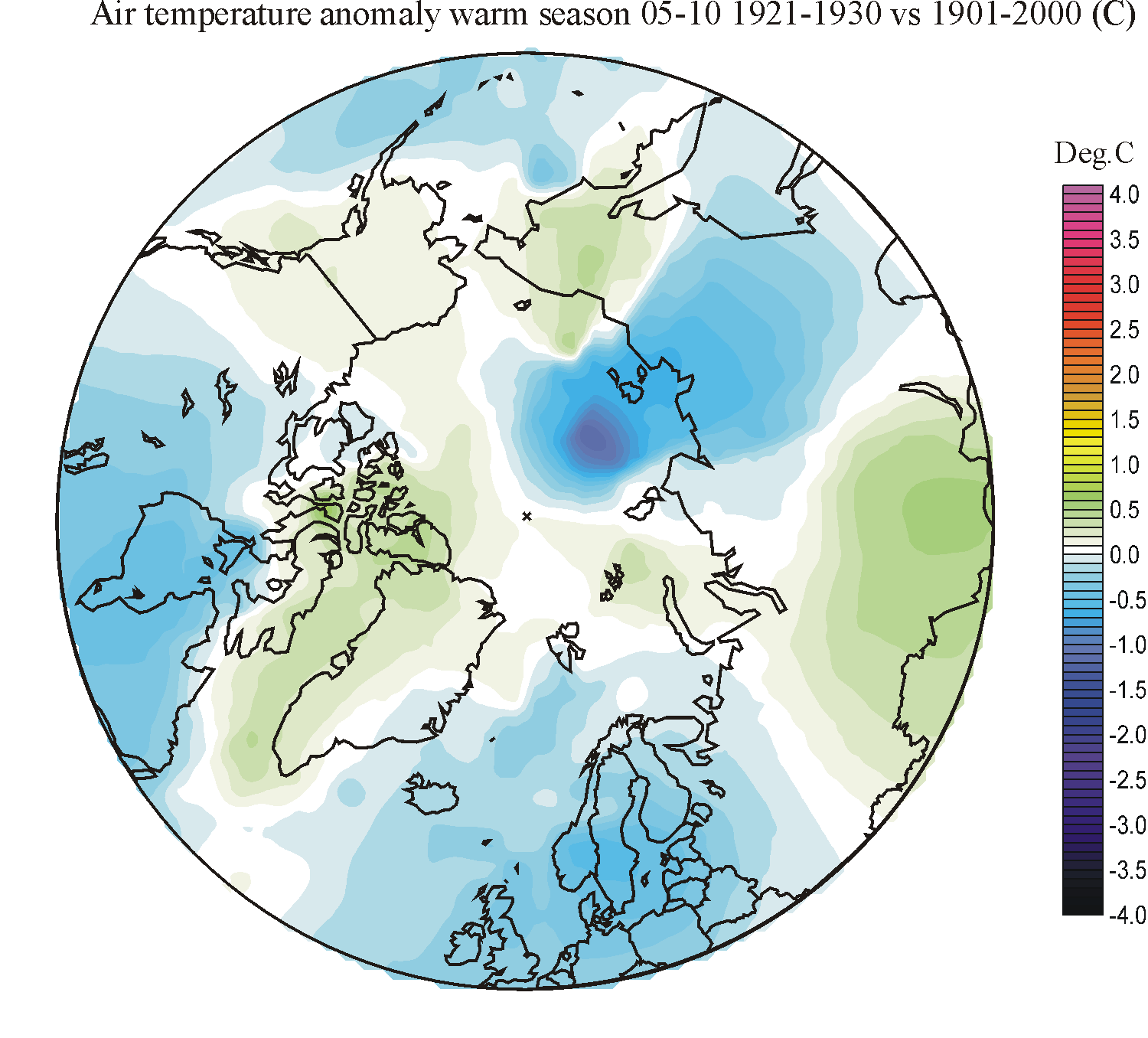
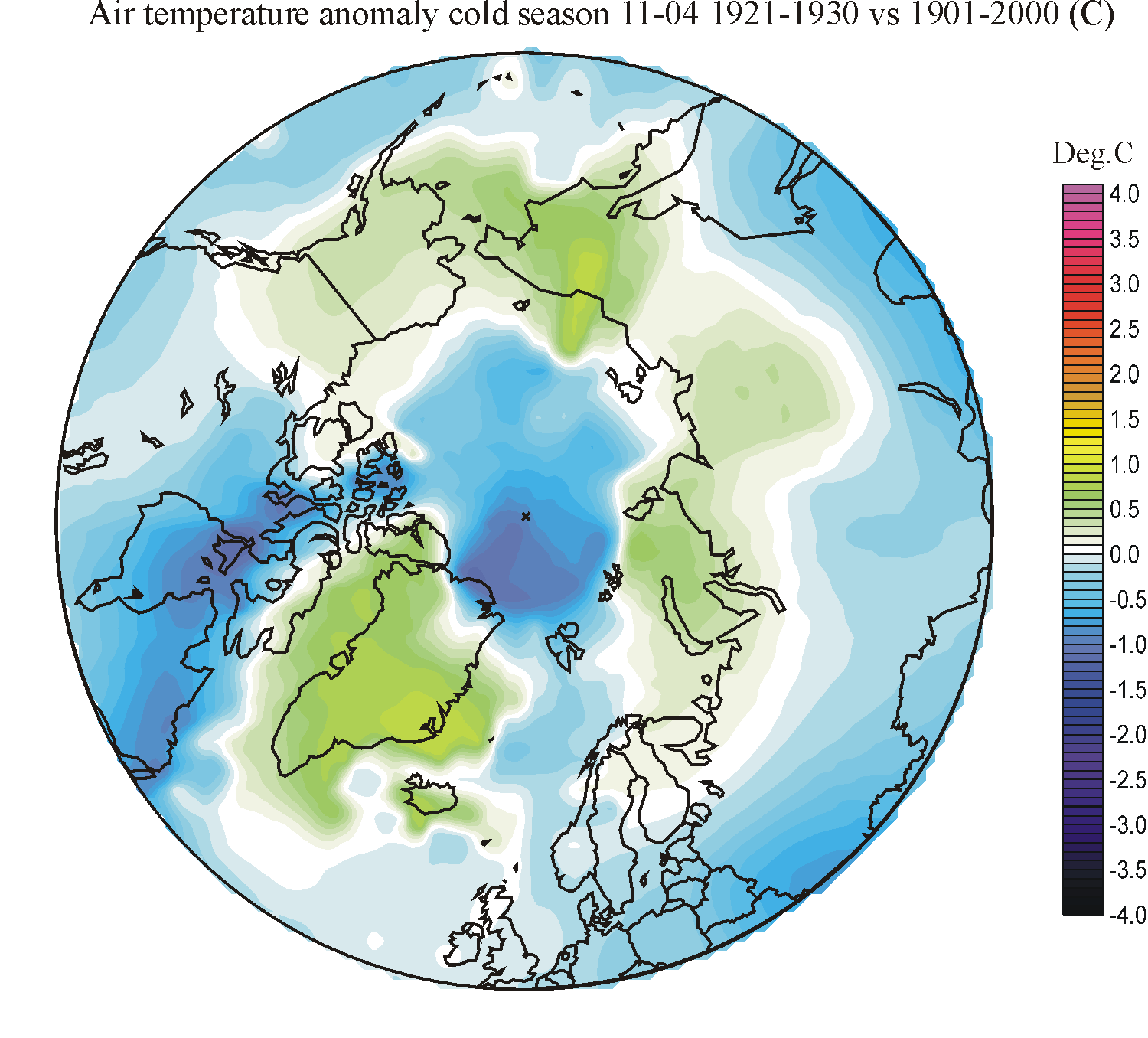
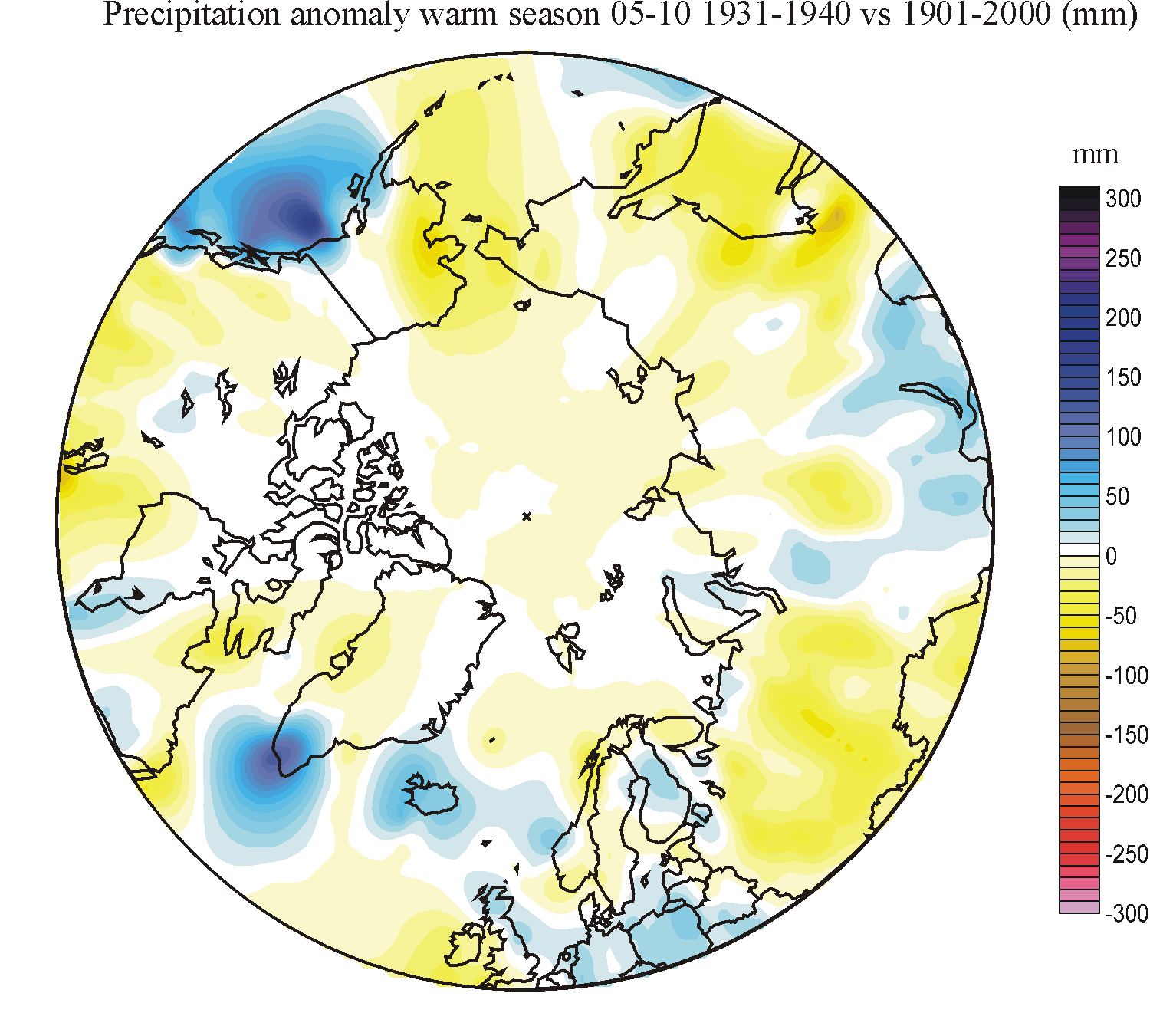
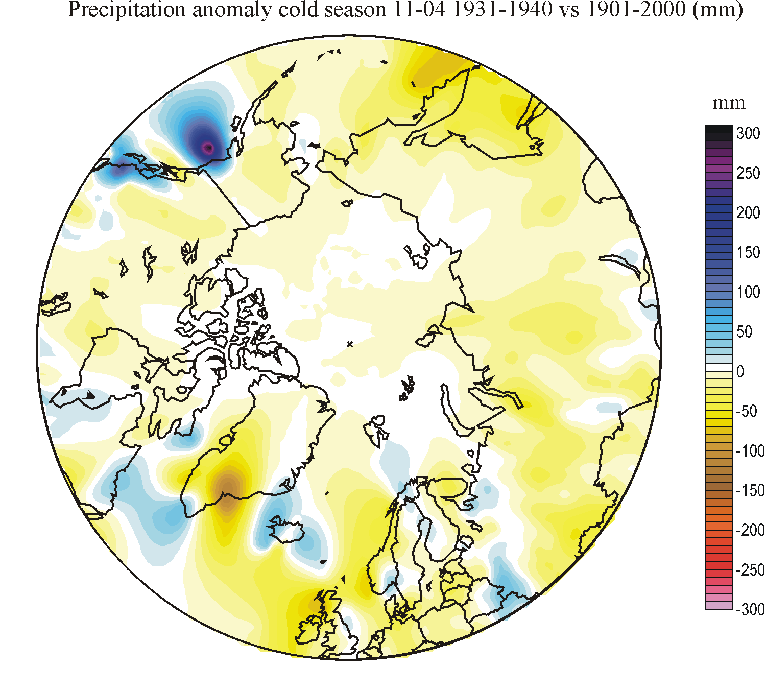
In
the table below the decadal situation as to precipitation is compared to the
average conditions for the whole 20th century, as shown in the diagrams above.
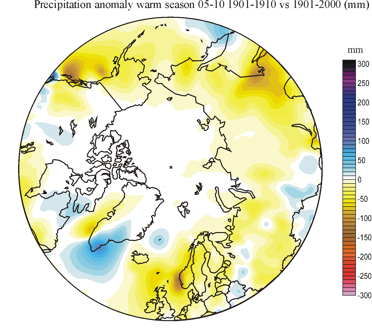
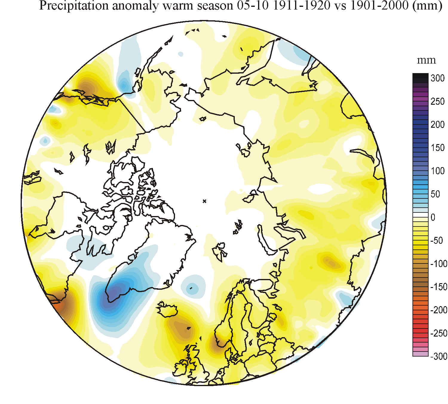
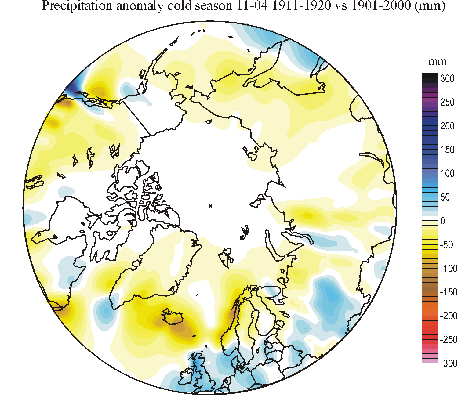
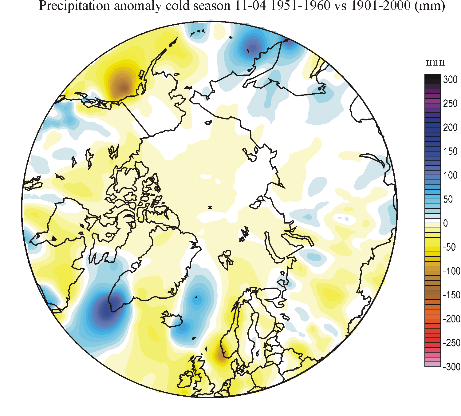
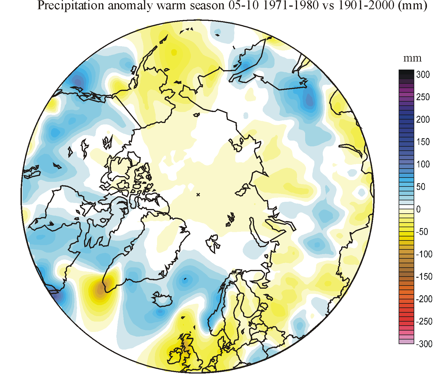
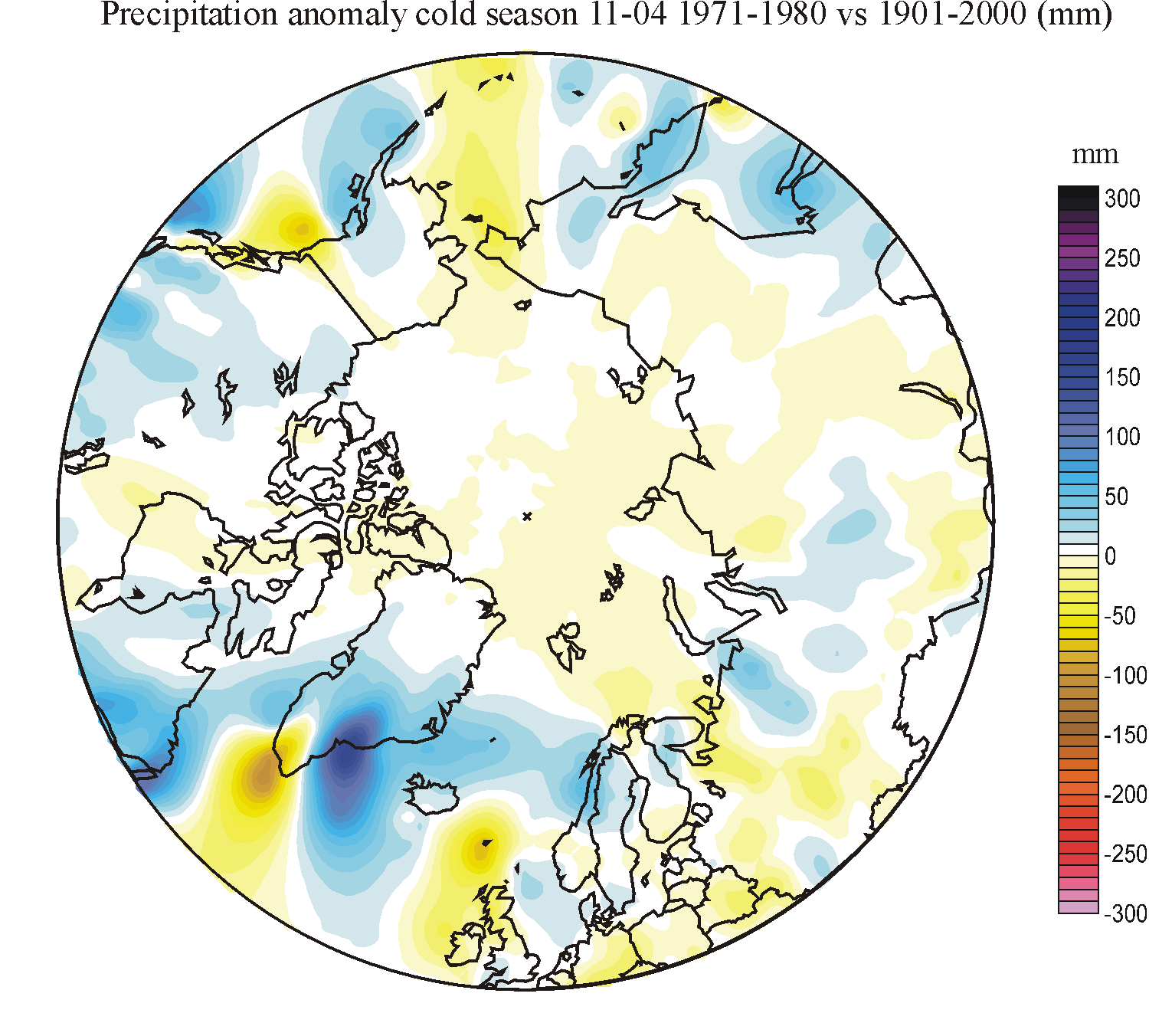
Click on one of the small maps, and a new window with a larger map will open,
showing areas north of 50oN in polar projection. In the precipitation
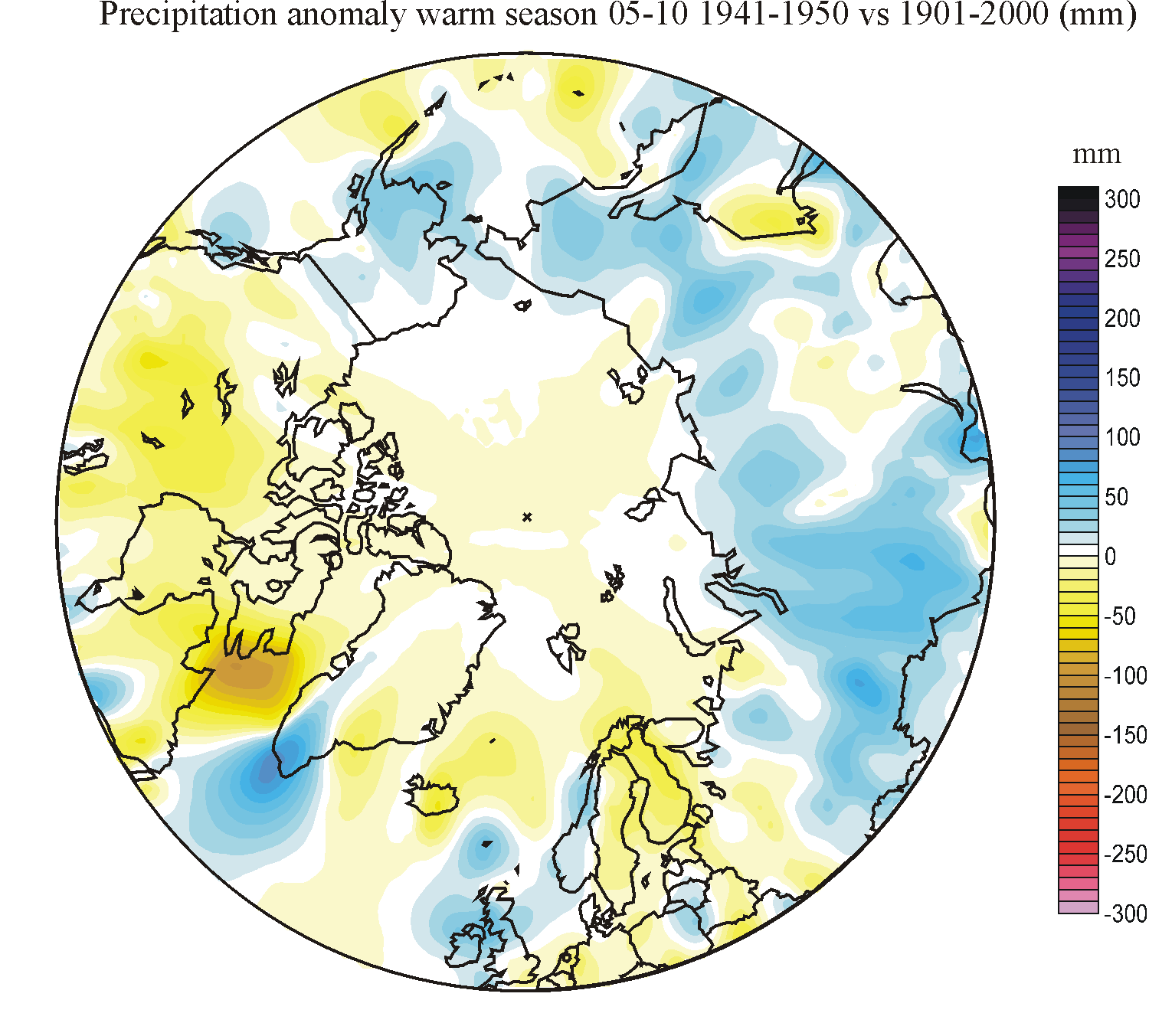
diagrams (column 2-4) yellow-red colours indicate less precipitation than the
20th century average, while blue colours indicate higher precipitation than the
average. It should be realised, that especially for the cold season, when most
precipitation falls in the form of snow, precipitation records may underestimate
the real amount of precipitation due to undercatch by precipitation gauges.
Measuring solid precipitation correctly is still a major problem, and it is very
likely that the real amount of winter precipitation is higher than shown in the
diagrams below.
To
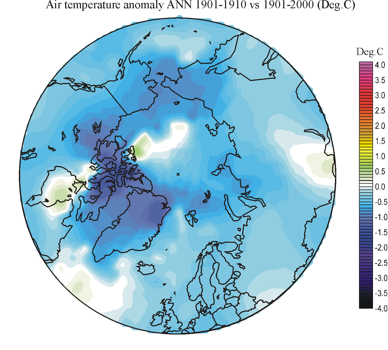
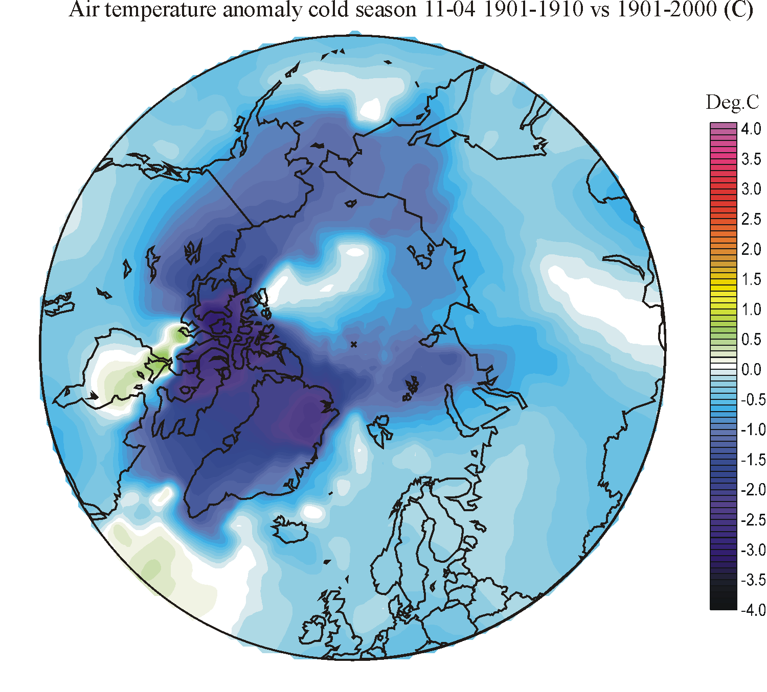
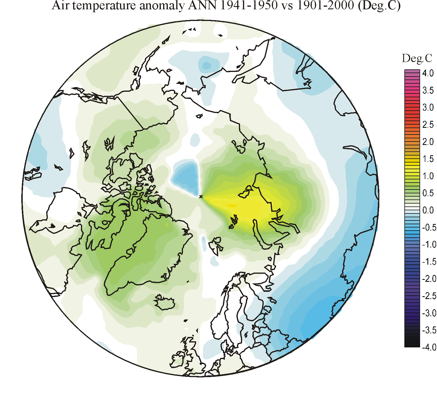
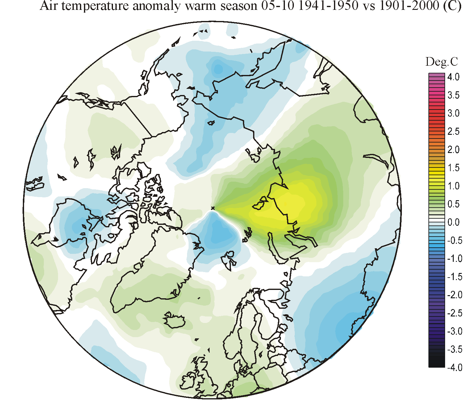
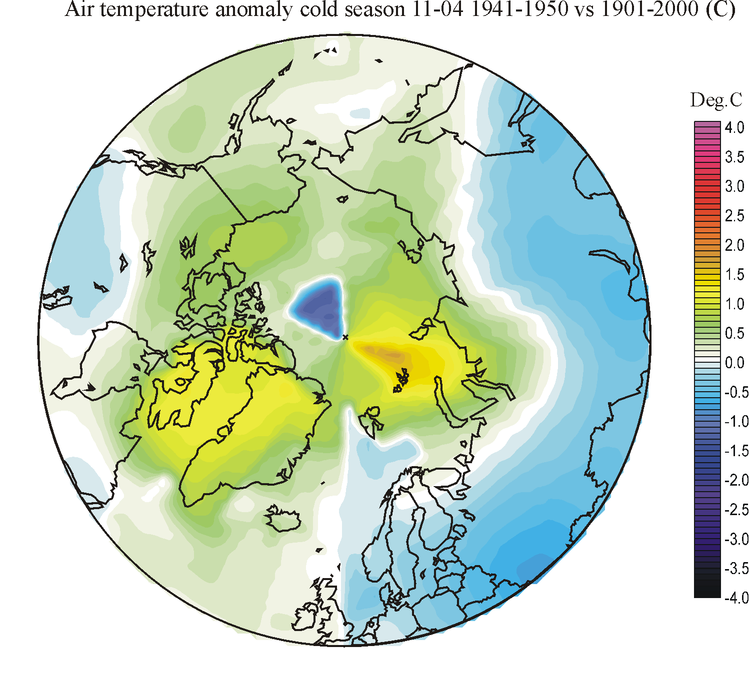
analyse the association between changing air temperatures and precipitation maps
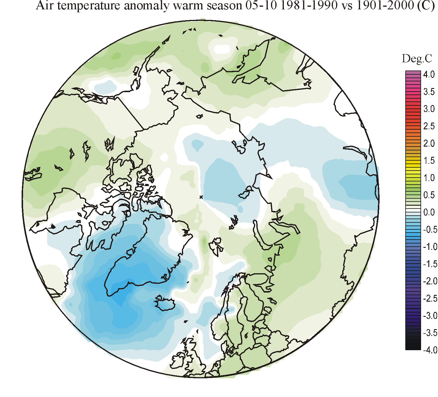
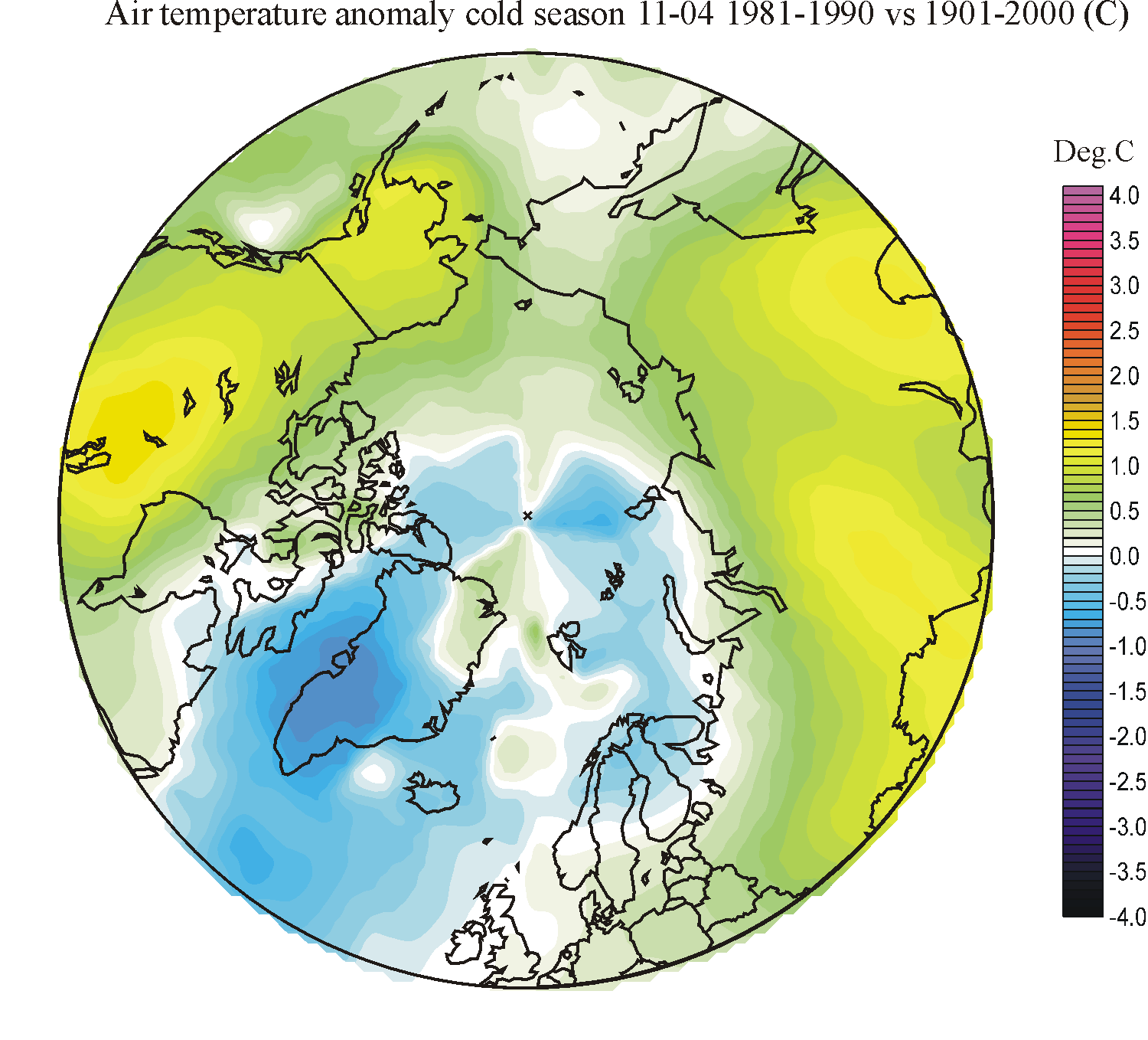
showing the decadal temperature changes are also available (column 5-7), again
compared to the average 20th century conditions. Warm colours indicates areas
with higher temperature during the decade considered than the 20th century
average, while blue colours indicate lower than average temperatures
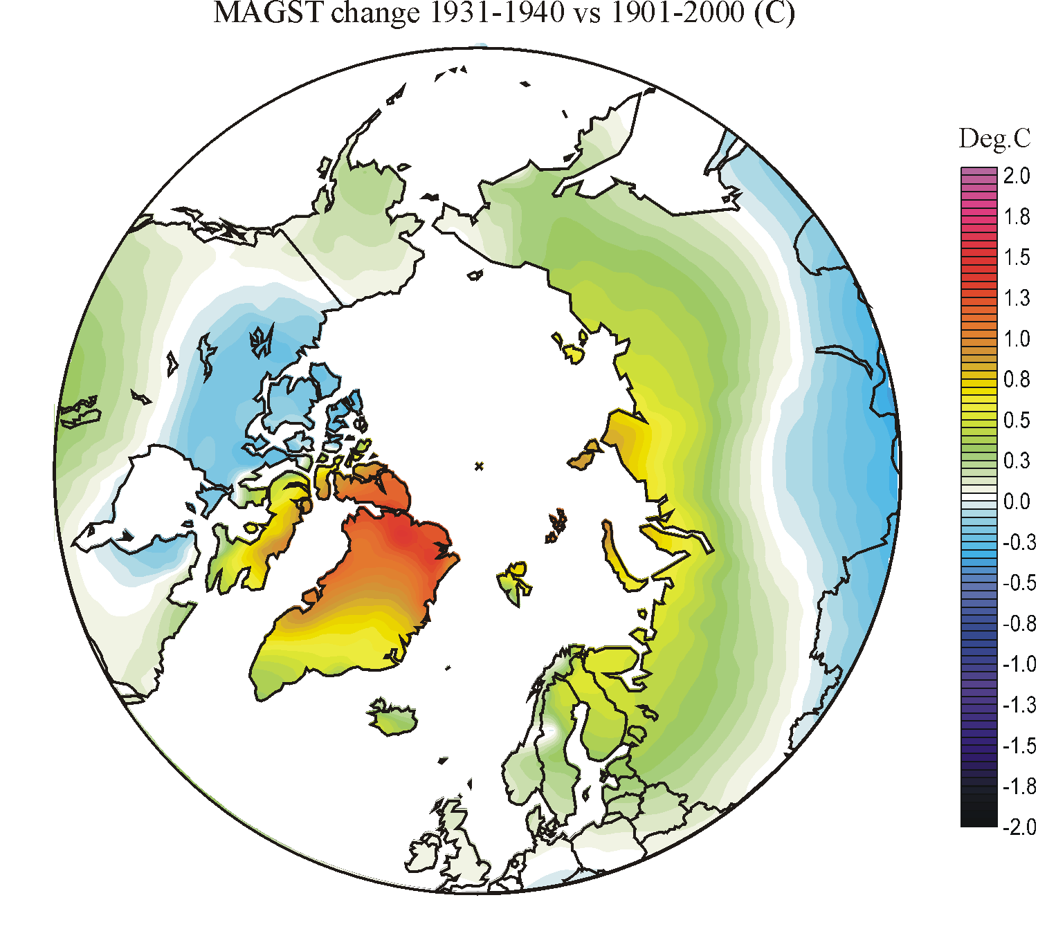
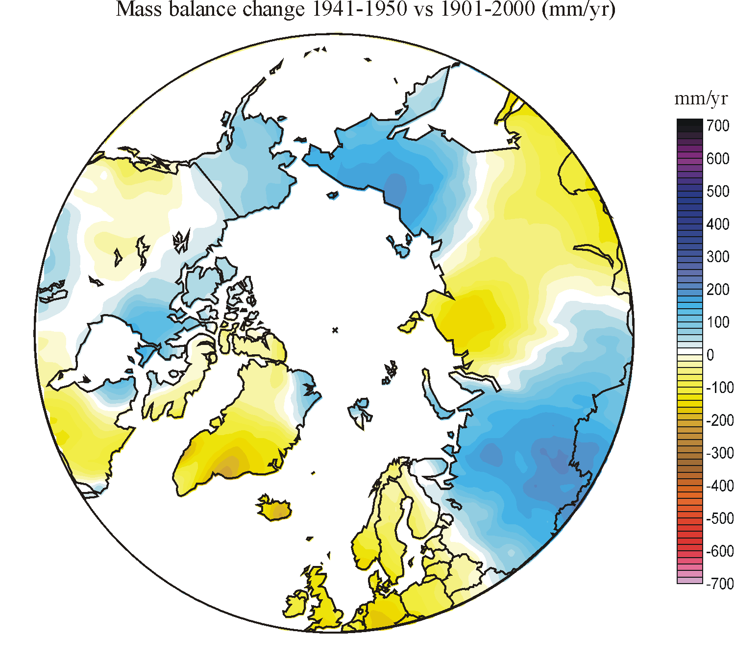
The
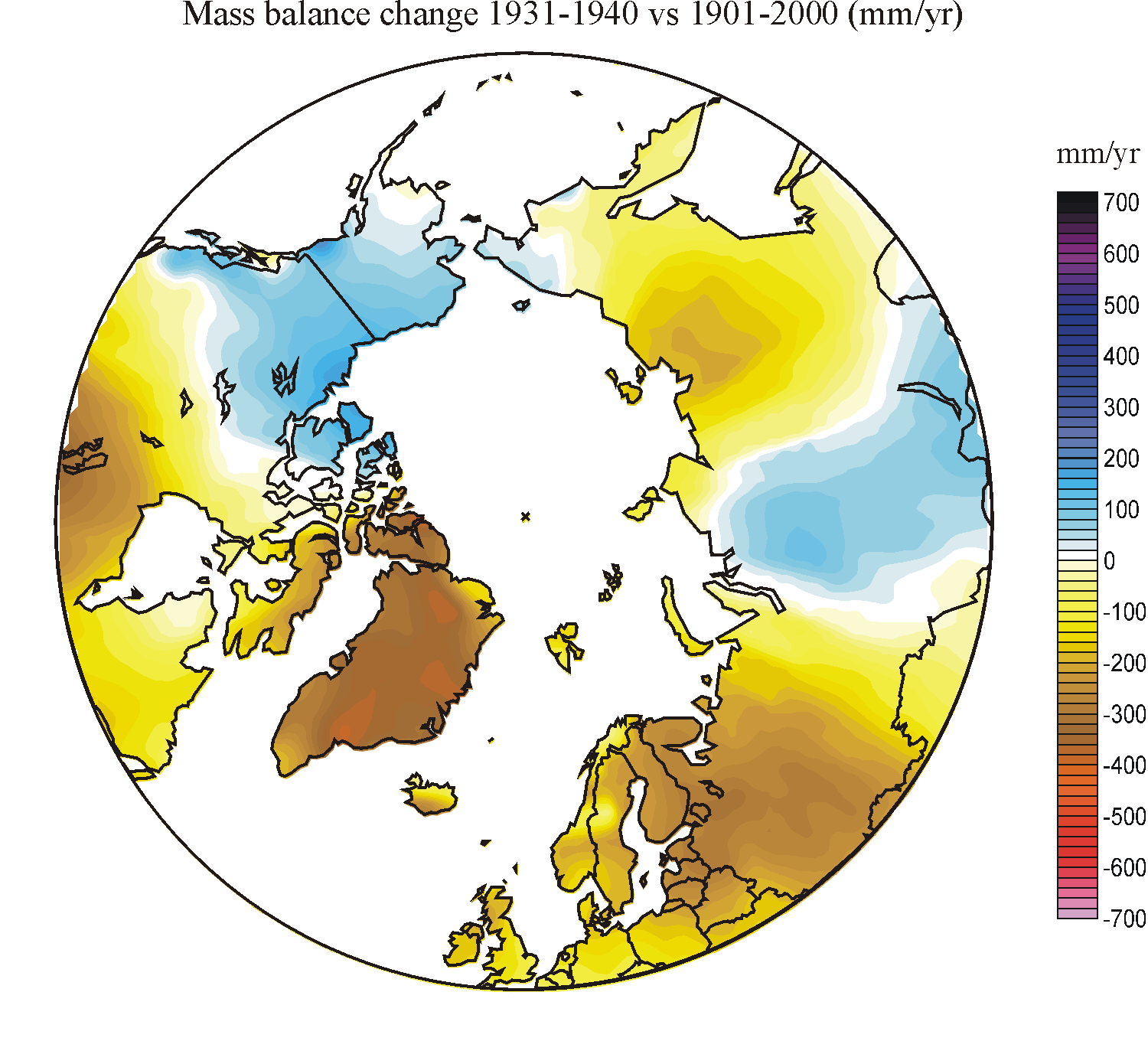
two rightmost columns show the calculated large-scale effects on ground
temperatures and net accumulation of snow (~ glacier mass balance). These
diagrams, however, ignore all small-scale effects derived from, e.g.,
topographic lee and shading, and should not be over-interpreted.
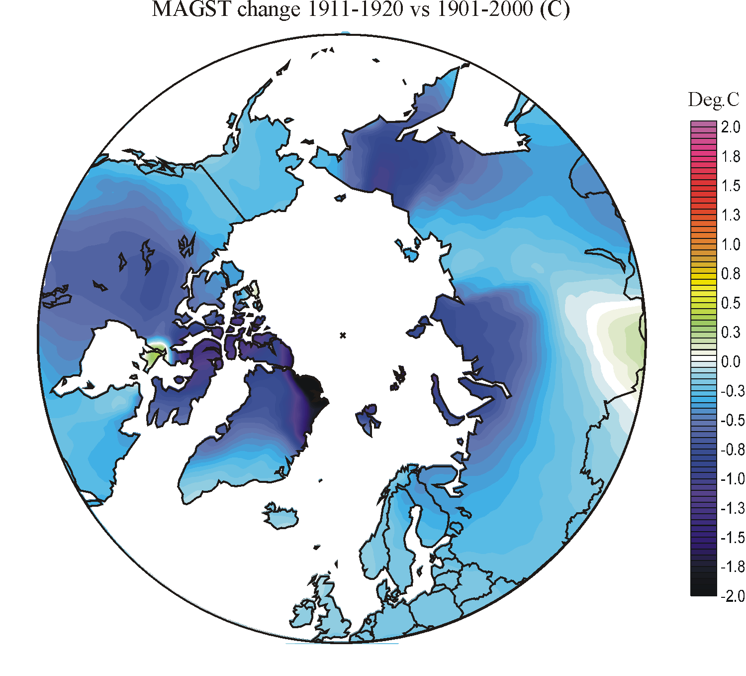
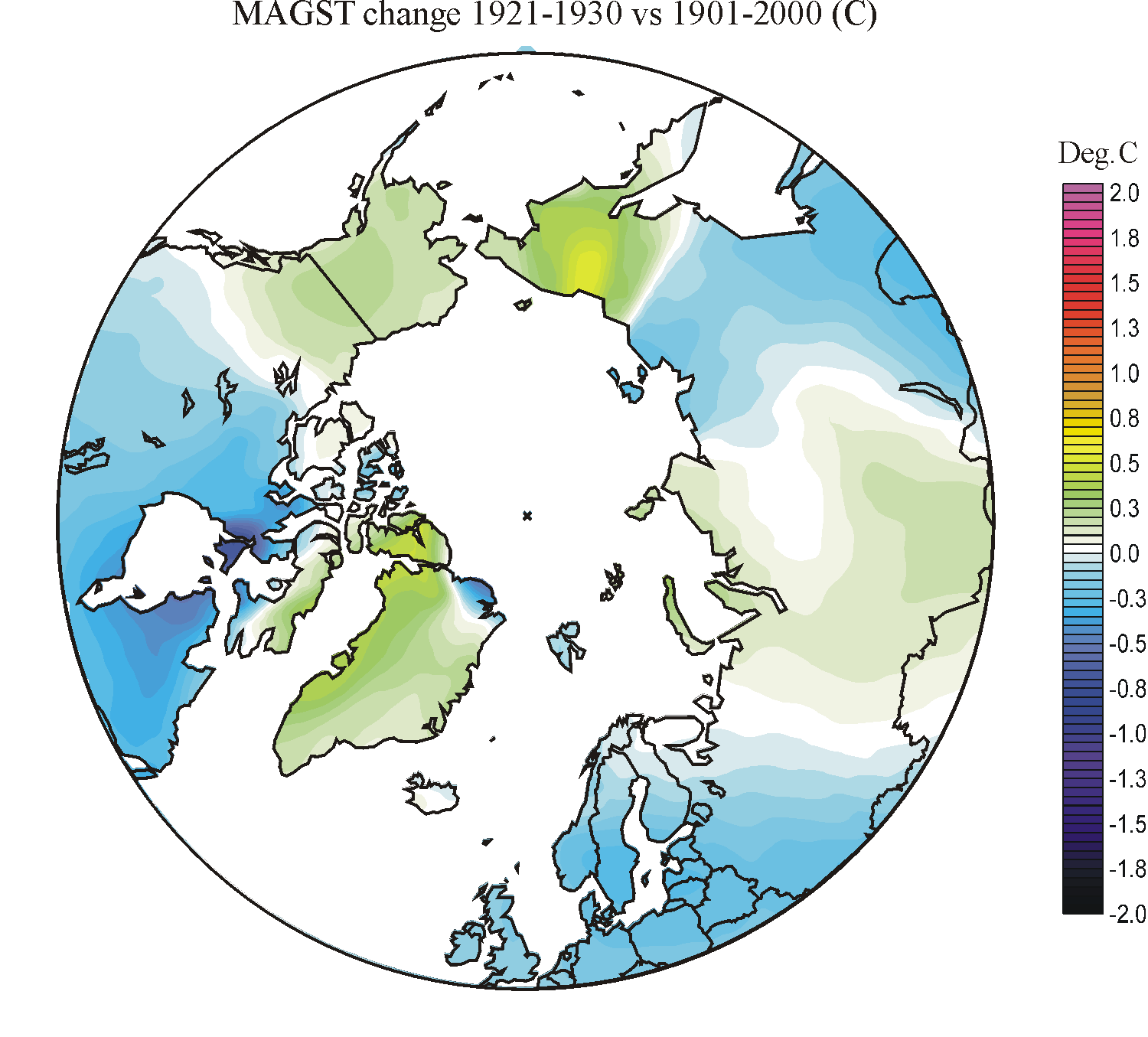
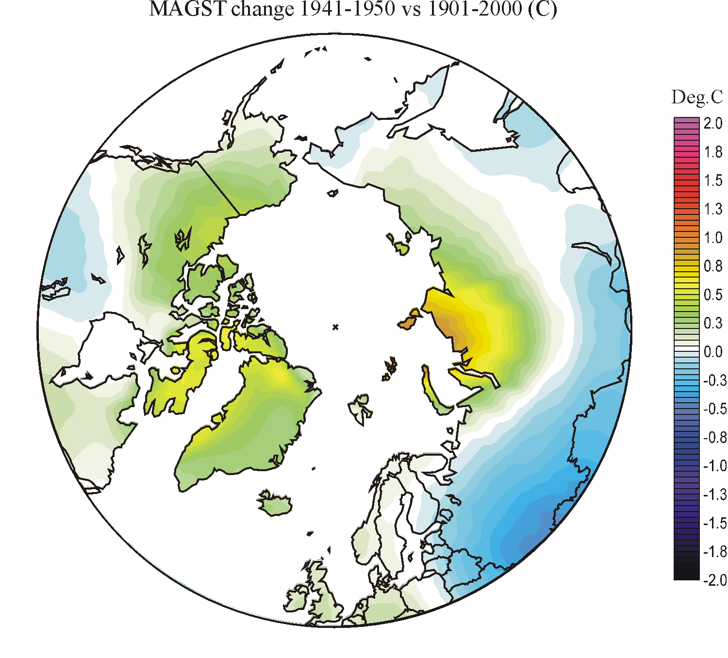
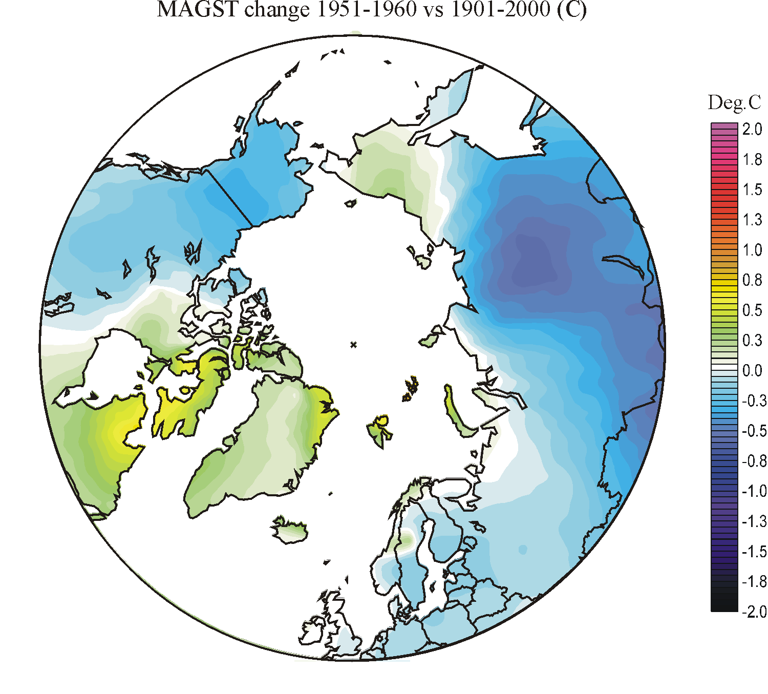
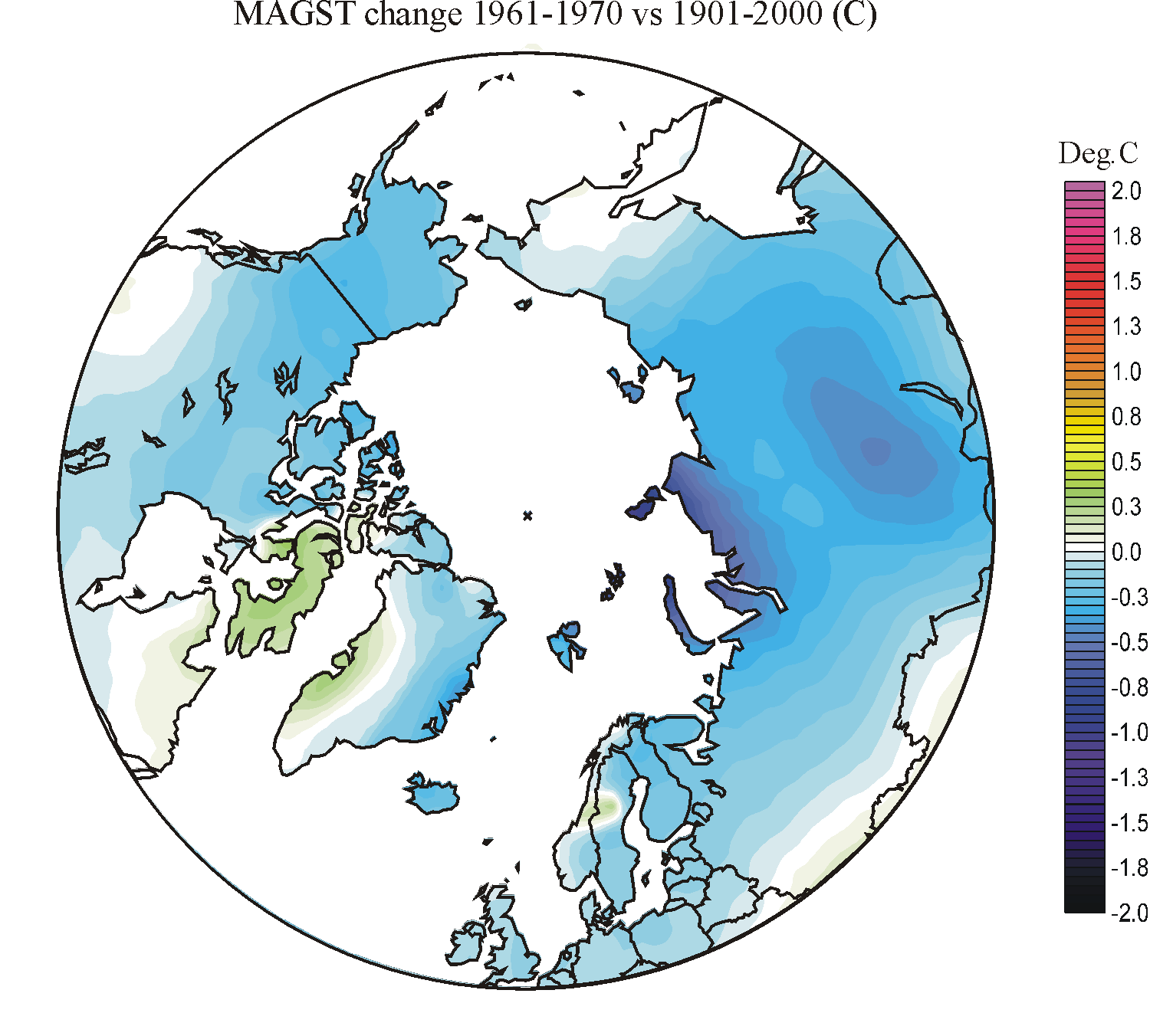
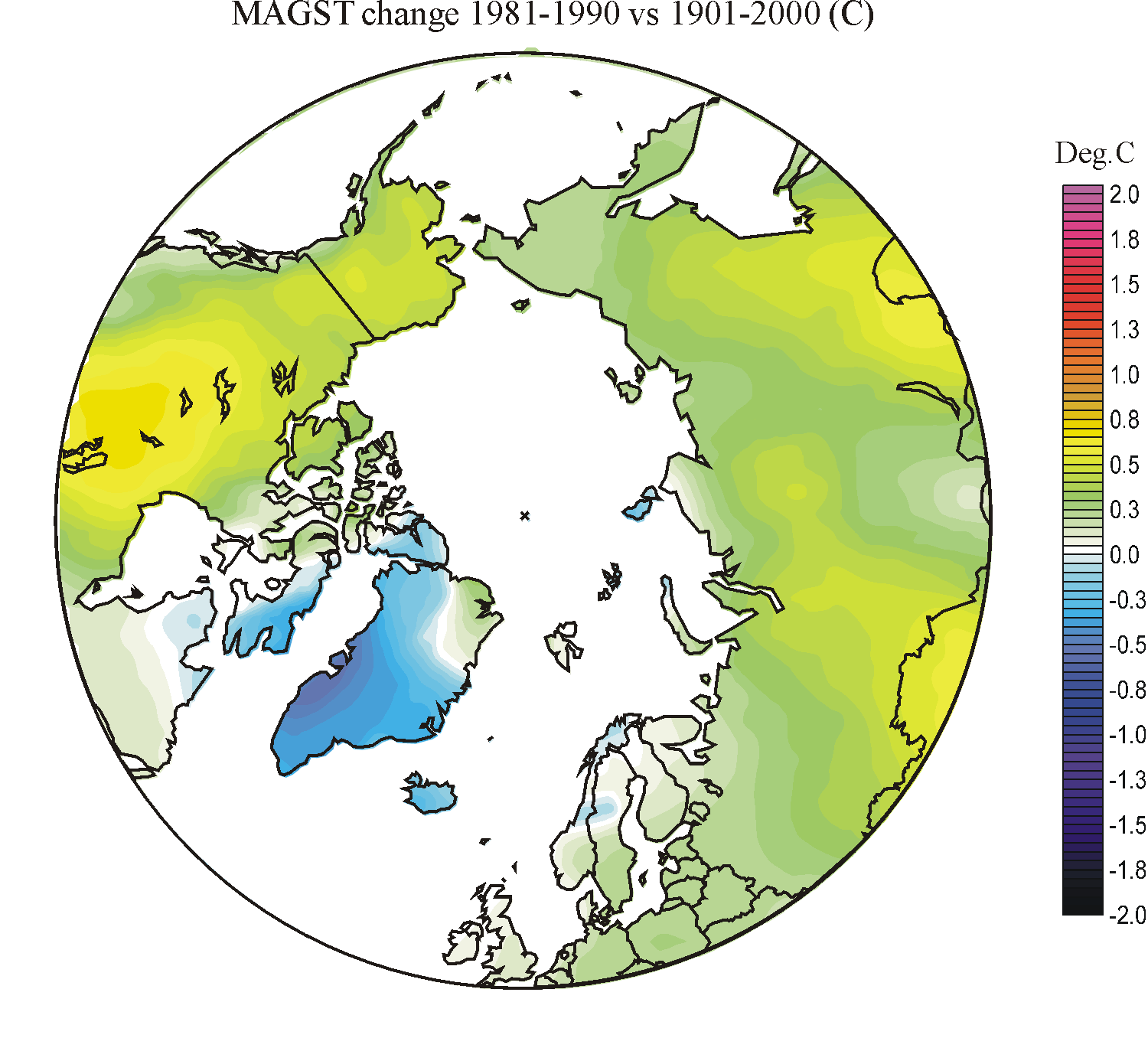
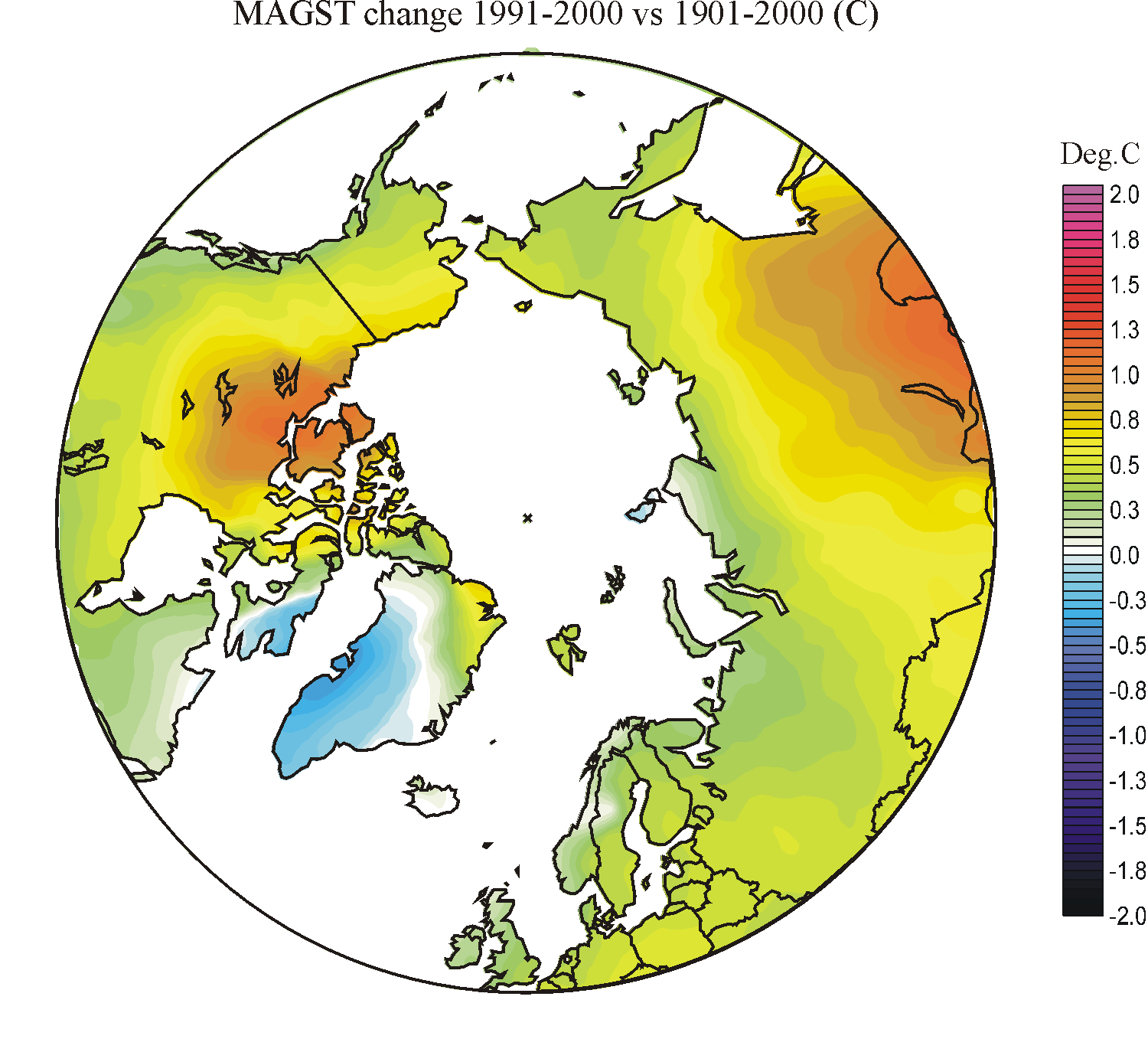
In
the ground temperature diagram MAGST is short for mean annual ground surface
temperature
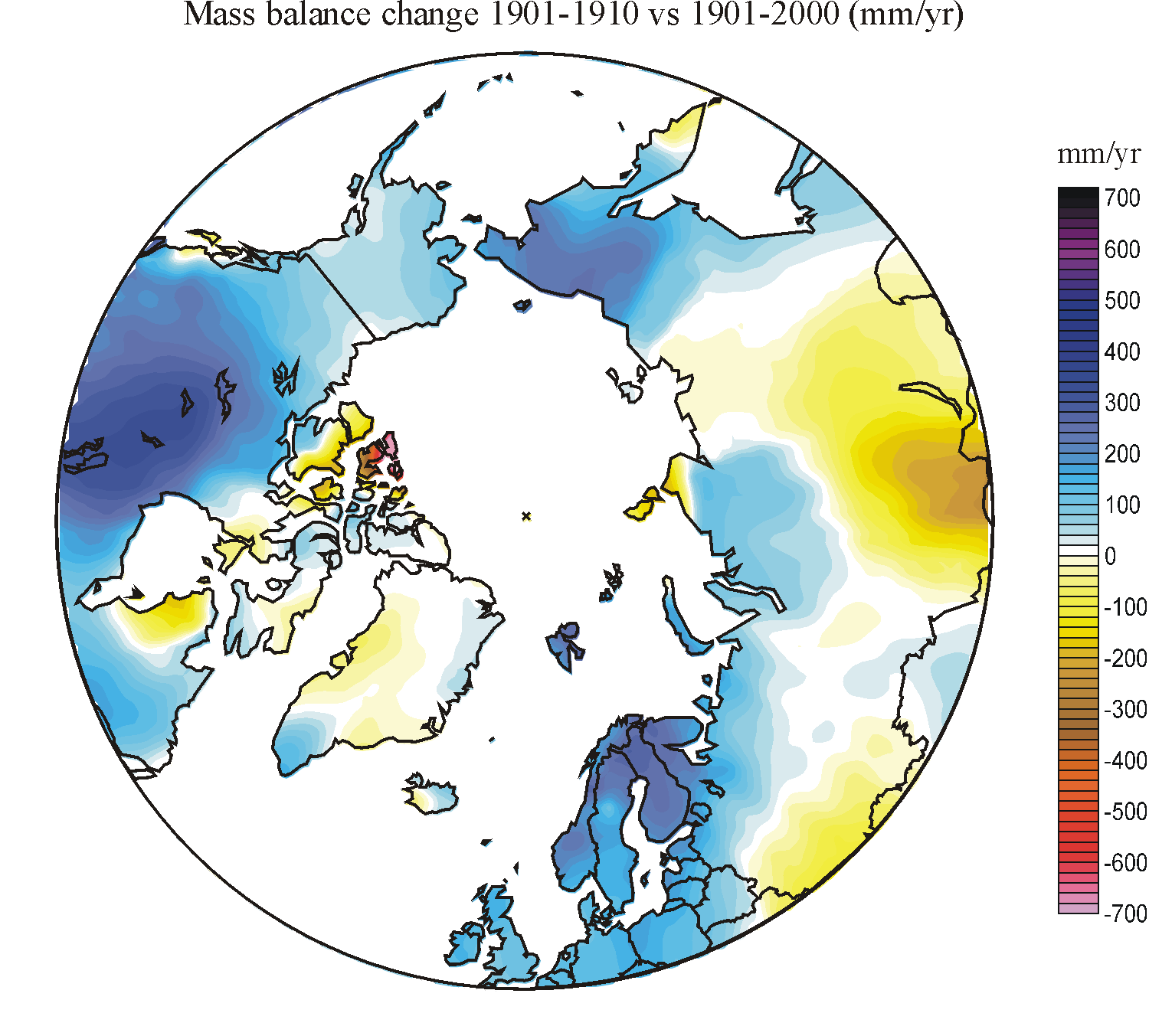
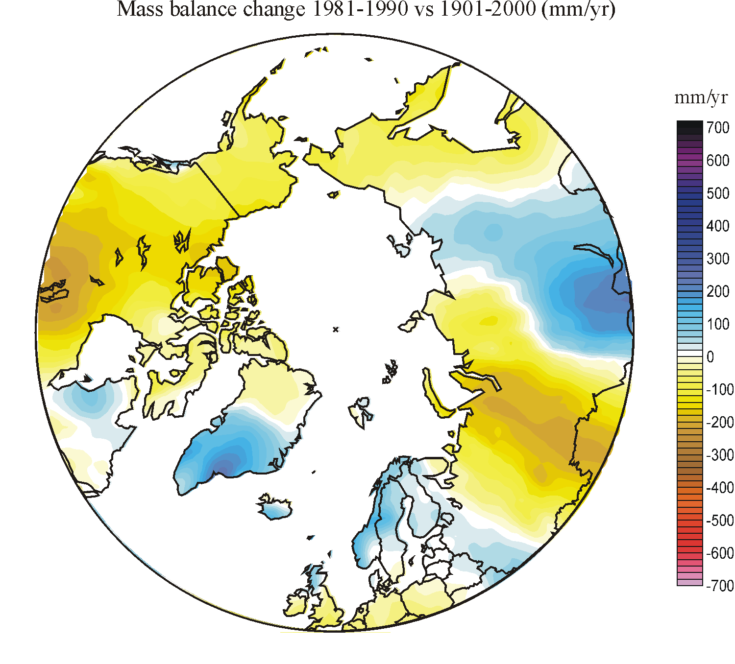
In
the snow mass balance diagram warm colours indicate areas where seasonal snow
will tend to disappear early in the year during the decade considered, compared to average 20th century conditions. Blue colours
indicate areas where the seasonal snow cover will disappear later in the year than average 20th century conditions. For areas
with glaciers, these two criterions correspond to below-average and
above-average glacier mass balance compared to average 20th century conditions,
respectively. The snow mass balance change is calculated by considering the
corresponding changes in cold season precipitation and warm season air
temperatures. Higher cold season precipitation (snow) will tend to improve the
overall annual mass balance, while higher warm season air temperatures will lead
to increased melting of snow and ice, and thereby have the opposite effect. A
degree-day factor of 3.8 mm w.e. has been used in the calculations of summer
ablation (melt and evaporation). As mentioned above, neither this nor the
neighbouring ground temperature diagram should be over interpreted with regard
to their details.
Click
here to jump back to the list of contents.
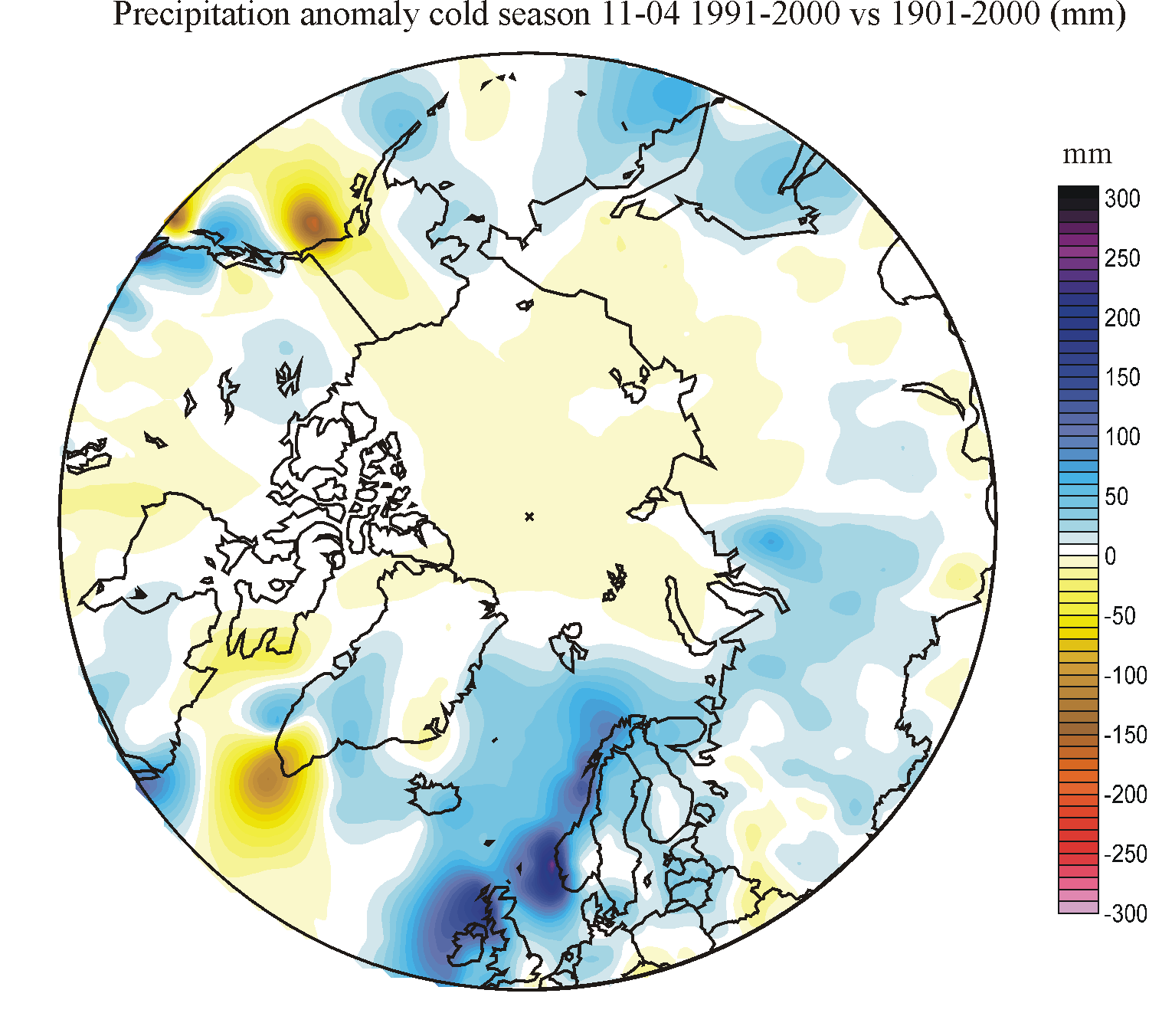
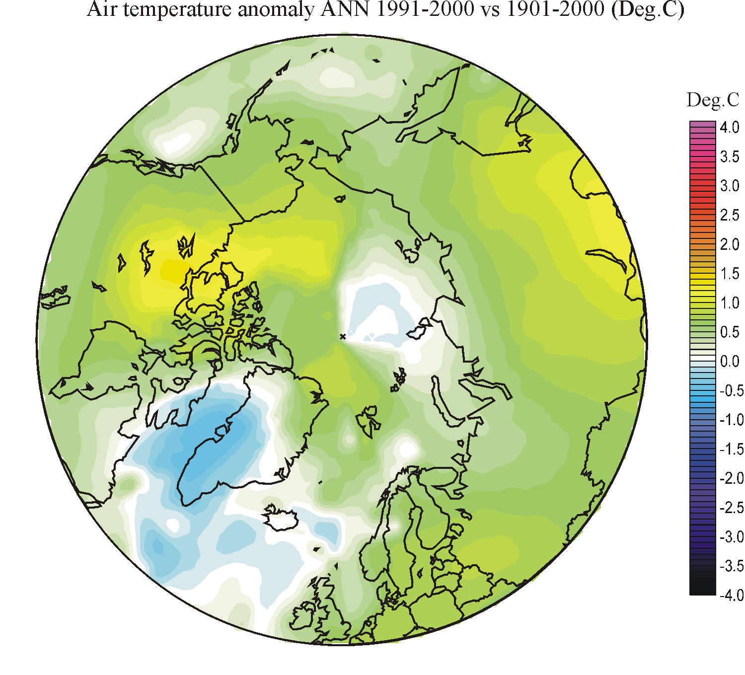
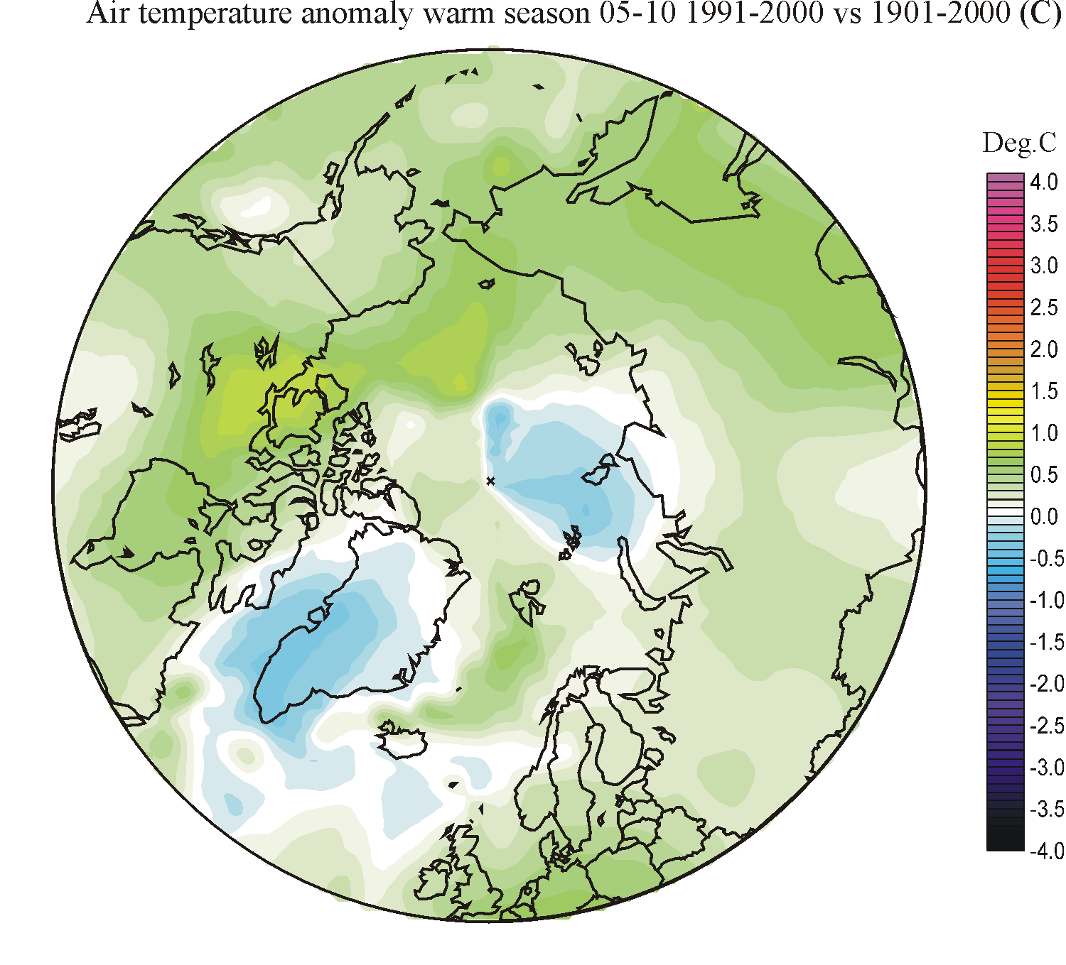
Diagram table showing Arctic change during the 20th century
| Period | Precipitation annually | Precipitation warm season | Precipitation cold season |
Temperature annually |
Temperature warm season | Temperature cold season | Ground temperature | Snow mass balance |
| 1901-1910 | 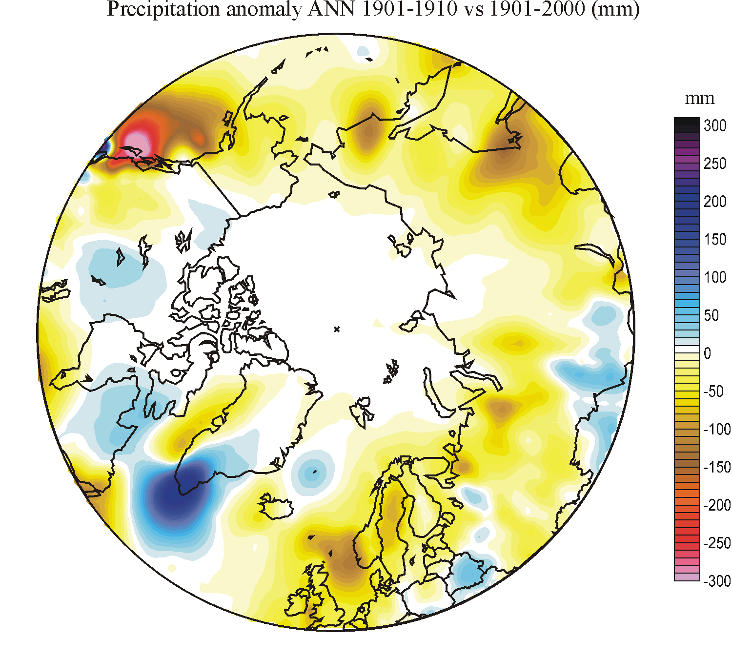 |
 |
 |
 |
 |
 |
 |
 |
| 1911-1920 | 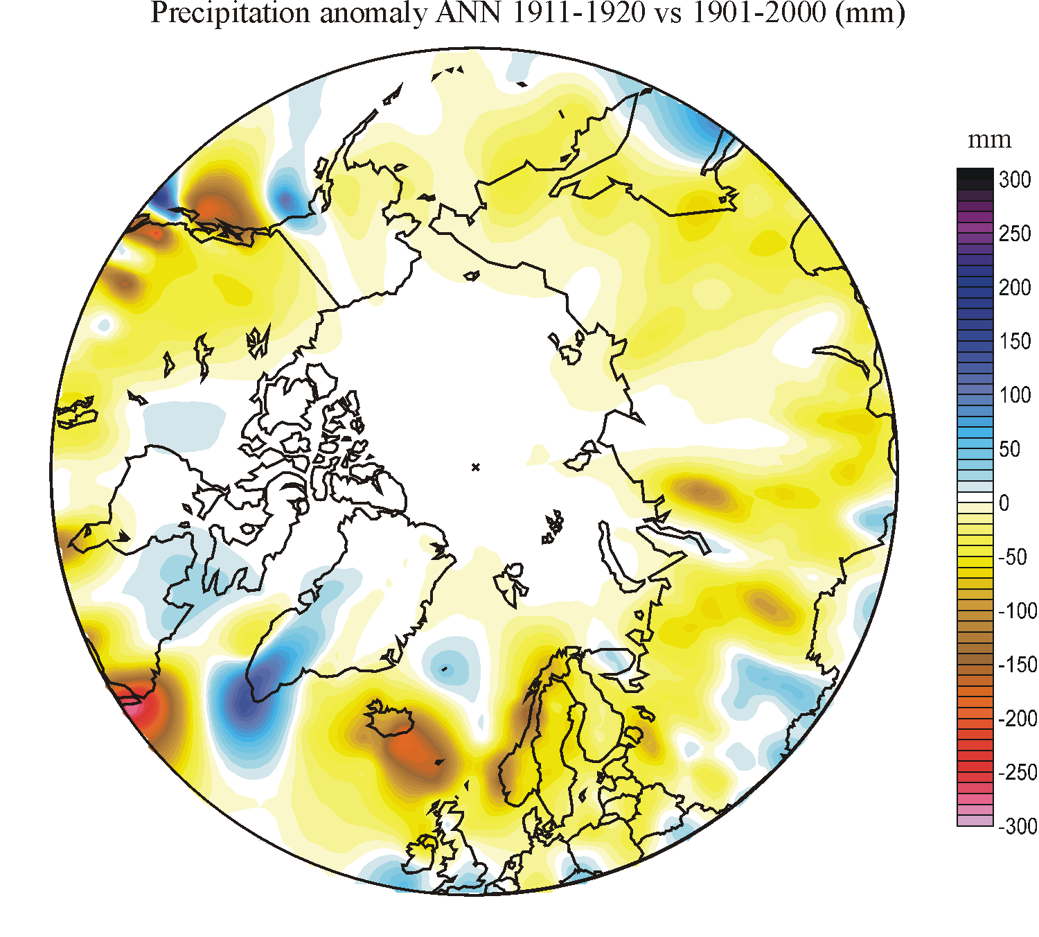 |
 |
 |
 |
 |
 |
 |
 |
| 1921-1930 | 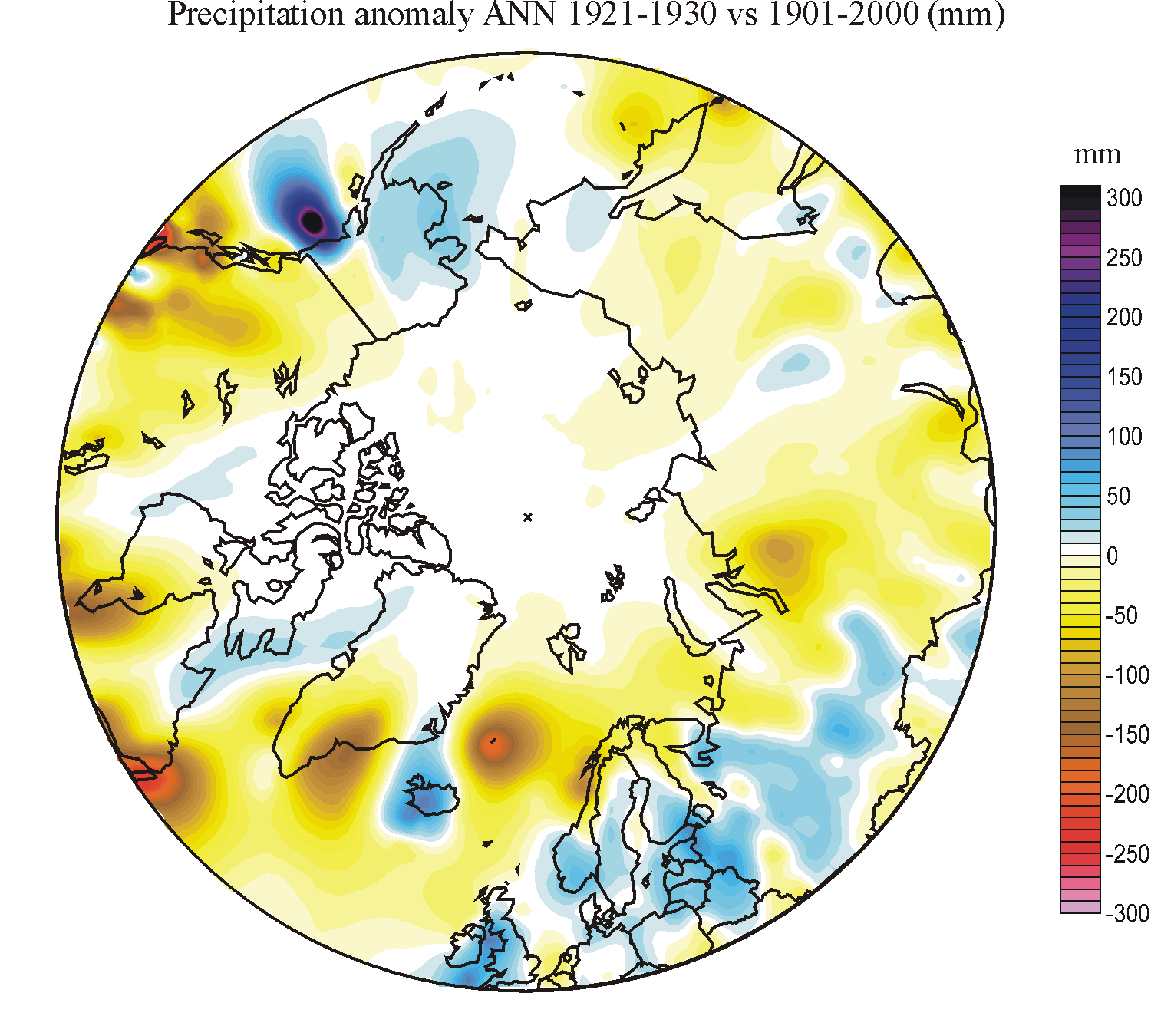 |
 |
 |
 |
 |
 |
 |
 |
| 1931-1940 | 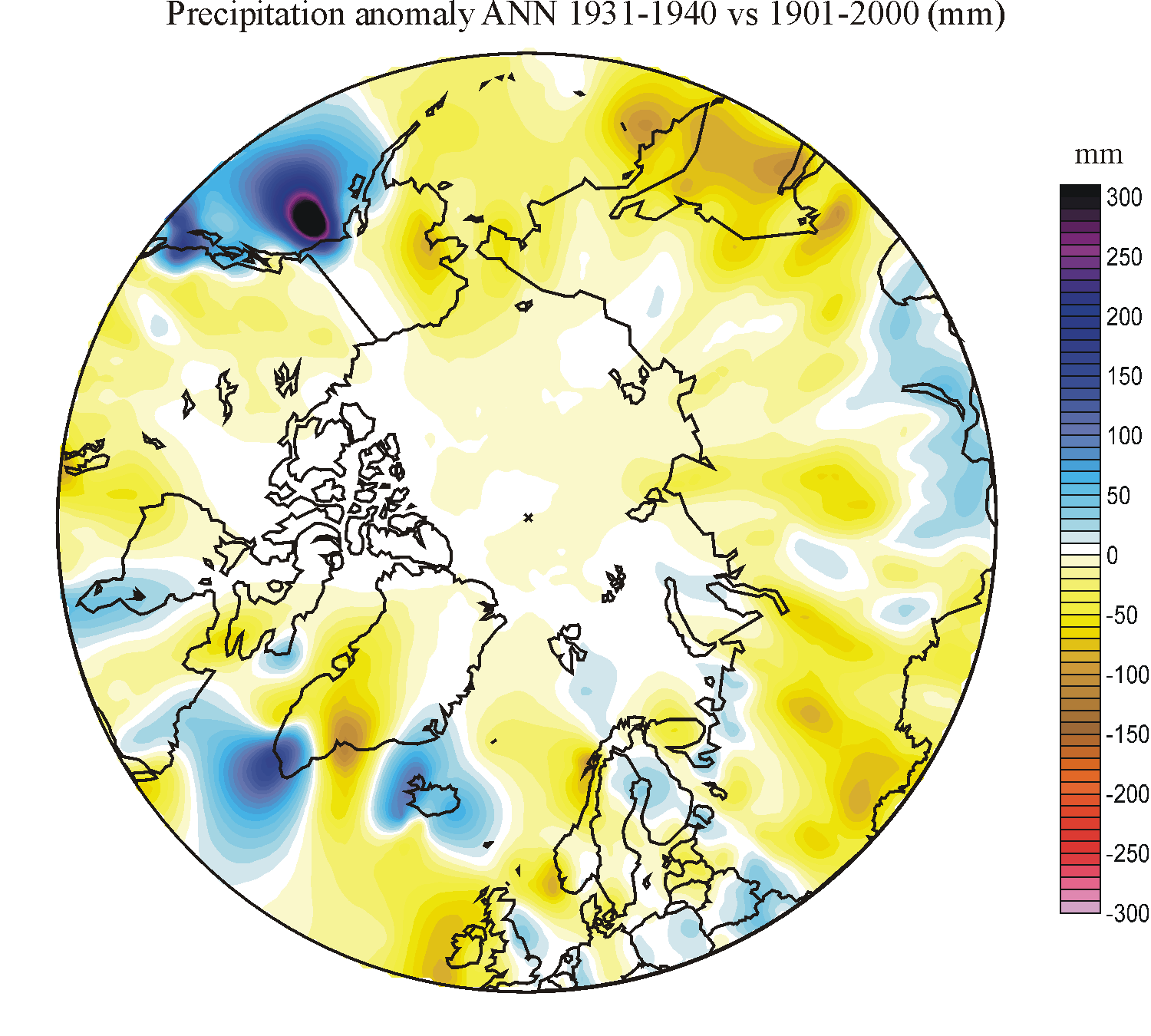 |
 |
 |
 |
 |
 |
 |
 |
| 1941-1950 | 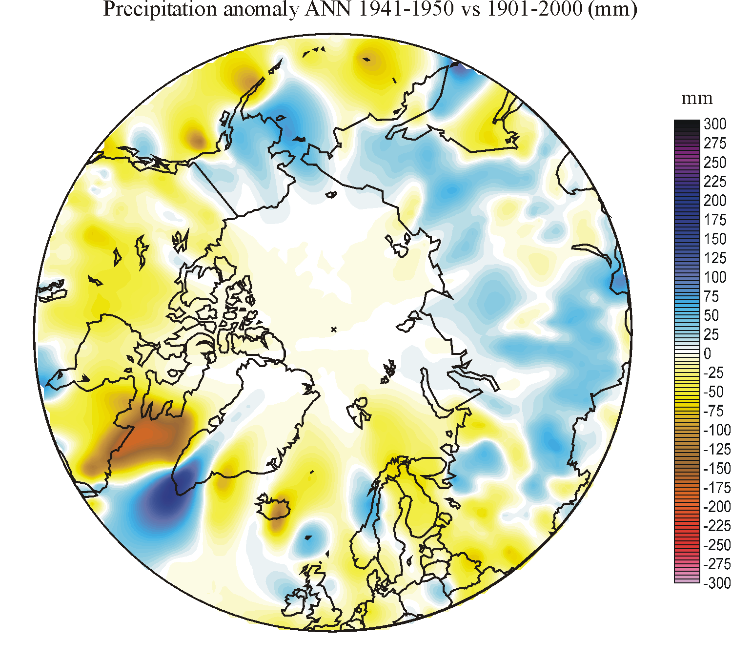 |
 |
 |
 |
 |
 |
 |
 |
| 1951-1960 | 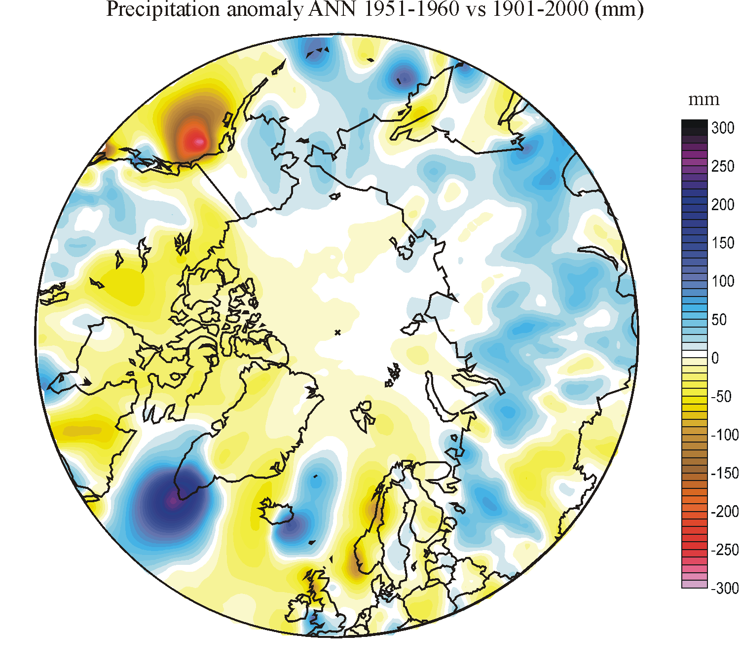 |
 |
 |
 |
 |
 |
 |
 |
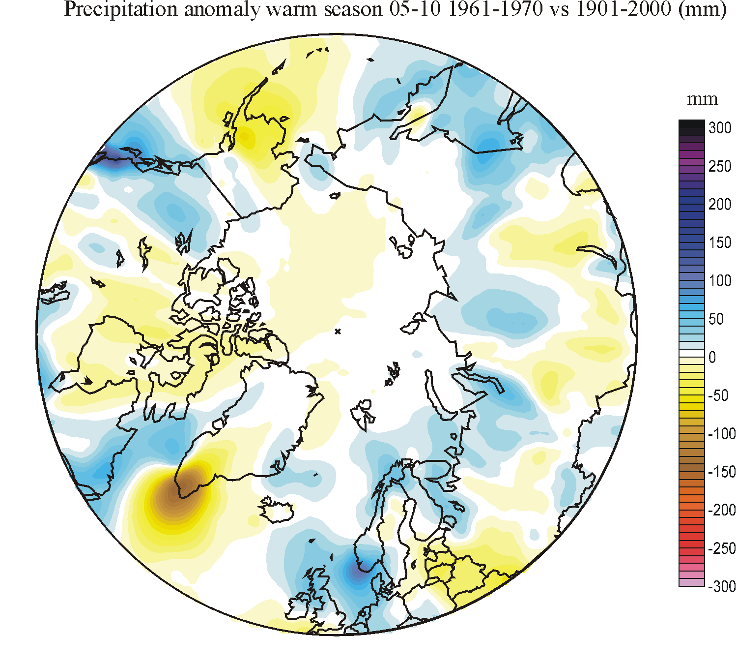
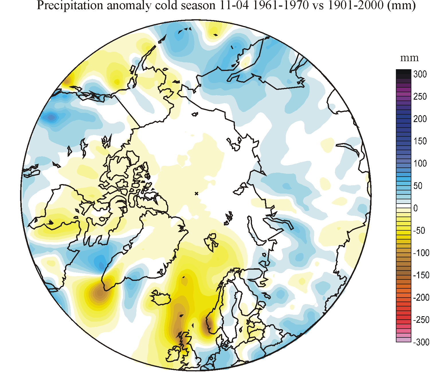
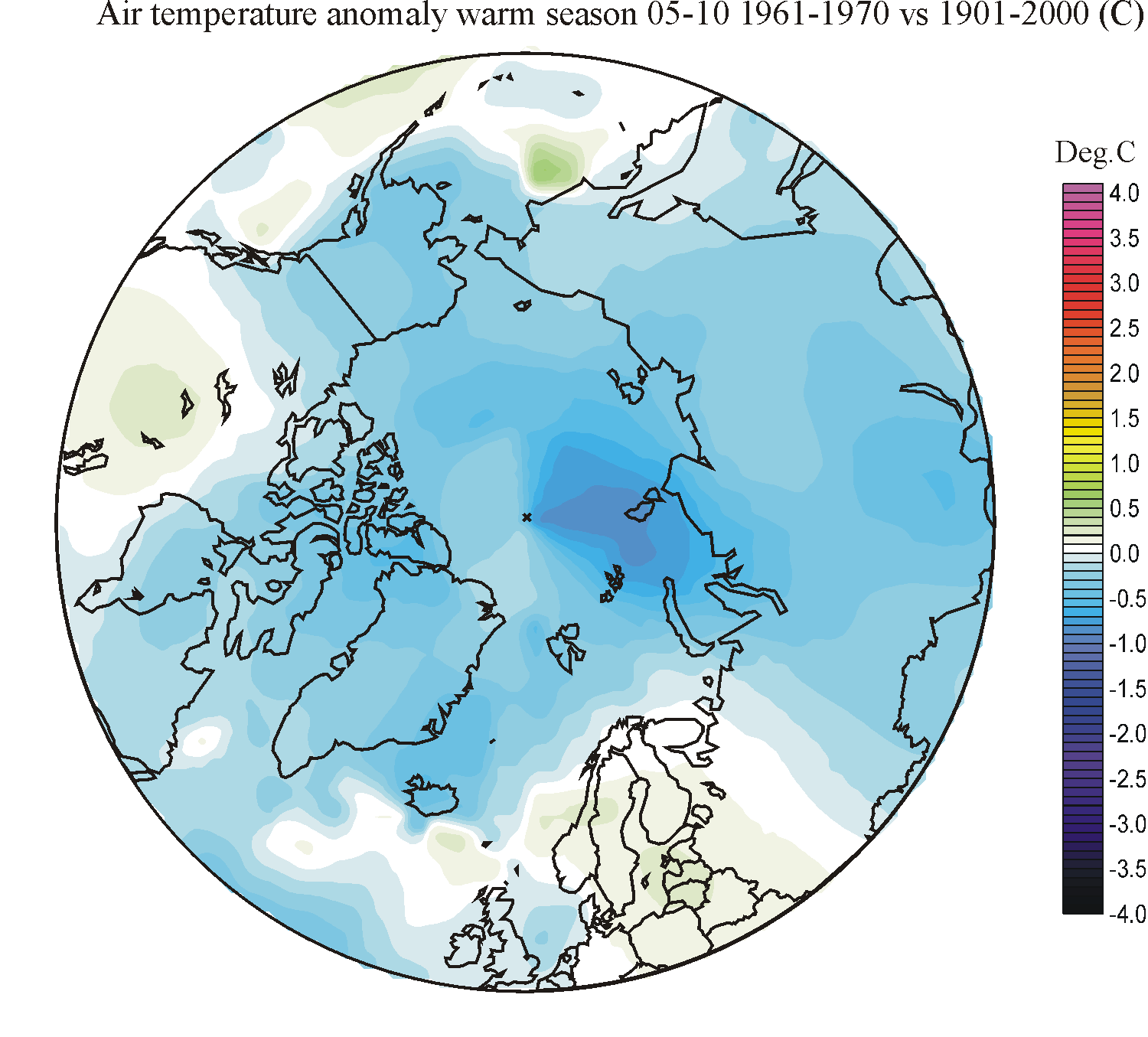
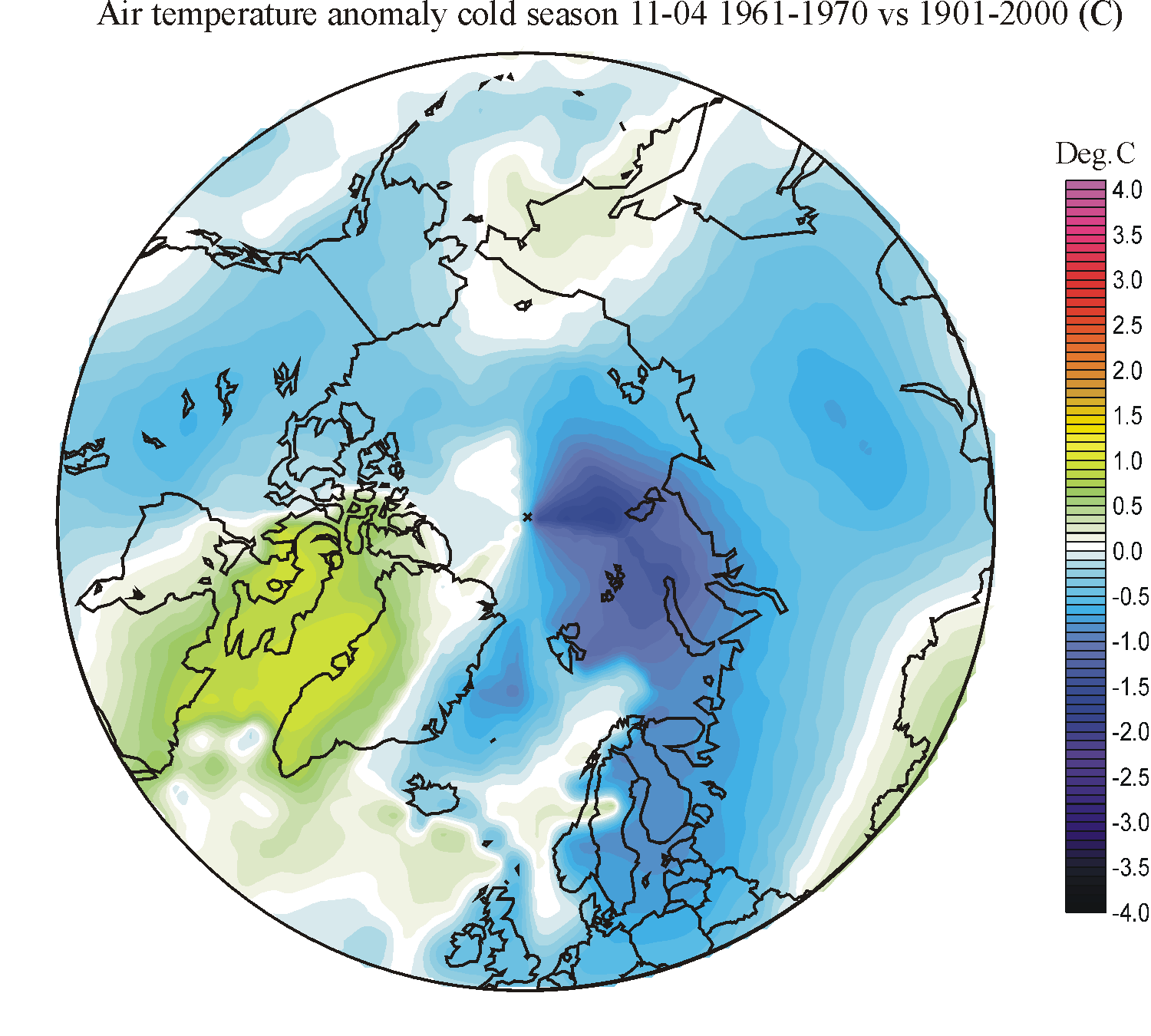
| 1961-1970 |  |
 |
 |
 |
 |
 |
 |
 |
| 1971-1980 | 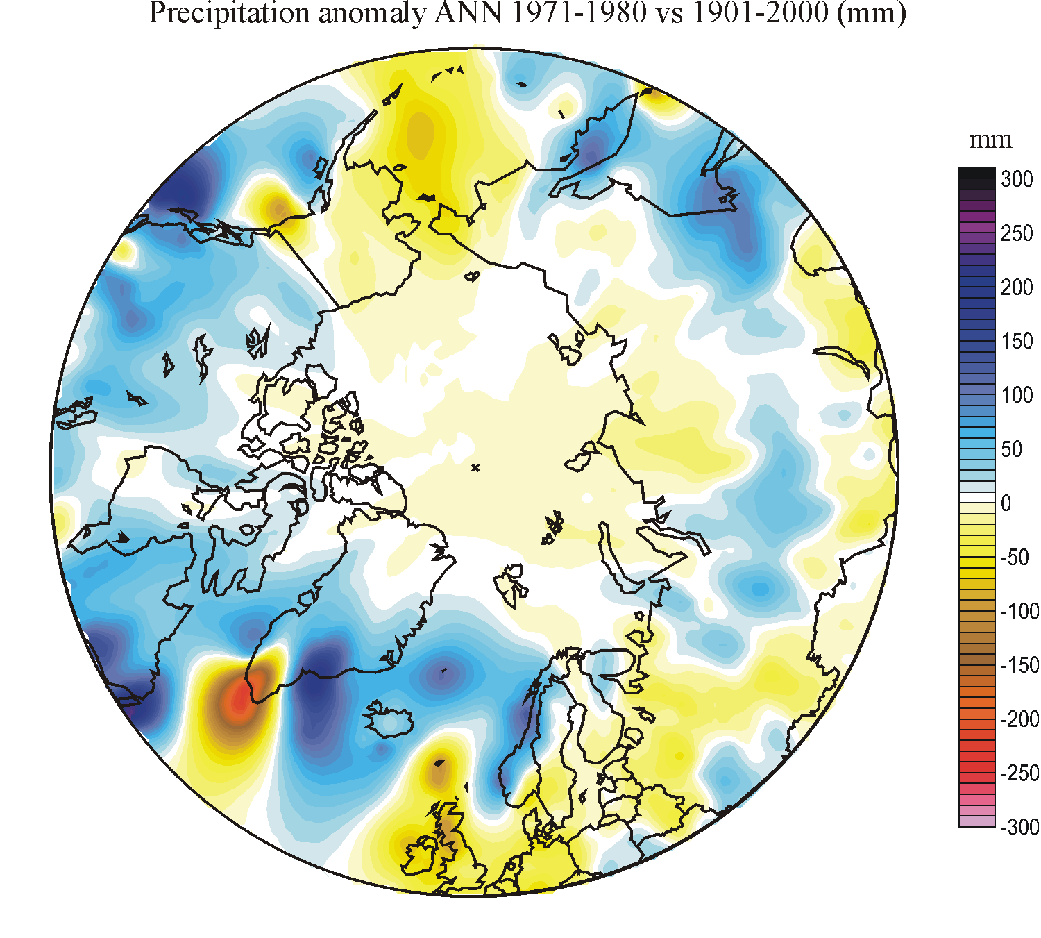 |
 |
 |
 |
 |
 |
 |
 |
| 1981-1990 |  |
 |
 |
 |
 |
 |
 |
 |
| 1991-2000 | 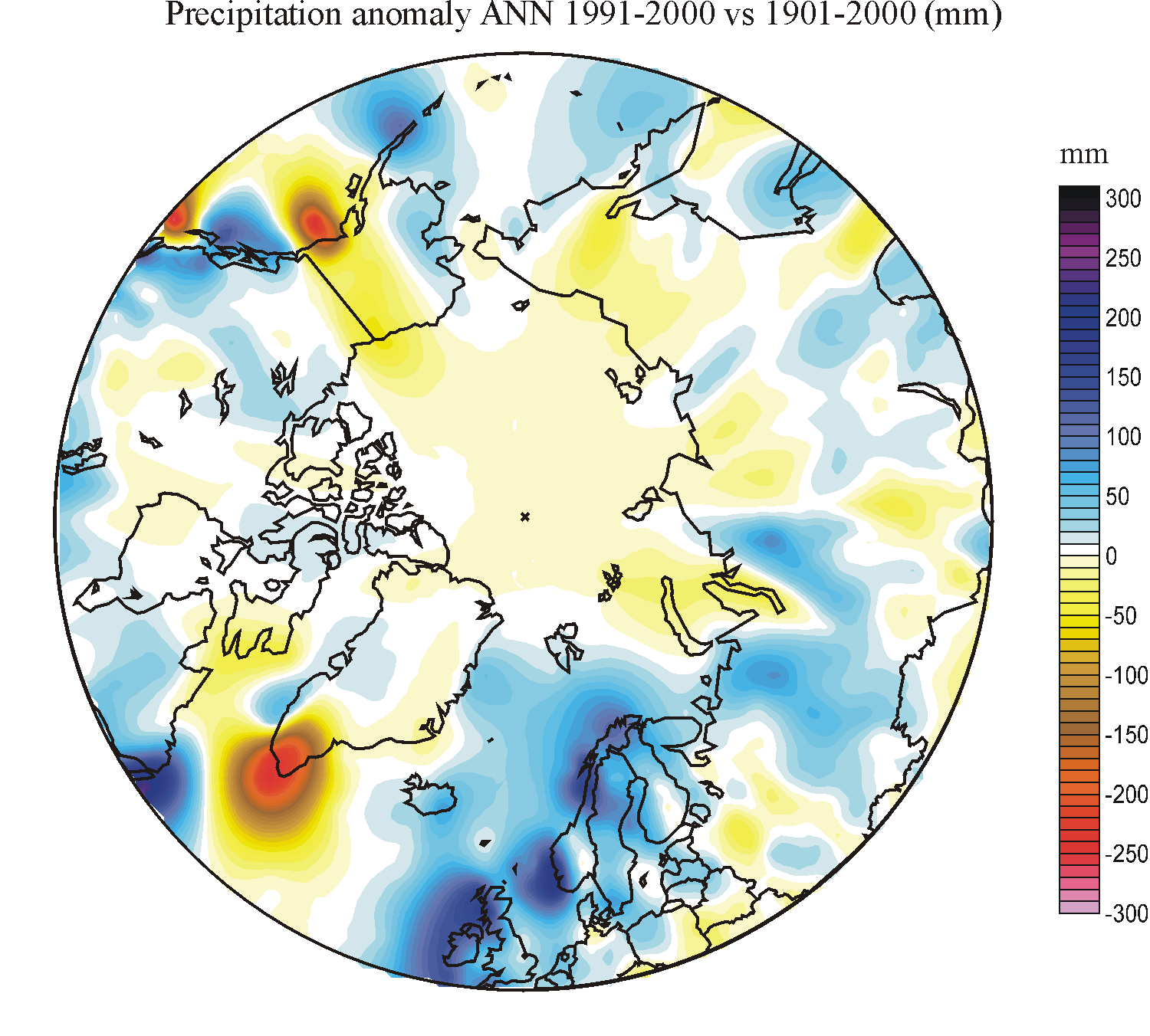 |
 |
 |
 |
 |
 |
 |
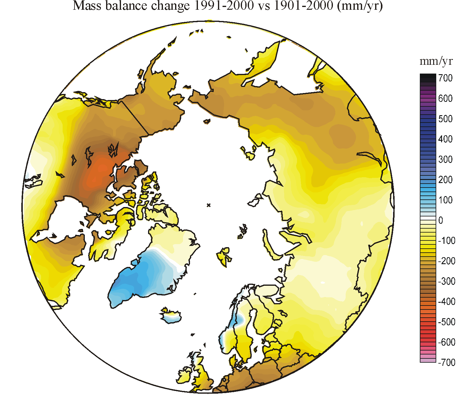 |
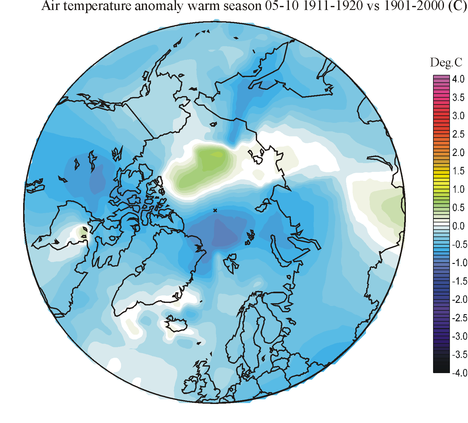
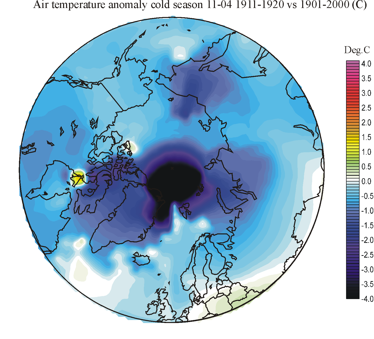
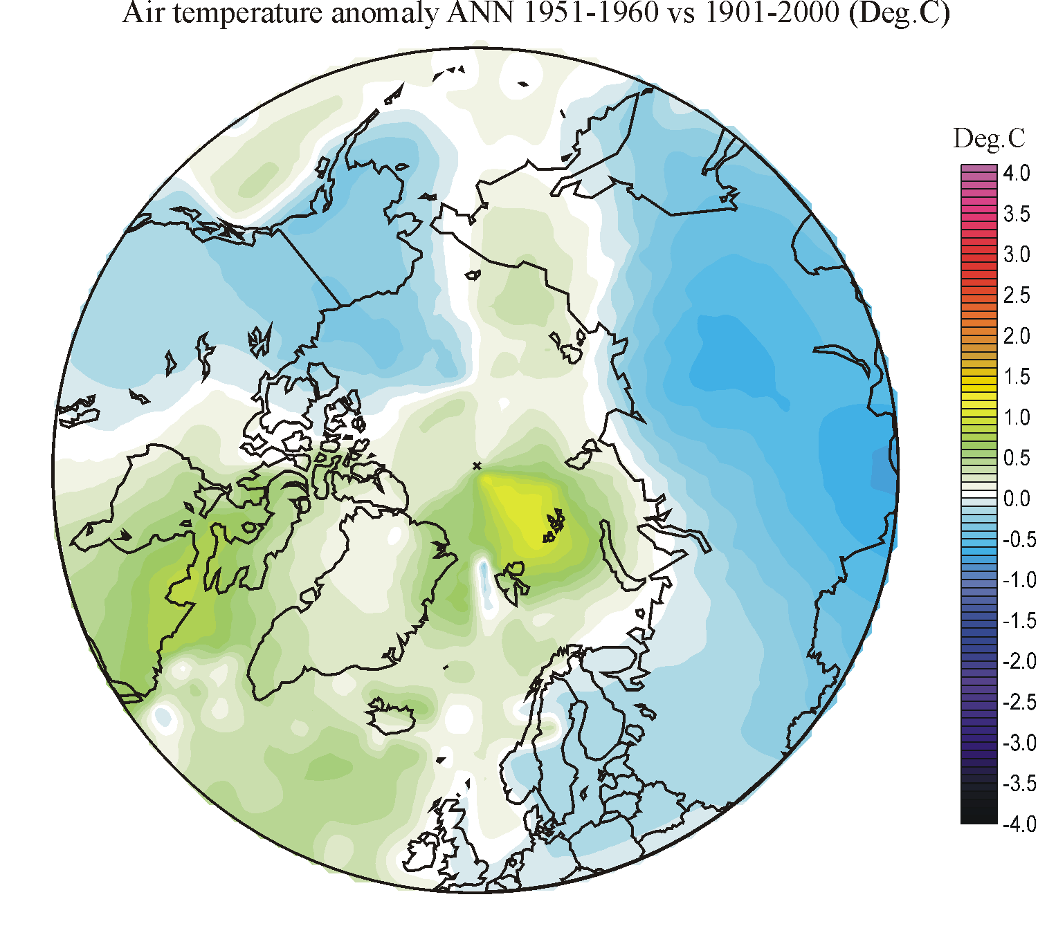
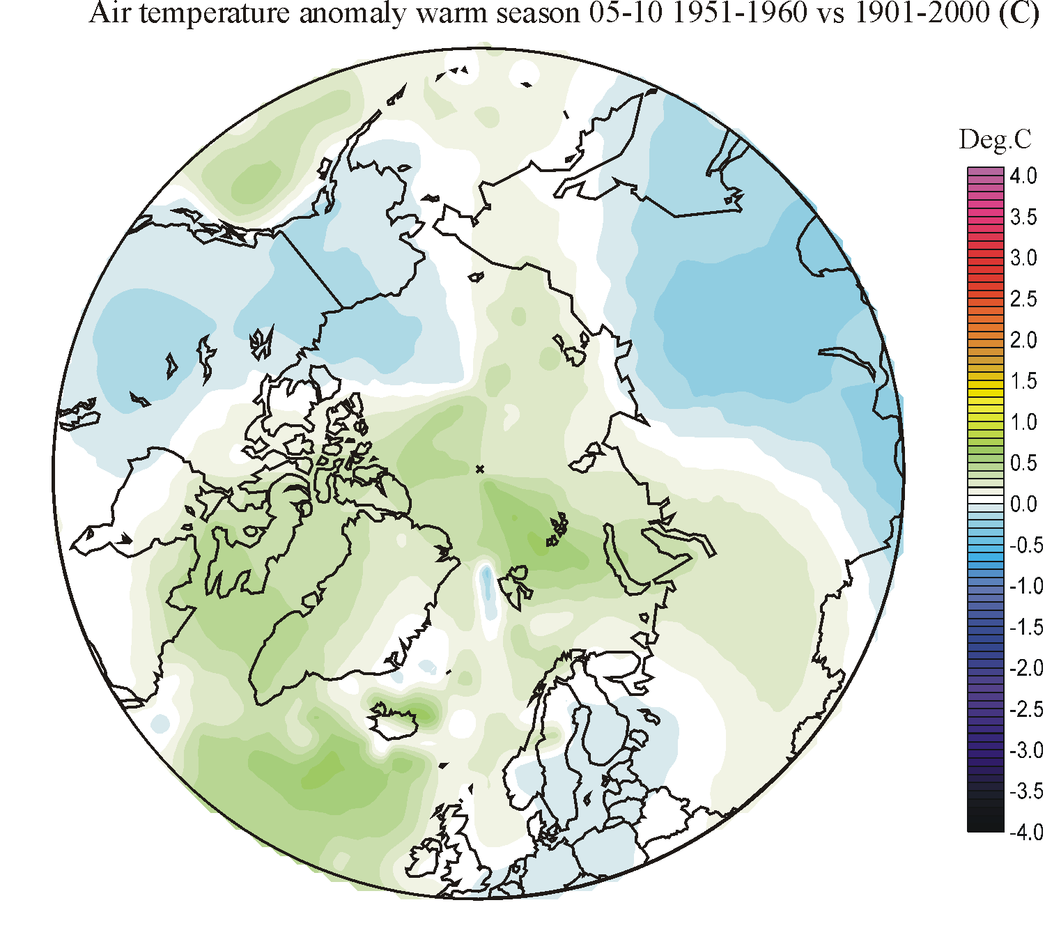
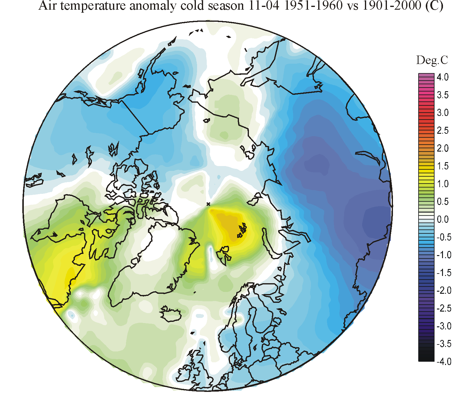
Spatial distribution of decadal annual precipitation, surface air temperature, estimated ground temperature, and estimated snow mass balance in areas north of 50oN, in relation to the average for the 20th century. The significance of the colours used is described in the text above, and is also indicated in the individual diagrams by a scale. The time range is indicated by a number: 1 = January, 2 = February, etc. Click on the individual small diagrams to open full-size diagrams. Similar temperature diagrams showing both polar regions since 2005 can be seen by clicking here. Data source: NASA Goddard Institute for Space Studies (GISS).
Click here to jump back to the list of contents.
Comments to the diagram table above
The complexity of climatic change during the 20th century is apparent from the diagrams above. Some regions may become wetter, while other nearby simultaneously become more arid (dry). Some may become warmer, while other nearby simultaneously become cooler. Clearly the configuration of jet streams and local wind conditions by orographic effects often exercise the main control on the amount of recorded precipitation changes at individual sites (column 2-4), while the influence of air temperature is smaller. At the same time, there is a overall tendency to relatively low precipitation at many sites until the end of the Little Ice Age (around 1920), perhaps associated with low air temperatures. On the other hand, the cooling period 1941-1980 appears to have been characterized by generally increasing precipitation in many regions north of 50oN, which is in contrast to what would be expected from the air temperature change. Following the general warming after 1981, precipitation apparently has continued the overall, slow increase. It remains to be investigated how much of the apparent 20th precipitation increase (both during warming and cooling periods) are the result of gradually improved design of meteorological gauging stations.
The temperature diagrams (columns
5-7) are interesting to compare with known historical developments. At the end
of the 1921-1930 Arctic
warming, a number of very mild winters were experienced in
The ground thermal diagrams (column
8) confirm the general tendency of increasing temperatures in the topmost part
of permafrost, as recently documented from several Arctic regions. It is however
also clearly seen, that the now 5-15 year long dataseries of permafrost
temperatures represent very short periods, even when considered within the short
instrumental period (the 20th century). As an example, the ground temperature
diagrams give reason to believe that presently rising permafrost temperatures in
Alaska and parts of
The snow mass balance diagrams (column
9) reveal several geographical features documented by observed glacier
variations and glaciological mass balance investigations. As one example, many
glaciers in the
Click here to jump back to the list of contents.
Current Net Surface Mass Budget of the Greenland Ice Sheet within current mass balance year

Date: 31 May 2025. Left: Today's surface mass balance. Right: Net surface mass balance anomaly since September 1, 2024. Click here for picture source and latest update. Courtesy of Danish Meteorological Institute (DMI).
NOTE:
The diagram above shows the surface mass balance (winter accumulation of snow,
reduced by summer melting) of the Greenland Ice Sheet. Usually, this is
positive. The total mass balance, however, is also influenced by dynamic ice
loss (calving), representing a major factor in the total mass balance of the
Greenland Ice Sheet. In 2000, the total discharge from all of Greenland’s
tidewater outlet glaciers was estimated to about 462 ± 6 Gt by Enderlin
et al. (2014). This approximate number should be subtracted from the annual
net surface balance indicated by the diagram above, to obtain an estimate of the
real total mass balance of the Greenland Ice Sheet. 1 Gt corresponds to 1 cubic
kilometre of water.
Click
here to jump back to the list of contents.
Click here to se recent variations of air temperature in the northern hemisphere polar region.
Click here to read more about meteorological conditions in the Arctic.
Click here for an update on present global, Arctic or Antarctic meteorological conditions.