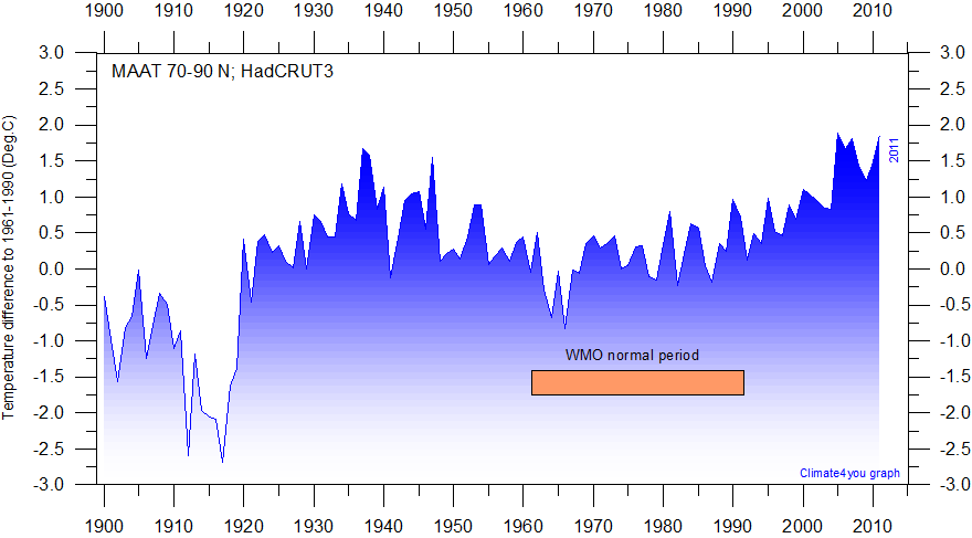
Year 1950-1999 AD
-
1950: Significance of the early 20th century Arctic warming in Greenland
-
1960-1975: Global cooling and the prospect of a coming ice age
-
1967: Cod fishing at
-
1968-1971: Arctic cooling, The Rome Club and Limits to Growth
-
1975: Glaciers in Zillertaler Alpen, Austria, begins to advance in response to climatic cooling
-
1995: Tony Benn MP, remark on the Plimsoll case during the debate about the hunting ban
1950:
Significance of the early 20th century Arctic warming in Greenland

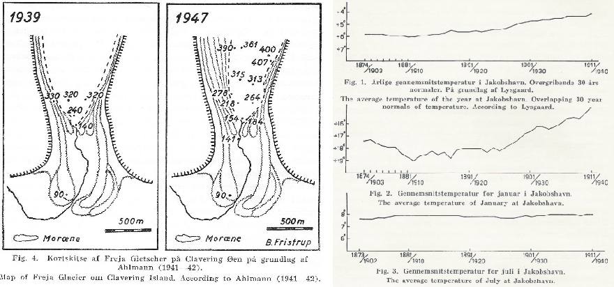
Maps showing retreat of Freja glacier on Clavering Island, NE Greenland, between 1939 and 1947. In front of the glacier the terminal moraine from the Little Ice Age is seen (left; Figure 4 in Jensen and Fristrup (1950), based on Ahlmann (1941-1942). Meteorological diagrams showing air temperature (deg. C) in Jakobshavn (now Ilulissat) 1874-1940, upper panel shows mean annual air temperature, mid panel shows January air temperature, and the lower panel shows July air temperature (right; Figure 3 in Jensen and Fristrup (1950)).
Ongoing Arctic climate change and its significance for Greenland was discussed by Jensen and Fristrup (1950). The publication is in Danish, but in translation part of their introduction states the following:
"Meteorological measurements in all regions of the Arctic show that a significant climatic change is taking place, and that this change is especially pronounced at high latitudes. The climate is becoming milder, especially during the winter. There is a larger number of publications addressing the reasons for this climatic change, and many theories for explanation have been suggested, however, without any of these has been proved correct".
Jensen and Fristrup (1950) draws attention to the long Greenlandic meteorological record from Jakobshavn (now: Ilulissat), initiated back in 1873. Here the average January air temperature 1874-1903 was -17.4oC, while it has increased to -14.6oC for the period 1911-1940. They also state that the winters especially around 1920 became warmer, and that the present January temperature now is 3.4oC above the normal (at that time the 'normal' period was 1891-1920). During the same period, there have only been small changes recorded for the summer.
Many glaciers in Greenland are observed to retreat significantly since the onset of the warming (see example map above). The large calving Jakobshavn Isbræ retreated no less than 10 km from 1888 to 1925 (Jensen and Fristrup 1950).
In addition to the widespread glacier retreat, Jensen and Fristrup (1950) also note that the Greenland sea ice now (1950) comes later and disappears earlier than previously. In southern Greenland the quality of the fjord ice is so bad, that the important seal hunting tradition with nets hanging below the ice have been abandoned. The amount of sea ice around South Greenland is now smaller than ever seen before during the period with regular observations (back to 1820). The change in sea ice was, however, especially rapid around 1920.
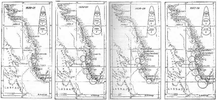
Map series showing development of cod fishing along the coast of SW Greenland in 1920-21, 1930-31, 1938-39 and 1947-48, from left to right. The diameter of the three scale-circles indicate 1000, 2000 and 3000 tonnes, respectively. The maps are published as figures 5-8 in Jensen and Fristrup (1950).
Finally, Jensen and Fristrup (1950) also draws attention to the fact, that along with the climatic change to warmer conditions, the cod fishing in Greenland has improved very much, especially after 1920 (see maps below). Apparently, the Greenlandic cod immigrated from Icelandic waters within few years, shortly after 1920.
To illustrate the geographical extent of the early 20th century climatic warming described by Jensen and Fristrup (1950) the diagram below shows the change in mean annual air temperature from the period 1900-1915 to the period 1930-1945. The temperature data are insufficient in the polar regions to allow good interpolation in the highest latitudes, but the available data clearly suggests a rather widespread Arctic warming in the early 20th century, and pronounced in the West Greenland - Baffin Island region.
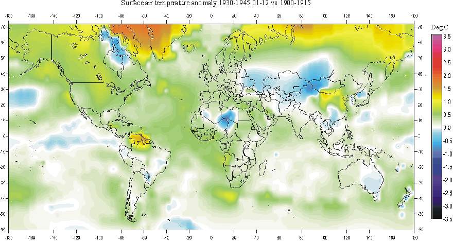
Map showing the change of the annual surface air temperature from 1900-1915 to 1930-1945; calculated by subtracting the 1900-1915 average from the 1930-1945 average. Green-yellow-red colors indicate warming during the period, and blue colors indicate cooling. Much of the northern hemisphere experienced warming during the early 20th century, but less so south of Equator. Compare with the following period of cooling. Temperature scale in degrees Celsius. Data source: NASA Goddard Institute for Space Studies (GISS).
Click here to se Arctic sea ice data collected by DMI 1893-1961.
Click here to jump back to the list of contents.
1951:
Grosser Gurglerferner in Austria retreats 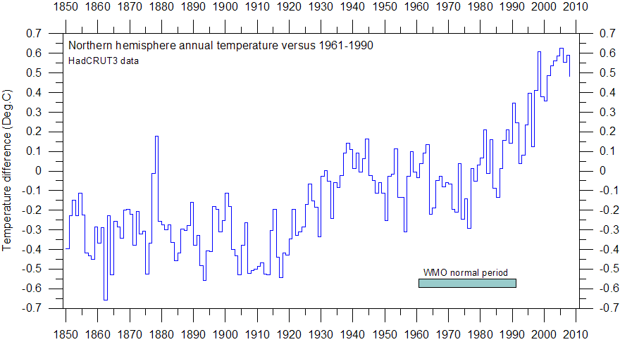
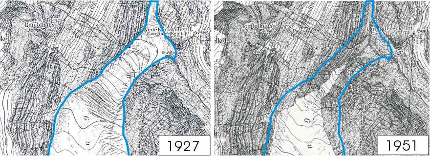
Part
of the old and new Alpenvereinskarte Blatt Gurgl, showing the terminus of the
glacier Grosser Gurglerferner 1927 and 1951, southern North Tyrol, Austria. The
blue line indicate the outline of the glacier tongue in 1927. The contour
interval on the maps is 20 m. North is towards the top. Each map measures about
3 km across, from west to east.
Some
of the most detailed maps over mountain areas are published by the German and
Austrian Alpine Association (Deutschen
und Österreichischer
Alpenverein). These maps are the result of painstaking field work carried
out since the late 19th century and are published in the scale of 1:25,000, with
a contour interval of only 20 m. In addition, these maps contain an impressing
amount of geomorphological information about the terrain surface characteristics
(exposed bedrock, talus, loose sediments, moraines, glaciers, perennial
snowfields, rivers, vegetation, etc.).
The
very high quality criterion laid down by this map series have made recurrent map
updates necessary over time, especially as most glaciers in the Alps have been
retreating during the 20th century. By this, a comparison between the individual
map editions represents an important historical archive on landscape changes.
As one example, the terminus of the big Grosser Gurglerferner in southern North Tyrol, Austria, is shown in the figure above. These two map editions are based on the glacier extension in 1927 and 1951, respectively. The mid 20th century glacier retreat resulting from the negative mass balance experienced by most alpine glaciers since around 1860, and especially since the end of the 1st World War, is well demonstrated by the two map editions. More information on these maps was published by Finsterwalder (1980).
Like
most glaciers in the eastern Alps, Grosser Gurglerferner reached its maximum
Little Ice Age extension around 1860. Since then, most glaciers in the Alps,
including Grosser Gurglerferner, have been exposed to a period of general
frontal retreat.
1953:
Storm and flooding in the Netherlands
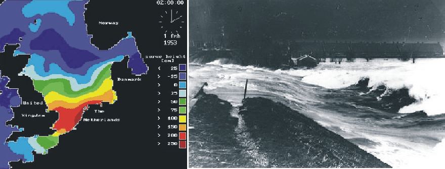
The storm surge created by the 31 January 1953 storm over the North Sea (left). Sea water streaming trough a developing breach in a dike in the Netherlands (right).
On 30 January 1953, a cyclone was developing south of Iceland. The depression was travelling in direction of Scotland and was intensifying to a strong storm. After passing Scotland, the storm centre followed the jet stream towards southeast across the North Sea and intensified further into a storm of almost hurricane force in the afternoon of 31 January.
When
the depression reached the Netherlands this region of the North Sea was having a
a high spring
tide.
The sea level rose further by northwesterly winds on the rear side of the
cyclone and by the low air pressure associated with the storm centre (see figure
above). Shortly after
At the following high tide, in the afternoon of 1 February, there was another flood, claiming more lives and destroying more property. As many dikes had already been breached the previous night, the sea water now has unhindered access to the lowlying areas behind the dikes and sea walls.
Officially,
1835 people lost
their lives by this flooding. Lack of proper warning of the impending flood
explains at least part of this high number of casualties, as people generally
were unable to prepare for the flood. An estimated 30,000 animals drowned, and
47,300 buildings were damaged or destroyed.
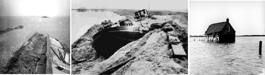
A collapsed dike after the storm (left). The river barge de Twee Gebroeders stranded in the Groenendijk dike gap (centre). A damaged building surrounded by sea water (right).
The dyke along the river Hollandse IJssel protected three million people living in the provinces of South and Nord Holland from flooding. The dike was, however, on the brink of collapse, and a gap was rapidly developing. A complete collapse of this dike would have endangered the lives of the large population living in the area. As a last resort, the captain of the river barge de Twee Gebroeders (The Two Brothers) navigated his ship into the developing gap in the dike (see photo above). The ship actually managed to plug the gap, whereby many lives presumably were saved.
Also
in UK, the North Sea flood of 1953 was one of the most devastating natural
disasters ever recorded. More than 1,600 km of coastline was damaged, and sea
walls were breached, inundating 1,000 km². Flooding forced 30,000 people to be
evacuated from their homes, and 24,000 properties were seriously damaged.
Click here to jump back to the list of contents.
1959:
Hans Hedtoft is lost on her maiden voyage
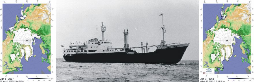
Northern hemisphere sea ice 31 January 2007 (left; map from University of Bremen). MS Hans Hedtoft (2,857 brt) before setting out on her maiden voyage to Greenland (centre). Northern hemisphere sea ice 31 January 2008 (right; map from University of Bremen). The two sea ice maps show the interannual variation of sea ice in modern time.
On
January 30, 1959
the new Danish combined freighter-passenger liner "Hans Hedtoft"
was lost en route from Julianehåb,
The Hans Hedtoft was a diesel-engine
2,857-ton ship specially designed for the Danish government to handle winter storms
and sea ice in the
On
A West German ocean-going trawler,
the Johannes Krüss (see photo below), and the U.S. Coast Guard cutter Campbell
both were in the area near Hans Hedtoft and immediately turned
toward Hans Hedtoft's position after the initial distress call. However, due to the high sea, floating ice, dwindling daylight
and generally bad visibility they were unable to reach the position provided by
Hans Hedtoft before she sank later that afternoon. Presumably Johannes Krüss (commanded
by Kapitän Albert Sierck) after a gallant and dangerous voyage in the ice-filled stormy waters actually made it to the
position of Hans Hedtoft only few minutes after her sinking, but was unable to
find any survivors under these extremly difficult conditions.
The only item ever recovered from Hans Hedtoft was a life belt that was washed
ashore on the coast of
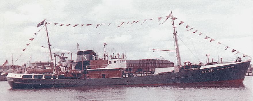
The German 60.4 m long ocean-going trawler Johannes Krüss in 1956, setting out for sea trials before her maiden voyage.
Eight years later, in early March 1967, the trawler Johannes Krüss was itself lost in the same waters as Hans Hedtoft. The ship simply disappeared with its crew of 22, after last being having radio contact on 28 February, about 450 km east of Cape Farewell, Greenlands southern tip. At that time the wind strength was 10 on the Beaufort scale, and the air temperature -22oC. Most likely the loss of Johannes Krüss was caused by a collision with an iceberg or an ice floe, or perhaps rapid icing leading to capsizing; something sudden which prevented a distress call from the ship. Click here to read more about this tragic event. In 1967 the cooling beginning around 1945 was even more pronounced, and sea ice conditions in the North Atlantic known to be more difficult than in 1959.
Click here to se Arctic sea ice data collected by DMI 1893-1961.
Click here to jump back to the list of contents.
1960-1975:
Global cooling and the prospect of a coming ice age 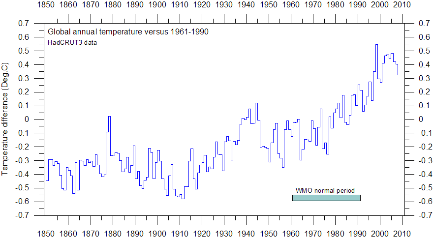
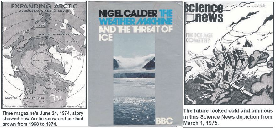
Illustration from Time magazine June 24, 1974 (left). Frontcover of Nigel Calder's 1974 book entitled The Weather Machine and the Treat of Ice (centre). Illustration from Newsweek, March 1, 1975 (right).
In
the 1960s and early 1970s, the time frame of most scientists was still
retrospective, rather than prospective (Oldfield
1993). However, the revived notion of the Milankovitch theory then suddenly
offered the new possibility of actual climate prediction. At that time there was
relatively little emphasis on potential or actual ‘global warming’, and the
idea was virtually unknown to popular consciousness. Indeed, a widespread belief
at that time was that the planet was heading for a new ice age, fuelled by
acceptance of the Milankovitch theory and new knowledge gained from isotope
analysis of
Hays et al. (1976) suggested that the observed orbital-climate relationships predict that the long-term trend over the next several thousand years would be toward extensive Northern Hemisphere glaciation. The period of global cooling since around 1940 was thought to be the first indication of a new ice age, and was seen as being accelerated by aerosols from industrial pollution blocking out sunlight. Even among some of those scientists drawing attention to contemporary increases of atmospheric CO2, a phase of significant global cooling was envisaged (e.g. Rasool and Schneider 1971).
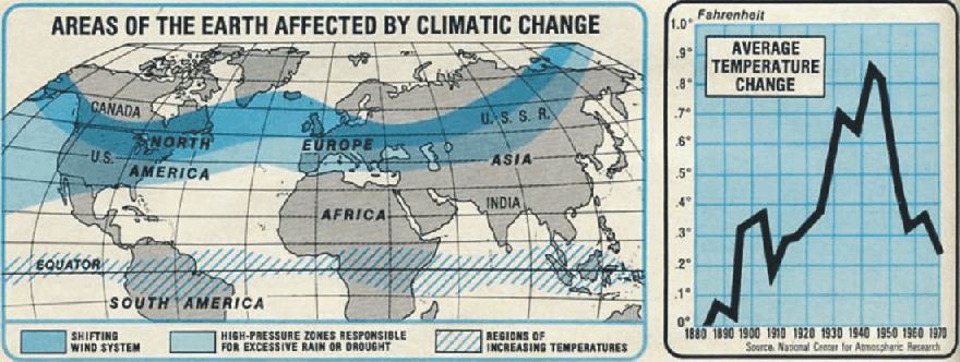
Diagram from Peter Gwynne's 1975 article entitled The Cooling World, published in Newsweek, April 28 (see text below).
Decreasing global surface air temperatures such as illustrated in the figure above were frequently taken as the empirical evidence for a coming ice age (e.g. Calder 1974; Ponte 1976). Such concerns in the mid-1970s brought together atmospheric scientists and the US Central Intelligence Agency (CIA) in an attempt to determine the geopolitical consequences of a sudden onset of global cooling.
The journal Newsweek in an article 28 April 1975 stated the following (Gwynne 1975):
"There
are ominous signs that the earth’s weather patterns have begun to change
dramatically and that these changes may portend a drastic decline in food
production – with serious political implications for just about every nation
on Earth. The drop in food output could begin quite soon, perhaps only ten years
from now. The regions destined to feel its impact are the great wheat-producing
lands of
The evidence in support of these
predictions has now begun to accumulate so massively that meteorologists are
hard-pressed to keep up with it. In
Trend: To scientists, these seemingly disparate incidents represents the advance signs of fundamental changes in the world’s weather. The central fact is that after three quarters of a century of extraordinarily mild conditions, the earth’s climate seems to be cooling down. Meteorologists disagree about the cause and extent of the cooling trend, as well as over its specific impact on local weather conditions. But they are almost unanimous in the view that the trend will reduce agricultural productivity for the rest of the century. If the climatic change is as profound as some of the pessimists fear, the resulting famines could be catastrophic……
…..Climatologists are pessimistic that political leaders will take any positive action to compensate for the climate change, or even to allay its effects. They concede that some of the more spectacular solutions proposed, such as melting of the arctic ice cap by covering it with black soot or diverting arctic rivers, might create problems far greater than those they solve. But the scientists see few signs that government leaders anywhere are even prepared to take the simple measures of stockpiling food or introducing the variables of climatic uncertainty into economic projections of future food supplies. The longer the planners delay, the more difficult will they find it to cope with climatic change once the results become grim reality".
An example of climate prediction made in year 1976.
Click here to se Arctic sea ice data collected by DMI 1893-1961.
Click here to jump back to the list of contents.
1961-1969:
Cooling and decreasing yield of hay in
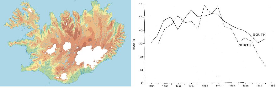
Topographical map of
From around 1961, the mean annual
temperature in
Grass is the main crop grown in
In a single year, 1967, yields of hay per hectare were 870 kg lower than the average over the previous 25 years. Over 1000,000 ha there was a decrease in production of 87,000 tonnes, at that time worth 260 million krónur, reducing the basic productivity of Icelandic agriculture by 20 per cent (Grove 1988). The year 1967 was not the only one with severe icing; 1970 and 1975 were similar in many respects.
The drop in hay yield affected
livestock production, as did the productivity of the grazing land. A calculation
by Bergthórsson (1985) of the relationship
between climate, the productivity of cultivated grassland and potential
livestock capacity lead to the conclusion that a decrease of 1oC in mean annual
air temperature would reduce carrying capacity in
Click here to jump back to the list of contents.
1963:
The WMO/UNESCO Rome symposium on changes of climate
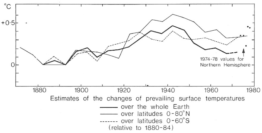
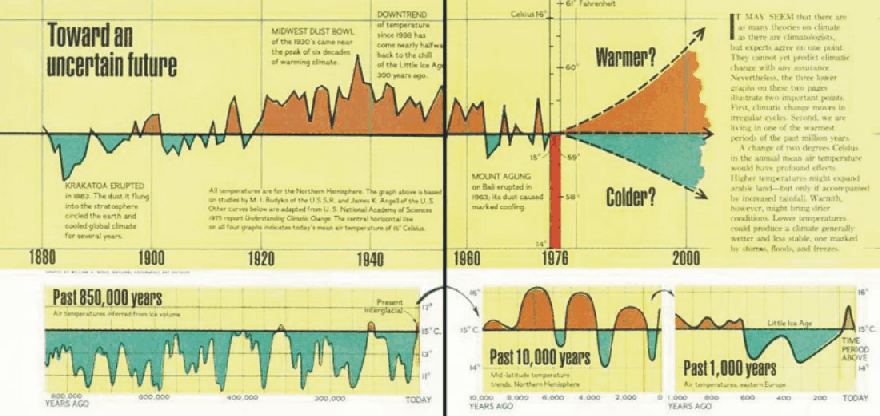
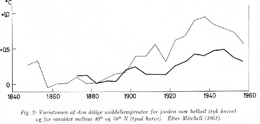
Average global surface air temperatures, as presented in 1963 by the late J. Murray Mitchell Jr to the WMO/UNESCO Rome symposium on changes of climate (Figure 91a in Lamb 1995). Values younger than 1963 added by Lamb (1995).
In 1957 an Arid Zone programme was constituted as one of the major projects of UNESCO and as a result a number of symposia were organized, to summarize the state of knowledge in a given scientific field related to arid zone problems. Within this framework and at the suggestion of WMO (World Meteorological Organization) a symposium on changes of climate was held at Rome in October 1961. The Proceedings of the Rome Symposium was published by UNESCO in Paris, 1963, containing 45 papers.
Many outstanding names appear among the contributors, testifying to the increasing recognition of the potential stimulus to meteorology that could be expected from forthcoming research in this intriguing field. One of the participants was the late J. Murray Mitchell Jr, who presented his findings on global temperature variations, as shown in the diagram above. The diagrams display successive five-year periods from 1870 (in the northern hemisphere from 1840) to 1959, and later extended to the 1970s (Lamb 1995). Mitchell's diagram was one of the first attempts of establishing global temperature changes during the instrumental period. It clearly shows the warming (in both hemispheres) following the Little Ice Age, and the subsequent global cooling since around 1940, in the 1960s giving rise to speculations on a coming ice age.
Click here to jump back to the list of contents.
1963-1980:
Failures of USSR grain harvest
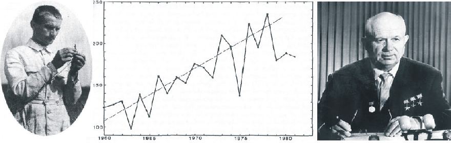
Trofim Lysenko (1898-1976), agronomist and director of Soviet biology under Joseph Stalin (left). Graph showing the total grain production in USSR 1960-1980 (left axis showing millions of tonnes). The broken line indicates the rising production expected from increasing acreage sown and increasing technological development and input (Diagram from Lamb 1995; data provided by United States Department of Agriculture). Nikita Khrushchev (1894-1971), First Secretary of the Communist Party of the Soviet Union 1953-1964 (right).
In 1913 Imperial Russia was still the main producer and exporter of surplus grain, especially wheat. Up to the 1930s many other countries, including USA, produced surpluses for export. Since 1960, however, the world's total production of grains was barely able to keep pace with the growth of the world population. From 1960 the end of season world stocks of grains was declining. In 1960 the stock was estimated at 222 million tonnes, about 26% of the annual requirement). In 1975 the total stock was down to about 135 million tonnes, representing 11% of the annual requirement (Lamb 1995).
One reason for this unfortunate development was a recurrent failure of grain harvest in the Soviet Union (USSR). In the 1970s the USSR, although still the world's second biggest grain producer, had become a net importer of grain. The overall driver for this development was the temperature decline since about 1940. Trofin Lysenko, however, must carry some of the responsibility for the severe harvest failure in 1963. Lysenko was an agronomist who rejected Mendelian genetics in favour of hybridization hypotheses. With considerable success he adopted these unproven ideas into a powerful political scientific movement termed Lysenkoism. His unorthodox experimental research in improved crop yields earned the support of Soviet leadership, and in 1940 he became director of the Institute of Genetics within the USSR’s Academy of Sciences. Sceptics of Lysenko’s agricultural hypotheses were formally outlawed in 1948, and many imprisoned. Following the disastrous 1963 harvest Lysenko's work was officially discredited in the Soviet Union in 1964. Along with other factors, the 1963 harvest failure contributed towards weakening the position of the First Secretary of the Communist Party of the Soviet Union, Nikita Khrushchev, who was forced to resign in 1964.
Global cooling, however, prevailed until around 1980. As a result of this, a number of subsequent disastrous harvests in the 1970's (see figure above) forced the Soviet Union to go onto the world market to buy additional wheat. In 1975 USSR was able to buy 25% of the total US wheat crop production, as well as buying elsewhere on the global market (Lamb 1995). This had the result that the world price of wheat doubled within a few months and the difficulties increased for not only USSR, but also for many poor countries suffering food shortage in 1975 because of the global cooling prevailing at that time (see map below). Temperature was not the only factor, but drought in western USSR also had its effects (see precipitation map below).
More disappointing USSR harvests in the late 1970's and in the early 1980's added to this negative economic development, and left the USSR in a weakened state. The war in Afghanistan and the contemporary arms race with USA made a bad situation even worse, despite first secretary Michail Gorbatjov’s impressive attempts of restructuring (perestroika). Eventually USSR collapsed in 1991.
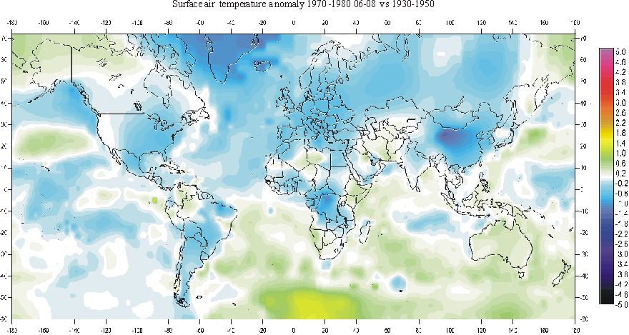
Map showing the deviation of the average surface air temperature during the main growing season June-August 1970-1980, compared to average conditions 1930-1950. Much of the northern hemisphere, and around 1975 the end of season world stocks of grains were dangerous low. Europe and USSR was among the worlds main grain growing areas hardest hit by this climatic development, compared to the previous 21 year period 1930-1950. Temperature scale in degrees Celsius. Data source: NASA Goddard Institute for Space Studies (GISS).
Click here to jump back to the list of contents.
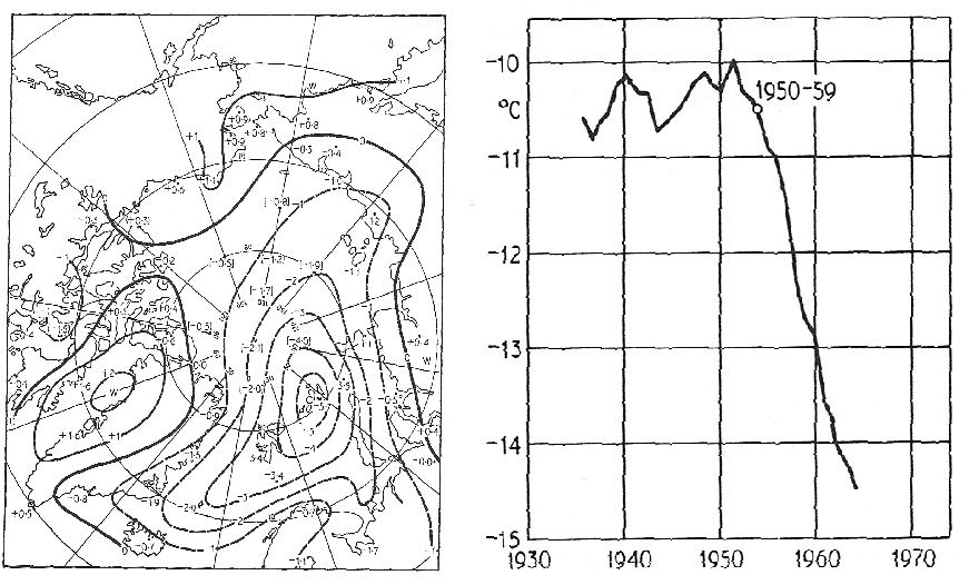
1965:
Worry about cooling in Greenland
Global surface air temperature /thick line) according to Mitchell (1961). Reproduced as figure 2 in Dansgaard and Weidick (1965). The thin line indicate the temperature between 40o and 70o N.
Dansgaard and Weidick (1965) discusses the Greenlandic implications of the global and Arctic cooling, which began around 1948 and 1940, respectively (see figure above). The background for worry is the Danish political decisions of investing heavy in future Greenlandic cod fishery, as a result of the climatic warming experiened before the 2nd world war, since about 1920. Also scientists were convinced about continuing warming as late as in 1950, presumably because the overall linear trend since 1920 still was upwards at that time. It has always been difficult to recognice the passing of a temperature peak, before several years into the following temperature decline, especially if one relies heavily on linear trend line analysis.
Often the official recognition of a new temperature trend takes the publication of one single good or lucky paper, and publications with similar conclusions will rapidly follow. In this case Hamilton (1965) was one of the first (perhaps not the very first) to acknowledge that the global temperature may have passed into a period of general cooling. Shortly after other papers followed, describing the same phenomenon and reaching comparable conclusions. In this case Dansgaard and Weidick (1965) had their publication rapidly after Hamilton's, and even directly referred to and reproduced one of the figures in Hamilton (1965), see diagram below. Dansgaard and Weidick rightfully referred to the work of Hamilton (1965) and others, to suggest that the observed temperature decrease was not an isolated Greenlandic phenomenon, but indeed was much more widespread.
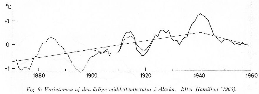
Diagram from Hamilton (1965), showing variation of the mean annual surface air temperature in Alaska 1870-1960. Reproduced as figure 3 in Dansgaard and Weidick (1965). As indicated by the linear trend lines, the diagram suggest the onset of a period of general cooling in Alaska, following the early 20th warming.
Dansgaard and Weidick (1965), among other things, examplified the effects of the beginning cooling by renewed glacier advance several places in Greenland. For example, the glacier Sermeq Siliadleq in the Umanak district (NW Greenland) ended its early 20th century retreat around 1953, and in 1964 the calving glacier front had already advanced about 1 km (see figure below). One of the authors (Anker Weidick) had in the previous years investigated no less than 135 glaciers in West Greenland, and his conclusion was that a climatic detoriation must have been taking place in Greenland since at least about 1945.
On this background it is interesting to note that both official Danish political planning for Greenland and many fine scientists apparently remained convinced that warming was still taking place, at least 10 years years after the actual temperature peak was reached around 1940.
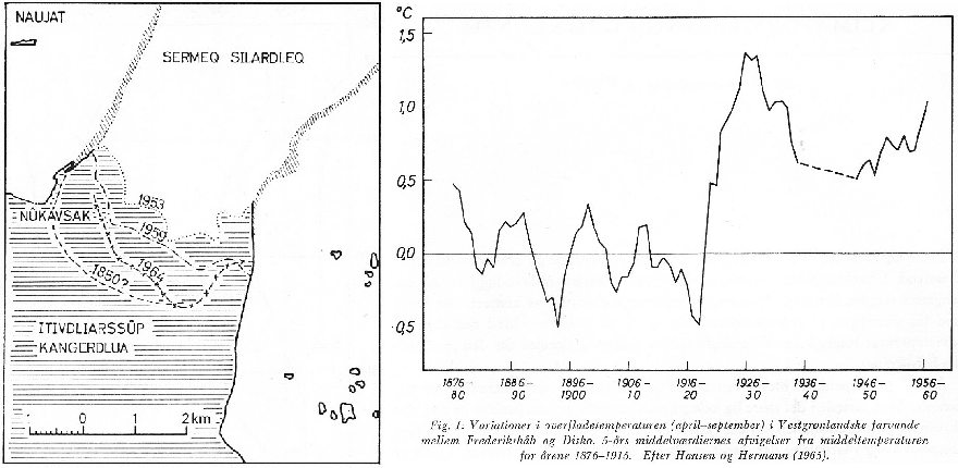
Map showing frontal positions of the glacier Sermeq Silardleq in the Umanak district, NW Greenland (left part of figure). North is towards the left. After the early 20th century retreat the glacier front in 1964 had again advanced, reaching the late Little Ice Age position (1850?) in the southern part of the fjord (Figure 4 in Dansgaard and Weidick 1965). Temperature diagram showing surface water temperature along the Greenlandic west coast (Figure 1 in Dansgaard and Weidick 1965). A rapid warming occurred around 1920, after which a falling trend is suggested by the available data. The stippled line indicate the lack of measurements during the 2nd World War.
The main concern expressed by Dansgaard and Weidick (1965) was however not related to advancing glaciers, but to the possible consequences for the new cod fishing industries established in Greenland in the years after the 2nd World War. They express concern about the fact that the whole political planning process for Greenland was based on the 1-1.5oC temperature rise of the water temperature west of Greenland around 1920, assuming that this signalled the beginning of a long-term trend. However, as shown by the diagram above, already in 1960 a significant part of this temperature rise had disapeared, and global air temperatures were showing a falling trend.
Dansgaard and Weidick (1965) ended their paper by stating (in translation) the worry that the benefits associated with the early 20th century warming might be disappear totally due to the ongoing climatic detoriation, and that this might result in great problems for the Greenlandic cod fishery. Sadly enough, time would show them to to be perfectly right in this worry.
The diagram below show the geographical distribution of the global cooling following the 2nd World War, from 1930-1945 to 1950-1965.
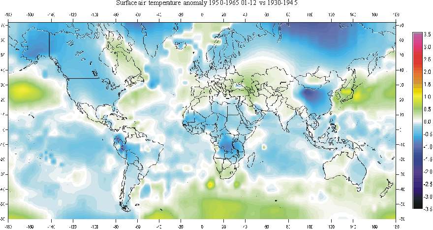
Map showing the change of the annual surface air temperature from 1930-1945 to 1950-1965; calculated by subtracting the 1930-1945 average from the 1950-1965 average. Green-yellow colors indicate warming during the period, and blue colors indicate cooling. Much of the planet experienced cooling following the 2nd World war, but less so around a band between 20o and 30o N, and at latitudes south of Africa. Compare with the previous period of warming. Temperature scale in degrees Celsius. Data source: NASA Goddard Institute for Space Studies (GISS).
Click here to jump back to the list of contents.
1966:
Vernagtferner in Austria further reduced in area
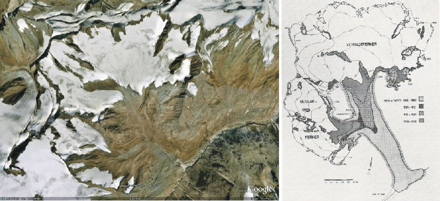
Vernagtferner in 2007 (left; Google Earth). Map showing reduction of Vernagt- and Guslarferner from 1845 to 1966 (Hoinkes 1969; right). Click here or on the map to open a larger picture. The outermost grey zone indicate areas deglaciated 1845-1889. The following zone (dark) indicate retreat 1889-1912. The dotted areas were deglaciated 1912-1938, and the innermost grey zone indicate areas deglaciated 1938-1966.
In 1966 H. Miller (1968) carried out a seismic survey of Vernagtferner. He found that the total volume of the glacier was about 600 x 106 m3 of ice, corresponding to a loss of about 50% of the glacier volume since 1845, representing the last Little Ice Age glacier advance reaching and blocking the main valley Rofental. After this advance, the Vernagtferner began its general retreat, only interrupted by smal readvances.
Click here, here, here and here to read about previous Little Ice Age advances of the Vernagtferner. Click here and here to read about the retreat of the glacier after the Little Ice Age maximum.
Click here to jump back to the list of contents.
1967:
Cod fishing at
Diagram
showing sea surface temperatures (degrees Centigrade) along the west coast of
southern
Balslev Smidt (1989) discusses the development of fishing in the Greenlandic waters. He especially addresses the fishing for cods, which began shortly after 1920, following the early 20th century increase of both air- and sea temperatures around 1920 in the Arctic. Previously, cod only was caught in Greenlandic waters in two short periods, around 1820 and 1845-1850. Since 1920, the total annual fishing for cod in Greenland varied in concert with sea surface temperatures, with high temperatures being associated with high numbers for the total catch.
Balslev
Smidt (1989) especially draws attention to the period 1920-1968, where sea
temperatures beyond southern West Greenland were relatively high (see diagram
above), and the simultaneous increase of cod fishing in the same region (diagram
below), as well as retreating
glaciers. In 1962 a total of about 450,000 tonnes of cod were caught in the
sea west of southern
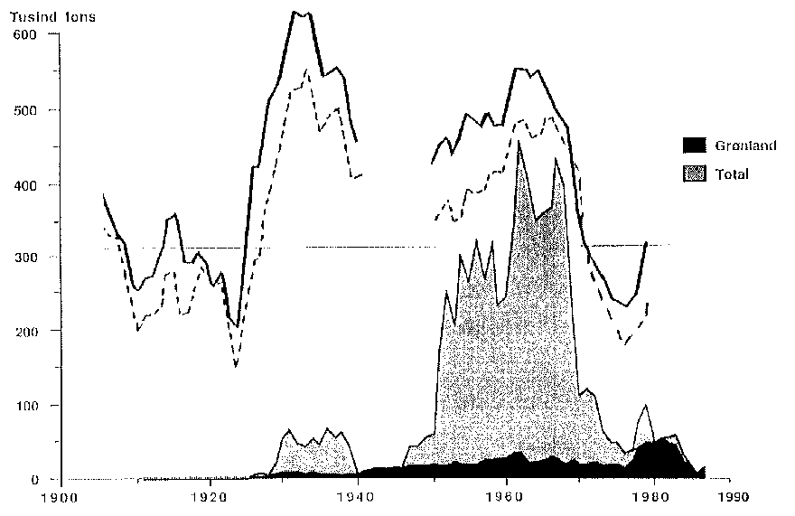
Diagram
showing sea surface temperatures (degrees Centigrade) and tonnes of cod caught
along the west coast of southern
The thorough modernisation of the Greenlandic society, which took place between 1970 and 1985 (Balslev Smidt, 1989), included the building of several large trawlers designed for cod fishing. Based upon the development since 1930, and especially since 1950 (see diagram above), cod fishing was assumed to represent a major source of income for the Greenlandic society in the years to come. Decreasing sea temperatures from about 1967, however, contributed to the following collapse of this industry in Greenland, and a major and costly change towards fishing for shrimps instead had to be introduced.
Click here, here and here for additional links on this development.
Click here to jump back to the list of contents.
1968-1971:
Arctic cooling, The Rome Club and Limits to Growth
Left
diagram: Change of Arctic air temperature for the four winter months
December-March: average values 1961-70 minus 1951-60. Note the general cooling,
greatest near the Norwegian Sea and the European sector, but warming near the
Bering Strait and northernmost Pacific, also off Arctic Canada and west
Greenland. Source: Lamb 1977. Right diagram:
Average 10 yr mean annual air temperature at Franz Josefs Land. Source: Rodewald
1972.
Back
in the 1960s and early 1970s, the timeframe of most scientists interested in
climate and environmental change was still retrospective, rather than
prospective (Oldfield, 1993). However, the
revived notion of the Milanković theory then suddenly offered the new
possibility of actual climate prediction.
At
that time there was relatively little emphasis on potential or actual ‘global
warming’, and the idea was virtually unknown to popular consciousness. Indeed,
a widespread belief at that time was that the planet was heading for a new ice
age, fuelled by acceptance of the Milanković theory and new knowledge
gained from isotope analysis of Greenland ice cores (Dansgaard
et al., 1970, 1971). Hays et al. (1976)
suggested that the observed orbital-climate relationships predict that the
long-term trend over the next several thousand years would be toward extensive
Northern Hemisphere glaciation.
This
beginning period of global cooling, at that time very pronounced in the European
sector of the Arctic (Rodewald 1971; Lamb
1976), was by some seen as the first indication of a coming new ice age,
perhaps even accelerated by aerosols from industrial pollution blocking out
sunlight.
Even
among some of those scientists drawing attention to contemporary increases of
atmospheric CO2, a phase of significant global cooling was envisaged (e.g. Rasool
and Schneider, 1971). Surface temperature changes as shown in the 1940-1965
panel of figure 9 was frequently taken as the empirical evidence for a coming
ice age (e.g. Calder 1974; Ponte,
1976).
Such
concerns in the mid-1970s brought together atmospheric scientists and the US
Central Intelligence Agency (CIA) in an attempt to determine the geopolitical
consequences of a sudden onset of global cooling.
Quite naturally, many people at that time were becoming increasingly worried about the future, especially if the ongoing cooling was to continue.

Front
cover of various editions of ‘The Limits to Growth’
This
was the general environmental and socio-economical background on which the Club
of Rome was founded in 1968
at Accademia
dei Lincei in
Rome, Italy. The Club of Rome describes itself as "a group of world
citizens, sharing a common concern for the future of humanity." It consists
of current and former Heads of State, UN bureaucrats, high-level politicians and
government officials, diplomats, scientists, economists, and business leaders
from around the globe. The club states that its mission is "to
act as a global catalyst for change through the identification and analysis of
the crucial problems facing humanity and the communication of such problems to
the most important public and private decision makers as well as to the general
public.” In 1972 it raised considerable public attention with its report The
Limits to Growth (Meadows et al. 1972).
The
Limits to Growth
describes the result of quantitative computer modeling of unchecked economic and
population growth with finite resource supplies. Its authors were Donella
H. Meadows, Dennis
L. Meadows, Jørgen
Randers, and
William W. Behrens III. The book used the World3
model to simulate the consequence of interactions between the Earth's and human
systems. With much fanfare and alarm the book revived the concerns and
predictions of Thomas
Malthus in An
Essay on the Principle of Population
(1798).
In
the spirit of Malthus, Limits to Growth predicted an end to the economic
progress that the West has experienced since the Industrial Revolution. Today
this particular modeling exercise stands as a celebrated example of failure of
quantitative modeling (Pilkey and Pilkey-Jarvis
2007). Limits to Growth famously predicted that within the coming hundred
years, there would be widespread natural resource shortages and economic
collapses. The authors warned that unless immediate action was taken to control
population and pollution, we would not be able to turn the situation around.
This doomsday prediction was based on a mathematical model known as the
pessimist model, called World III. Compared to modern conditions, the model was
simple, but at that time still requiring relative extensive computer
calculations. The report argued that population growth and pollution from
industrial expansion were leading to total exhaustion of natural resources and
massive environmental destruction. It predicted that catastrophes would begin by
the year 2000.
However,
there were many problems with the World III model. It treated the earth’s
mineral reserves as fixed and unchanging, and that food production per unit of
land area would remain static. In addition, it ignored the possibility of
additional major oil discoveries, advances in petroleum exploration and
extraction technology, and the possible contributions of nuclear, solar, or wind
energy resources, or any other new development instigated by man’s creativity
(Pilkey and Pilkey-Jarvis 2007).
University
of Manitoba professor Vaclav Smil summed up his view by noting that the Limits
to Growth report “pretended to capture
the intricate global interactions of population, economy, natural resources,
industrial production and environmental pollution with less than 150 lines of
simple equations using dubious assumptions to tie together sweeping categories
of meaningless variables” (Pilkey and
Pilkey-Jarvis 2007).
Yale
University professor Nordhaus (1973) went even
further in his critique of the companion study World Dynamics (Forrester
1971) to Limits to Growth: “The
treatment of empirical relations can be summarised as measurement without data.
The model contains 43 variables connected by 22 non-linear (and several linear)
relationships. Not a single relationship or variable is drawn from actual data
or empirical studies”. “The main
result of aggregation theory is that aggregation is generally possible only when
the underlying micro relations are linear. In fact, few of Forrester’s
relations are linear…”
However,
the problems with the World III model clearly went beyond the technical
weaknesses of the model. A Club of Rome official stated shortly after the
predictions were released that the idea was “to
get a message across, and to make people aware of the impending crisis”.
In other words, the model outcome had been determined before the model was run.
Finding the truth according to a preconceived opinion or philosophy is a common
flaw in applied mathematical modeling, and the World III model is today
considered a fine example of a numerical advocacy model (Pilkey
and Pilkey-Jarvis 2007).
Click here to jump back to the list of contents.
1969:
Severe storm over the British Isles and the North Sea
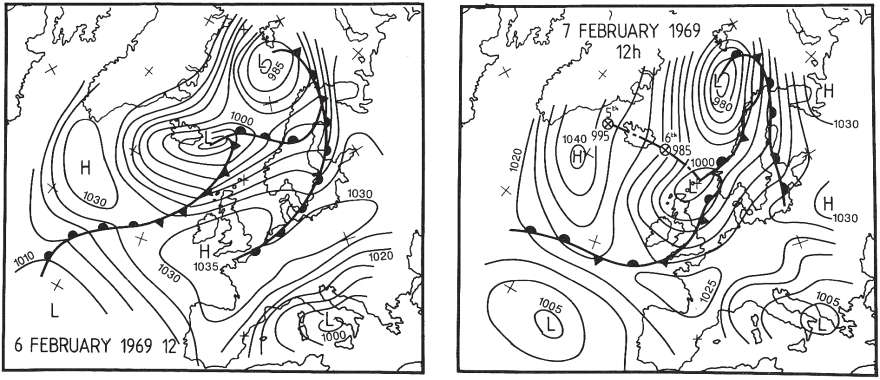
Diagrams showing the meteorological situation 6-7 February 1969 in the North Atlantic near the British Isles (Lamb 1991).
On 6 February 1969 a depression was travelling slowly southeast towards the British Isles, from a position east of Iceland (see diagram above). Very strong pressure gradients existed around this depression, particularly west and north of the centre. This resulted in a strong flow of exceptionally cold air rapidly south trough the Fram Strait between eastern Greenland and Svalbard (Spitsbergen), from a source region near the north pole, assisted by another depression situated north of Norway. On 7 February this northerly air flow was straightened out with a more north-south orientation, as the depression near Iceland moved east towards the northern entrance to the North Sea. Air temperatures in the resulting northerly gale fell to -20oC at Jan Mayen (71oN) and -17oC in Iceland (Lamb 1991).
At 9.15h on 7 February a gust of 118 knots was measured at the Kirkwall airport in the Orkney Islands. This was the second highest wind speed ever recorded in the British Isles (Lamb 1991). Meteorological Office staff working at the Kirkwall airport confirm that driving on the roads was impossible about the time of the gust, because of the density and height to which snow was being blown up from the terrain surface. Actually, the staff inside the airport building dived for safety as they expected the building to collapse.
The stream of cold arctic air spread south over the British Isles during 7 February. Temperatures fell below the freezing point in central London that evening, and the strong wind lifted blowing snow from the streets in spirals of drift up to, and over, the dome of St. Paul's Cathedral. Most of the main roads were blocked by snow drifts and strewn with hundreds of abandoned vehicles (Lamb 1991).
Click here to jump back to the list of contents.
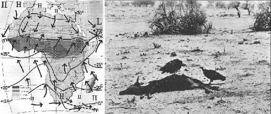
Diagram showing the average distribution of precipitation in Africa in July (left). Photo from Niger in the Sahel zone from the great drought of the 1970s (right).
The cooling which affected USSR (see above) also had negative effects in other areas, especially in the Sahel region in North Africa, but also parts of India and China were experiencing precipitation below what was previously considered normal. The drought reached a climax in 1972 and 1973 in the Sahel region along the southern fringe of the desert zone, because of the general tendency of all climate zones to move in direction of Equator during periods of global cooling, and vice versa in periods of global warming. The African monsoon, like that over India and southern Asia, represents the seasonal northward displacement of the convergence zone between the surface wind systems of both hemispheres, and the accompanying rains.
The drought in the Sahel region had disastrous effects. An estimated 100,000 to 200,000 people and perhaps four million cattle died in the zone stretching across Africa from the Sahel in the west to Ethiopia in the east. There was also a mass migration of people leaving their homes and land, travelling southwards towards more humid regions, creating social stress in many countries. The important coffee harvest in Ethiopia, Kenya and the Ivory Coast and the harvest of ground nuts, sorghum and rice in Nigeria were also sharply reduced (Lamb 1995).
The social unrest and stress caused by the 1972-1973 drought and famine in North Africa seem to have had other repercussions. It may have been a contributing factor to the revolution which toppled the old imperial regime in Ethiopia. And in several leading scientific, technical and administrative institutions in many countries there was some confusion about how to interpret this climatic development and to revise attitudes to climate. Most immediately, the hopes that had been raised by the Green Revolution of being able to meet indefinitely the food demands of the world's rising population were seen to have been unrealistic optimistic.
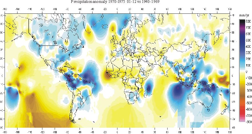
Map showing the deviation of the average precipitation 1970-1975, compared to average conditions 1940-1969. Many areas shortly north of Equator received less precipitation than during the previous 30 years. Among the regions worst hit by drought was the Sahel region in North Africa. Precipitation scale in mm w.e. per year. Data source: NASA Goddard Institute for Space Studies (GISS).
It has been shown (Lamb 1977) that the behaviour of the monsoon over west Africa is related to the northern hemisphere westerlies in middle latutudes. In periods when blocking anticyclones (high pressure areas) or northerly winds over western and northern Europe especially in winter and spring divert a branch of the upper westerlies (the jet stream) and much of the cyclone activity into the Mediterranean, the monsoon commonly fails to penetrate so far north as usual, or is late, over west Africa and elsewhere south of the Sahara. In such years the zone across Africa from Senegal and the Sahel to Ethiopia is liable to be stricken by drought.
Click here to jump back to the list of contents.
1975:
Glaciers in Zillertaler Alpen, Austria, begins to advance in response to
climatic cooling
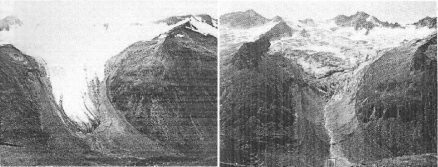
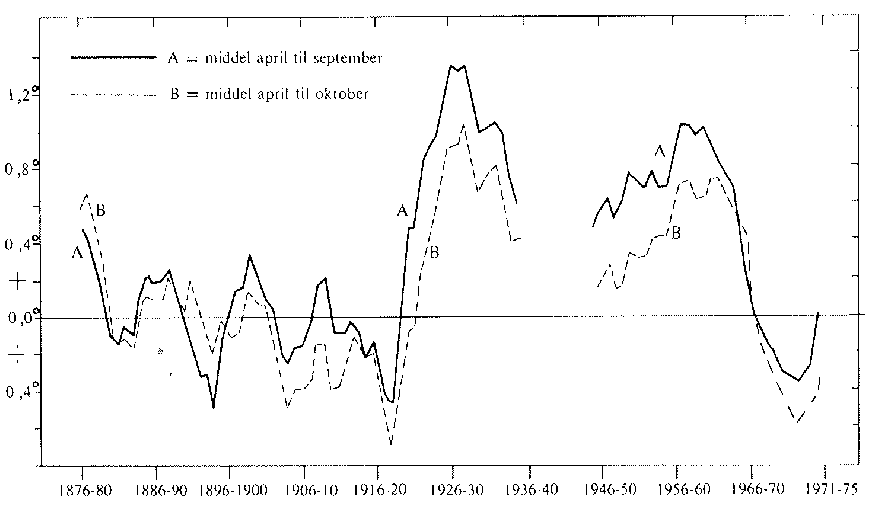
The glacier Waxeckkees in Zemmgrund, Zillertaler Alpen, Austria, in August 1921 (left; photo by S. Ulrich or R. Finsterwalder) and in 8 September 1973 (right; photo by H. Rentsch). The large 1850 moraines are clearly seen on either side of the glacier. Reproduced from Heuberger 1977.
Heuberger (1977) describes the climatic response of three valley glaciers (Waxeckkees, Hornkees and Schwarzensteinkees) in the southern Zillertaler Alps in Austria. In general, all glaciers attained their maximum Little Ice Age position around 1850, and have since been retreating between 800 and 2200 m (see diagram below). A period of rapid retreat for all three glaciers began around 1920.
One of the glaciers, Waxeckkees, has a rather steep long profile, and is known to react more rapid on climatic changes than the two other glaciers. In 1975, all three glaciers are advancing in response to cooling since around 1945. Due to its steeper longitudinal profile and somewhat shorter length, Waxeckkees began to advance already around 1960. In 1975 the glacier has advanced almost 200 m beyond the frontal position in 1960 (see diagram below).
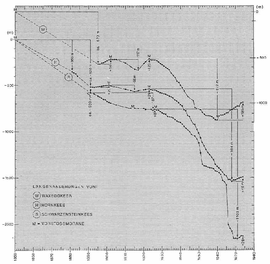
Diagram showing frontal retreat (in meters) of the three glaciers Waxeggkees, Hornkees and Schwarzensteinkees in the valley Zemmgrund, Zillertaler Alpen, Austria, from the maximum Little Ice Age position reached around 1850. A period of rapid frontal retreat began around 1920, followed by a period of beginning advance from 1960-1970. Diagram reproduced from Heuberger 1977, originally published by Hoinkes et al. 1975.
Click here to jump back to the list of contents.
1976:
Forecasting climate change to the year 2000
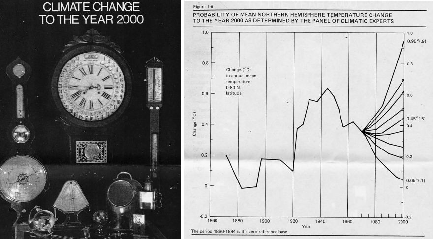
Part of the front cover of the National Defence University (NDU) report Climate Change to the Year 2000 (1976; left). Diagram showing probable mean northern hemisphere temperature change to the year 2000 as determined by the panel of climate experts (right).
The National Defence University (NDU), a Joint Chiefs of Staff (USA) organization, was established formally by the Department of Defence on 16 January 1976. The Industrial College of the Armed Forces and The National War College was the principal constituent elements of the University, along with the Office of the President and four University Directorates.
The mission of the University was to prepare selected military and civilian professionals for high level assignments in the formulation and execution of national (USA) security policy. The program look to the future to try to anticipate the requirements of national security based on US interests and objectives. All NDU research efforts were coordinated by a Research Directorate.
The National Defence University report Climate Change to the Year 2000, the result of a US study sponsored jointly by the National Defence University, the Department of Agriculture, and the National Oceanic and Atmospheric Administration, was conducted under coordination of the University Research Directorate. This study represented an attempt to quantify perceptions of global climate change to the year 2000, initiated by an interdepartmental study at NDU. Subjective probabilities for the occurrence of specified climatic events were elicited by a survey of 24 climatologists from seven countries. Individual quantitative responses to ten major questions were weighted according to expertise and the averaged, respecting the climatologists collective uncertainty about future climate trends.
The derived climate scenarios manifest a broad range of perceptions about possible temperature trends to the end of the 20th century (see diagram above) , but suggest - on average - as most likely a climate resembling the average for the past 30 years (since 1945). Any temperature change was generally perceived as being amplified in the higher latitudes of both hemispheres. The policy implications of the resultant climate scenarios will be examined using a world food economic model.
Click here to jump back to the list of contents.
1979:
The winter war in Lolland, Denmark
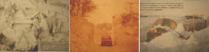
Snow conditions on Lolland, SE Denmark, early January 1979, as documented by local newspapers in Lolland. To the left a village is more or less buried by snow (1979.01.01), the illustration in the centre indicate how some roads were affected by accumulated snow (1979.01.01), and the picture to the right shows a train stuck in the snow masses (1979.01.02).
In
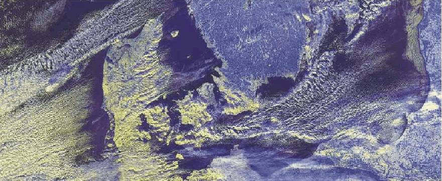
Satellite picture showing Denmark and part of the Baltic Sea to the east, January 6, 2003. The bright yellow colour of Denmark shows vthe ground to be snow covered. In contrast, the large forested areas in southern Sweden stand out as relatively dark. Cold easterly airflow prevails over southern Scandinavia. Evaporation from the relatively warm water in the Baltic produces cloud systems drifting west and resulting in local blizzard-like conditions on the islands Falster and Lolland in SE Denmark. The picture covers about 600 km from south to north.
Click here to jump back to the list of contents.
1987:
Storm affecting southeastern England and Norway
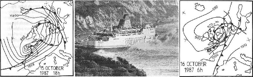
Meteorological diagram showing surface pressure October 15, 1987 (left). The Channel fery Hengist driven aground on the Kent Coast at the Warren, 1 to 2 km east of Folkestone, October 16, 1987 (centre). Meteorological diagram showing surface pressure October 16, 1987.
After generally moderate or light winds from variable directions over the British Isles on October 15, 1987, winds rapidly strengthened over southern England after midnight (Lamb 1991). In the early morning, between 2h and 6h, gusts of around 100 knots were recorded on the Sussex coast, and more than 80 knots occurred in central London. In the eastern North Sea gusts exceeding 95 knots were measured. The highest reported gust speed anywhere in this storm was an estimated 119 knots on the west coast of Brittany, France. The strongest winds in most places were from about SSW.
There was enormous damage to buildings, trees, electricity and telephone lines (Lamb 1991). About 15 million trees were broken, felled or uprooted in southern England (Met.Office). On the streets of London, about 90,000 trees were lost. Electric power lines were brought down over a wide area, and hundreds of thousands of homes in southeast England were still without power the following night and 2000 had not been reconnected after two weeks.
Hundredes of small boats were smashed or blown away. A Channel ferry was driven aground on the coast outside Folkestone (see photo above), and others were unable to get into port. In Dover harbour a bulk carrier capsized. At Harwich a ship being used as a detention centre for illegal immigrants broke adrift. In the North Sea off Lincolnshire a drifting vessel threatened an oil rig with 80 persons on board, which was also adrift (Lamb 1991).
In the afternoon of the 16th the storm struck south Norway causing flooding by the sea on parts of the south coast near Tønsberg. Tide levels were 1.0 to 1.9 m above normal at the coast between Stavanger and Oslo, the highest recorded since 1914. Hundreds of parked cars were destroyed by the salt water, and innumerable buildings near the coast and harbour installations were badly damaged. In the forest the loss of timber was calculated at about £ 20 million (1987 value). Much of this destruction of forests being inland in southeastern and eastern Norway, between Oslo and Hedmark.
In England, newspapers and radio media were quick to suggest comparability of this storm with the great storm in 1703, since such events are rare in the extreme south and southeast of England (Lamb 1991). It's worthwhile to consider whether or not the storm was, in any sense, a hurricane - the description applied to it by so many people. In the Beaufort scale of wind force, Hurricane Force (Force 12) is defined as a wind of 64 knots or more, sustained over a period of at least 10 minutes. Gusts, which are comparatively short-lived (but cause much of the destruction) are not taken into account. By this definition, Hurricane Force winds occurred locally but were not widespread.
The highest hourly-mean speed recorded in the UK was 75 knots (Met.Office), at the Royal Sovereign Lighthouse. Winds reached Force 11 (56-63 knots) in many coastal regions of south-east England. Inland, however, their strength was considerably less. At the London Weather Centre, for example, the mean wind speed did not exceed 44 knots (Force 9). At Gatwick Airport, it never exceeded 34 knots (Force 8).
The Great Storm of 1987 did not originate in the tropics and was not, by any definition, a hurricane - but it was certainly exceptional (Met.Office).
Click here to jump back to the list of contents.
1991:
Mount Pinatubo volcanic eruption
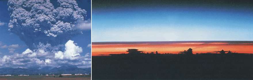
Mt. Pinatubo ash plume June 15, 1991 (left). Red haze in atmosphere caused by the Mt. Pinatubo eruption, as seen from Space Shuttle on August 8, 1991 (right). Pinatubo aerosol clouds (dark) are seen above high cumulonimbus tops.
The 1991 Eruption of Mount Pinatubo, Philippine Islands, was the 2nd largest volcanic eruption during the 20th century. The eruption produced high-speed avalanches of hot ash and gas, giant mudflows, and a huge cloud of volcanic ash hundreds of kilometres across.
On
In
March and April 1991, however, magma rising toward the surface from more than 30
kilometres beneath Pinatubo triggered small earthquakes and on 2 April
1991 caused powerful
steam explosions that blasted three craters on the north flank of the volcano.
Thousands of small earthquakes occurred beneath Pinatubo through April, May, and
early June, and many thousand tons of noxious sulphur dioxide gas were also
emitted by the volcano.
From
June 7 to 12, the first magma reached the surface of
When even more highly gas charged magma reached Pinatubo's surface on June 15, the volcano exploded in a cataclysmic eruption that ejected more than 5 cubic kilometres of material. The ash cloud from this climactic eruption nearly 40 kilometres into the air, high into the stratosphere. At lower altitudes, the ash was blown in all directions by the intense cyclonic winds of a coincidentally occurring typhoon, while winds at higher altitudes blew the ash south-westward. A blanket of volcanic ash and larger pumice lapilli blanketed the landscape around the volcano.
HadCRUT3 global monthly temperatures 1985-2008 illustrating the effect of the June 1991 volcanic eruption of Mount Pinatubo in the Philippines. The effect apparently lasted into 1993.
Some of the tephra fell on Singapore, over 2000 km away to the southwest. Satellites tracked the ash cloud several times around the globe. At the same time, nearly 20 million tons of sulphur dioxide were injected into the stratosphere by the eruption, and dispersal of this gas cloud around the world caused global temperatures to drop by about 0.4°C from 1991 to 1993. Sulphur dioxide oxidised in the atmosphere to produce a haze of sulphuric acid droplets. The large stratospheric injection of aerosols resulted in a 5 percent reduction in sunlight reaching the earth's surface. Global temperatures dropped about 0.35oC during the next couple of years, as can be seen from the diagram above. Click here to see a more detailed (monthly) visual analysis of Mount Pinatubo's effect on global air temperature.
Click here to jump back to the list of contents.
Changes of the world average temperature from 1861 to 1992 as indicated by the figures given by the Intergovernmental Panel on Climate Change (IPCC) in its Supplementary Report. Figure 91b in Lamb (1995). Compare with similar diagram in The National Defence University report (1976) and the diagram presented by the late J. Murray Mitchell Jr to the WMO/UNESCO Rome symposium on changes of climate (1963).
The first publications by the Intergovernmental Panel on Climate Change (IPCC) are the 1990 IPCC First Assessment Overview and Policymaker Summaries and the 1992 IPCC Supplement, Geneva, Switzerland.
In the 1992 IPCC Supplement a revised version of global temperature variations since 1860 is shown (see diagram above). The overall shape of this historical temperature graph is the product of successive revisions adjusting existing values for urban and industrial warming, and other possible distorting influences at the observation sites. Also included are adjustments derived from changes in observing practices at sea with ever bigger ships, and measurements of water temperature in recent decades being made within the vessel in intake pipes, instead of in open buckets.
Compared with previous attempts (here and here) to display the global temperature since 1860 this new IPCC diagram display some marked differences. One of the most obvious differences are that the cooling following 2nd World War is much reduced in the IPCC version, compared to previous published global temperature graphs. Lamb (1995) apparently found the differences so striking that he felt it necessary to comment (p.259) on the revised IPCC version: "The revised version put before us........gives a disconcertingly different picture of the course of world temperature history that should not pass without notice." He then goes on attempting to explain why the new IPCC version of global temperature changes since 1860 differ from previous graphs showing global temperature; inclusion of ocean surface data and new meteorological data south of 60oS, and recent warming in the tropics.
Click here to jump back to the list of contents.
1995:
Tony Benn MP, remark on the Plimsoll case during the debate about the hunting
ban
Tony Benn MP, making a reference to Samuel Plimsoll, in the House of Commons in 1995, during a debate about the hunting ban, remarked (Jones 2006): "We like to think that progress is made by an amendment from a Back Bencher, and accepted by the Government. It is not like that at all. Progress is made when public pressure builds up.... My experience is that when people come along with some good idea, in the beginning it is completely ignored; nobody mentions it at all. If people go on, they are mad, and if they continue, they are very dangerous. After that, there is a pause and then suddenly nobody can be found who does not claim to have thought of it in the first place. That is how progress is made."
Click here to jump back to the list of contents.